


Grey Doubt / Greyed Out

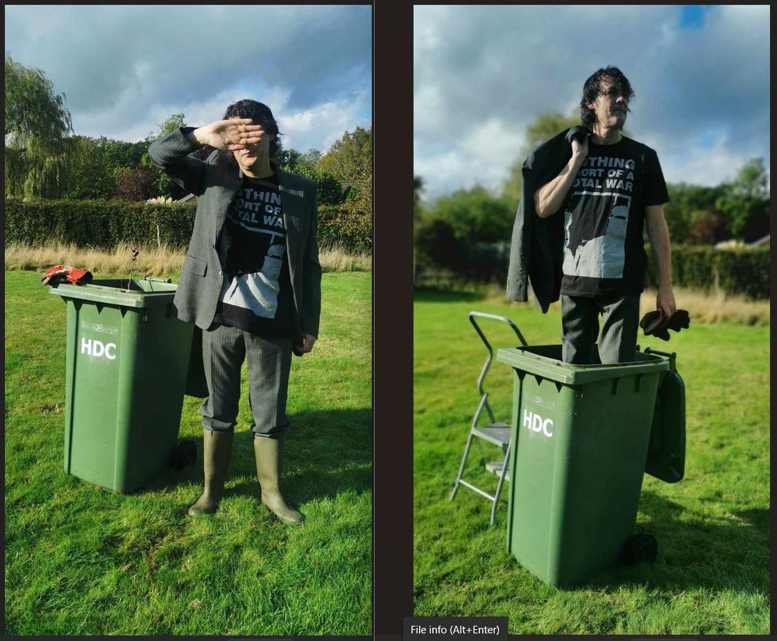
Here are a pair of photographs taken (posed) last weekend. One way of looking at it is by simple explanation, the clearing of accumulated garden clippings that have gathered over the year at a house where the occupants are no longer with us. But this is not a sad story of much-missed loved ones, the relentless march of time, etc.
Well, it’s partly about the march of time, but from the usual subcultural, musical and clothing angles. First things first. I’m attempting to help out a friend who has printed a new limited-edition tee-shirt. The shirt has been created by Chris Low and features a design by musician and artist Kevin Thorne. It’s a reprint of a sleeve from the 1983 cassette compilation Nothing Short of a Total War by Throbbing Gristle. Thorne was close to the band at the start of the 1980s, photographing them, and assisting with various post-TG projects when they underwent their acrimonious but inevitable spilt (or “termination of mission”) in spring/summer 1981. You can read about Low’s project here.
There is a greyness about Thorne’s artwork (and Low’s tee-shirt) that is redolent of the time, within the circle of TG, industrial music, and the wider theme of 1979/1980/1981. At the end of last year I published a lengthy monograph on TG. I’m not sure if it was a labour of love, or something else, but I was relieved when it was over (and not just for simply having the book out there). I’ve steered clear of TG matters since then. They have an active and engaged fanbase, often trading little known facets of information like Top Trump addicts in the school playground. The cultural theorist Henry Jenkins, in his recommended work Textual Poachers, coined the phrase epistemophilia – a proprietorial passion for small facts – which is very apt here.
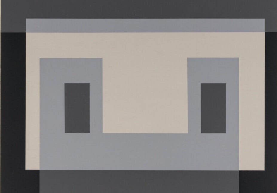
TG had an intimate relationship with the grey. Their series of 7” record sleeves had a uniform design which incorporated a major and minor image (black and white photographs) that held each other in an awkward check. Here’s the image for ‘Adrenalin’ and a bit of text from my book.
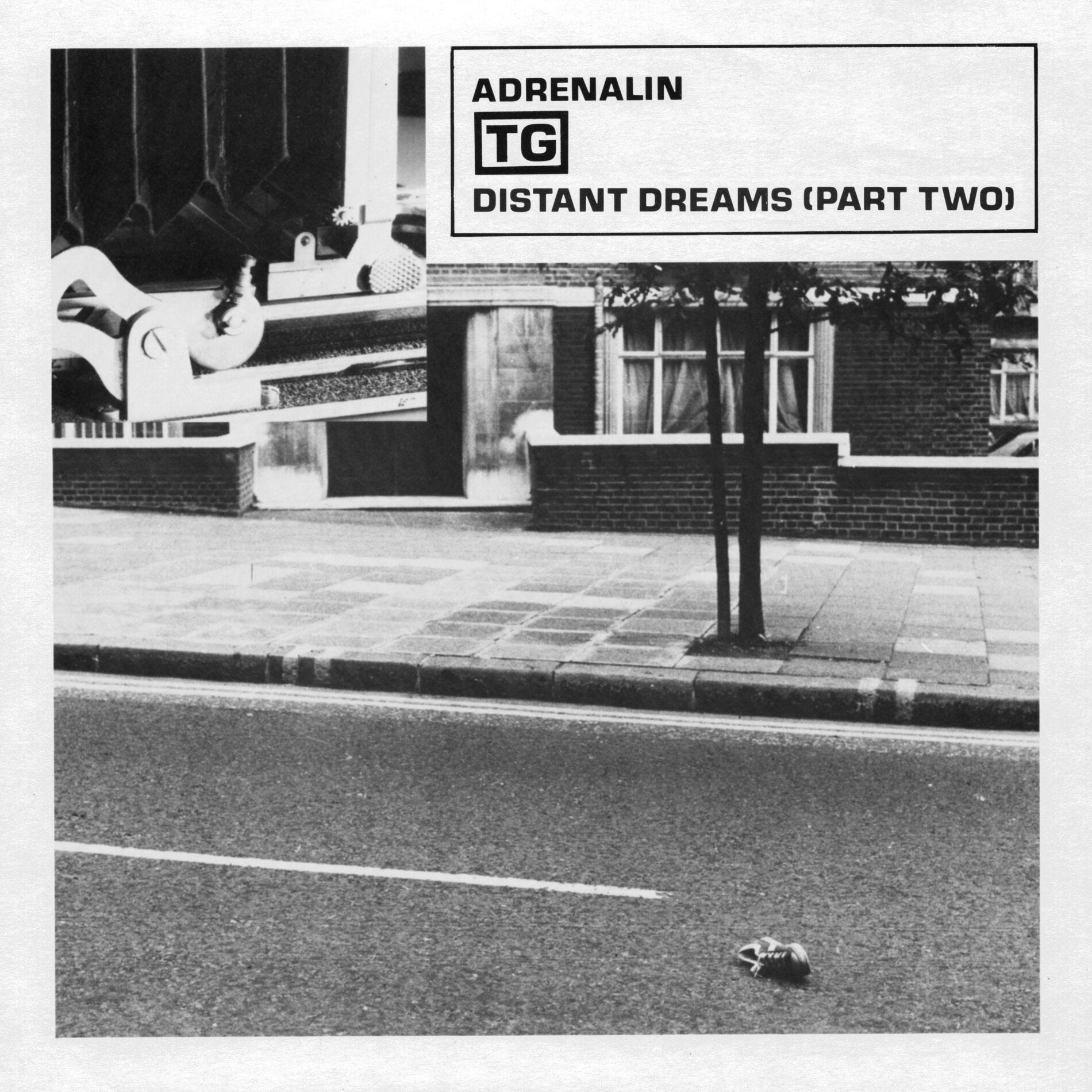
The sleeve artwork took banality to the limit, with a typically people-less scene looking across a road to a wide suburban pavement, a white-topped wall on a gradual incline, and a brick residence with a heavily fortified door and tightly drawn curtains. An abandoned shoe in the foreground, positioned on its side and at a 45-degree angle (to show a clear black void where a foot once was) directs your immediate reading to imagine a road accident, taking your attention away from the building, which – according to TG research sources - is a Ministry of Defence building. The inset photograph is a close-up of the bellows from a large format camera, a method of depiction often preferred by surrealists such as Jacques-André Boiffard or Brassaï. The juxtaposition of the two images was clever, making the rectilinear light and dark parts of the small photograph of the equipment initially appear as part of the structure of the building in the larger photograph – a technique employed to powerful effect by the conceptual artist John Stezaker.
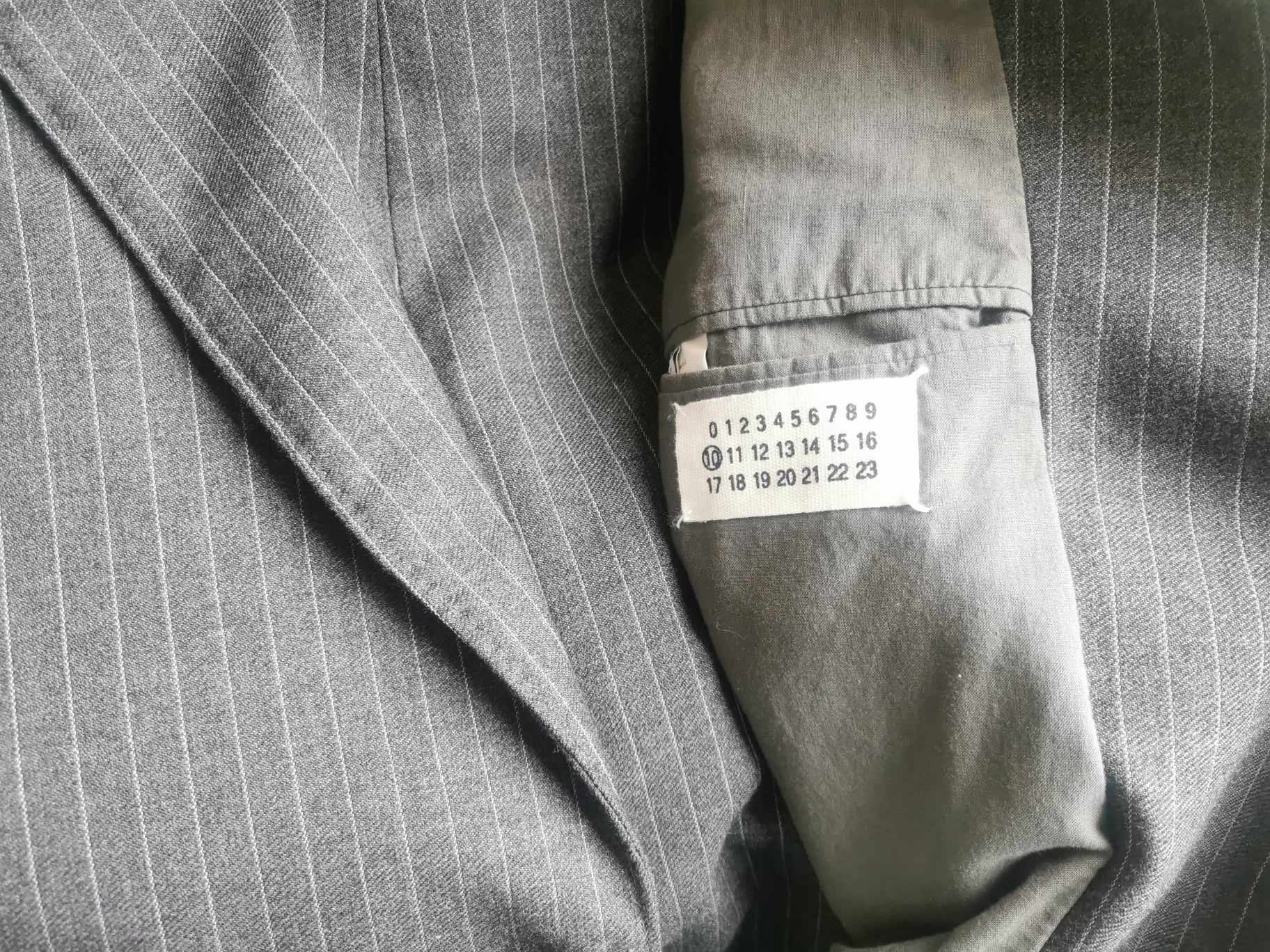
In my modelling photographs I’m trying for something, wearing a grey business suit. It’s by the designer Martin Margiela, part of the Antwerp wave of fashion designers who, following the Japanese designers of Yamamoto and Comme, were the next wave to shake up fashion. Over the next few weeks I will have a lot to say about Margiela, and about how he (in the mid-00s) started to return to a lost history of punk-punk clothing. That’s what I’m attempting to plug into here, albeit unsuccessfully!
There’s also a strange staggering of time in my photograph. Taking an origin point as my year of birth, we have approximate chunks of 20 years. The first time point is the TG compilation Nothing Short of a Total War in 1983, the second time point is the purchase of the Margiela suit around 2005, and the final time point is 2024, when Low produced the tee-shirt, I purchased one and took the photographs. Maybe if I’m around in 2045 something else significant in this visual chain will occur.
So, the suit was purchased around 2005, when I got into a Margiela phase. As said, that’s a piece of research on its way. However, the suit was bought with an idea in mind sculpted through a distinct photograph which turned out to be totally inappropriate and unfit for purpose. These pop-cultural images on record sleeves or the pages of The Face have determined my life, which you will know if you have read my numerous posts on this blog.
I’m not a businessperson, and I have managed 60 years here without needing to wear a drab suit apart from the odd court appearance or attendance at a wedding outside of my punk and post-punk circles. So, this suit was not needed for any ‘proper’ purposes. Margiela designed a series of odd 70s style clothes that revisited a kind of crafted drabness, and I thought this suit fit that bill. But it didn’t. Here’s the image that I had in mind – an image that still has a mighty power in my accumulative pop consciousness.
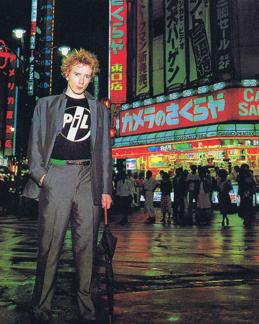
It's from the sleeve of PiL’s album Live in Tokyo, released in 1983 as part of the band’s punctuating of their album releases with live offerings. Lydon, once he left the clutches of McLaren, developed in fantastic musical directions – we know that. He also reasserted a sense of style. It could be suggested that his time with the Pistols was over-inscribed by the clothing developed by McLaren and Westwood. When he announced PiL in 1978 we saw a variety of suiting from smaller designers such as Caroline Walker and Johnsons. It was as if the dictum was defined in the negative – anything but Westwood! He even had a track called ‘The Suit’ on Metal Box, though admittedly it’s one of the weaker moments.
His suit here on this sleeve has always given me the impression it’s a deliberately drab affair, and Lydon’s pairing of it with a simple PiL tee (in black) and his orange spiked hair creates a clash of connotations. The green belt is an important detail. As it the upturned collar on one side. Obviously the staging and lighting of the photograph has a massive effect on its visual impact. That’s why these people are popstars and the rest of us were posing for photographs in bedrooms and back gardens.
But my mistake is assuming that this suit worn by Lydon is drab. It isn’t. It has a sheen and cut that is almost classic early 80s, perhaps (whisper it) in the Duran style. That’s good, as Lydon cuts rough and goes against its stylistic rules. And not simply in a Miami Vice way.
When I put on my Margiela suit in 2005, and even after twinning it with a vintage PiL tee-shirt, I didn’t look remotely as stylish or subculturally incongruent. I just looked like a boring businessman. Even worse, I had visions of the ‘henpecked’ character Barry in Last of the Summer Wine who spends his life either locked into a bad suit or 80s golfing attire.
The Margiela suit was never worn. In fact, it only came out last weekend to stage these photographs. I probably need to move it on before it spends another 20 years hanging up.
I’ve written a lot about early 80s suits over these blogs, but it doesn’t always look good. The smart (boring) grey suit is a hard sell. I know that Heaven 17 experimented with business suits amidst the profusion of zoots and post-punk dead man attire, but a plain grey suit is a different matter. The 80s was cautious of grey, initially seeing it as a kind of technicolour failure or departure point of surface excess (Visage’s ‘Fade to Grey’ and William Gibson’s famous opening sentence to his debut 1984 novel Neuromancer which reads “The sky above the port was the color of television, tuned to a dead channel”). Spanning before and beyond was William Burroughs with his concept of the ‘grays’ as control aliens, alongside his debut spoken word LP Break Through in Grey Room. We then had the 1983 artist collective the Grey Organisation, Mute Record’s Grey Area for their ‘difficult’ releases, The Specials singing “I’m the man in grey, I’m the man at C&A” (which was about how we tried to ignore impending nuclear apocalypse). There’s many more.
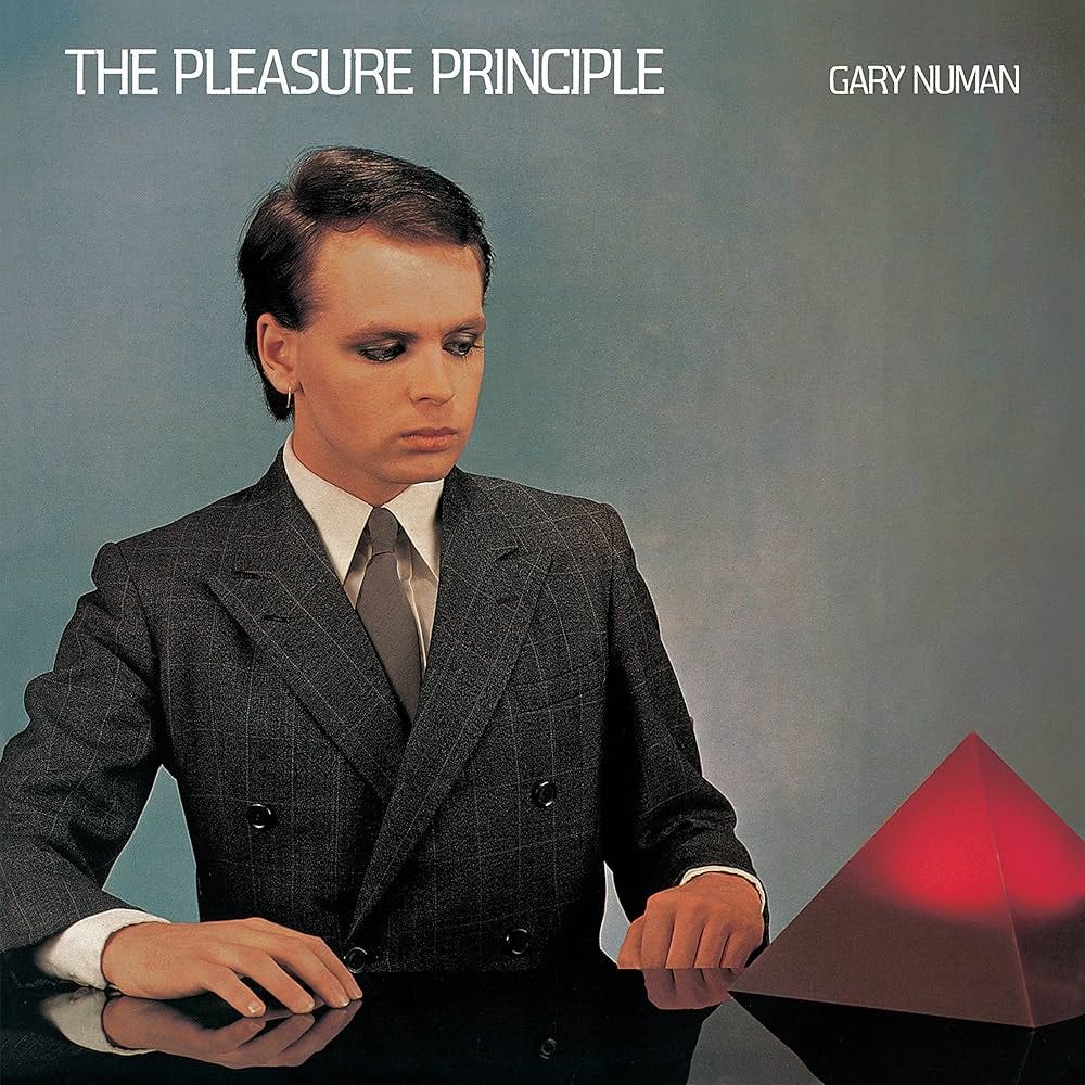
And so, the final image of a grey suit goes to Gary Numan, someone who never really shaped my own youth. He wears a grey suit for the cover for his album The Pleasure Principle, released in 1979, his first solo album, that quickly followed on from Tubeway Army’s Replicas. I’ve recently re-read Dylan Jones’ magnum opus on the new romantic scene – Sweet Dreams. I’m not sure why. I read it as an electronic book when it came out and found it disappointing on a number of levels - mainly because it felt a missed opportunity and quite lazy with its 95% content of repeated sound bites which don’t always stand up to consensual scrutiny or make for a good historical document. Jones can clearly write, but I wish he’d written this book rather than curated it. He does however dismiss Numan’s clumsy look on the LP sleeve, and omits any reference to Numan’s original attempt to create a technologically upgraded homage to a René Magritte artwork. Never mind, I’d agree with Jones in that it’s a terrible suit, rooted in the business 70s, and Numan looks stiff and awkward in it. Martin Margiela, before he quit designing, has probably luxuriated over this sleeve for long hours…
Great piece Ian. Funnily enough the stylings of the suit remind me of the campaign that Andreas shot for his first campaign without Viv in Tintwhistle. Which I loved.