

Sleazenation functioned as a style magazine, even if it proposed to be anti-style. This is part of a longer debate about anti-fashion that runs through much of the post-2000 avant-garde design sphere. Sleazenation also proposed to address, draw from, and ultimately stimulate “modern subculture”. This was slightly curious as subcultures were much changed from the early 1980s when they hinged significantly around music scenes, particular bands, and key followers of those bands. The previously subcultural bands of the early 1980s took to dressing up as the decade progressed, thus eliminating a kind of stakeholder mentality. A more egalitarian subcultural movement was glimpsed with the rave scene, though the fracturing of this scene (musically) into increasingly niche genres didn’t necessarily see a return of clearly defined sartorial markers. Instead, a bland-ish post-streetwear look emerged with more discrete markers. Futuristic fabrics, vaguely outdoor wear, dull colours resembling architectural substances and substrates, concealed zips, concealed pockets, matching trainers, slightly sci-fi in a Space 1999 way.
Clothing performed a premium function in Sleazenation. It was evident in at least four key ways: copious style photoshoots that branched into conceptualist experimentation, short and medium-length articles on new designers and events like London Fashion Week, photo-led features on music that sat just on the obverse side of mainstream, and last – but not least – a proliferation of advertisements for clothing companies that presumably paid for the magazine.
The style shoots and fashion designer articles tended to be pushing towards avant-garde and never-heard-of hard-to-find designers. The magazine had a strong relationship with the London store Pineal Eye which pushed the most obscure brands and mode of retailing. These fashion shoots by Sleazenation were awkward, edgy and confrontational, hijacking unfashionable or distasteful mise-en-scenes, putting their models under a degree of stress (nudity, embarrassing situations, etc). At the same time they offered a glimpse of some incredible designers such as Raf Simons, Martin Margiela, Comme, Yamamoto, etc. More on this in a minute.
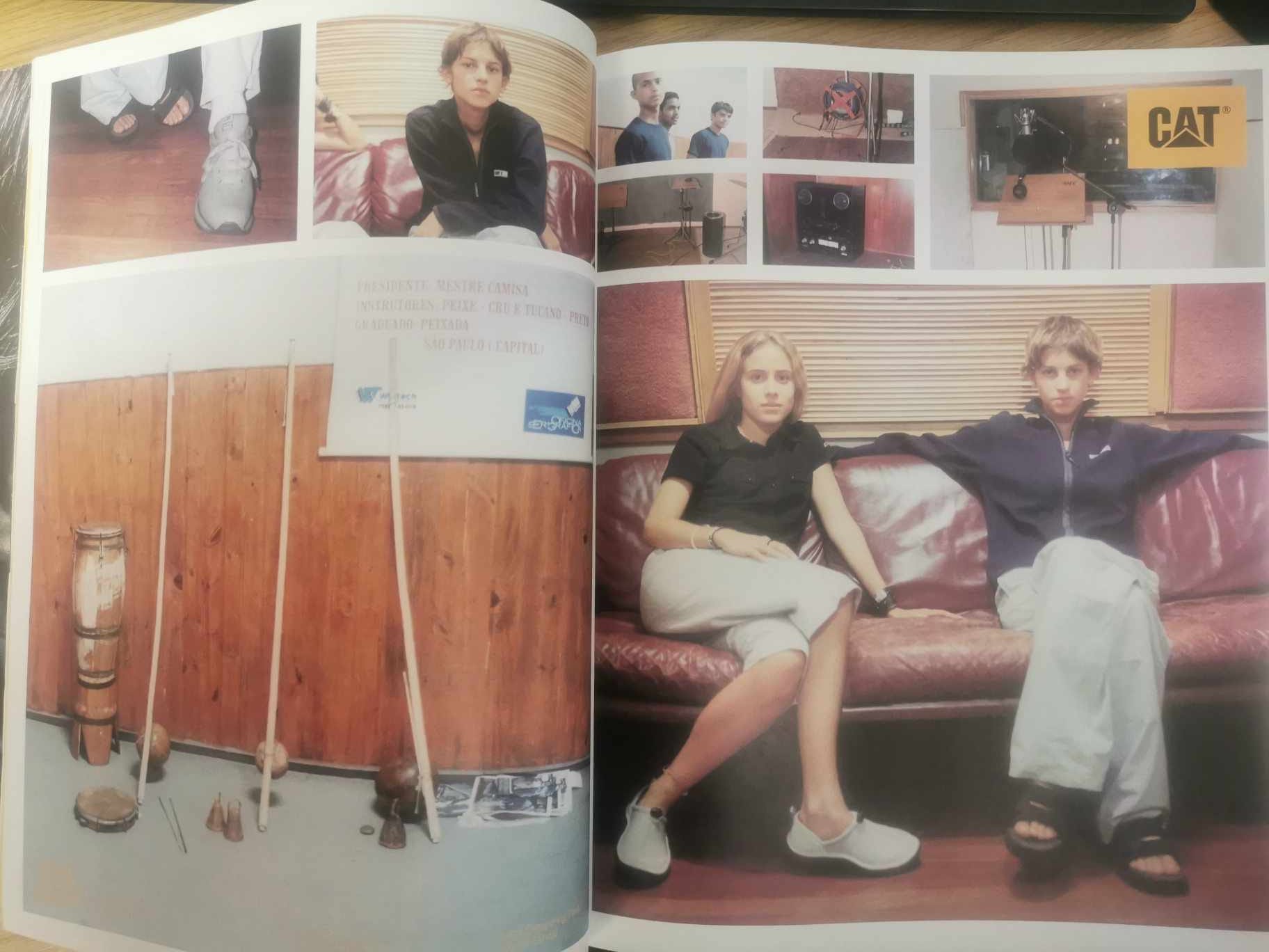
The attire adopted in the band features was the low-key and clean-cut space-age modernism. Looking back on it now… bland. Some of the looks were drawn from contemporaneous manifestations of street and skatewear, as it toned the cartoonish sloganeering and garish colourways. This fitted with the ethos and genres of the featured bands – post-rock, electronica, breakbeat by geeky maths boys.
There were standard (hackneyed) ways of photographing the bands, with the members occupying either a small corner of the frame or extolling an ephemeral (non)presence by seemingly passing through the moment or feigning total uninterest. The main visual attraction was brutalist concrete walkways or tower blocks, exteriors and interiors of faceless offices or downbeats pubs and cafes, mundane street furniture, incidental downtrodden members of the public sat on benches eating a bag of chips. Labels that rushed to advertise in the magazine pretty much defined the look – FatCat, Warp, Nuphonic, Wall of Sound, Domino, and so on.
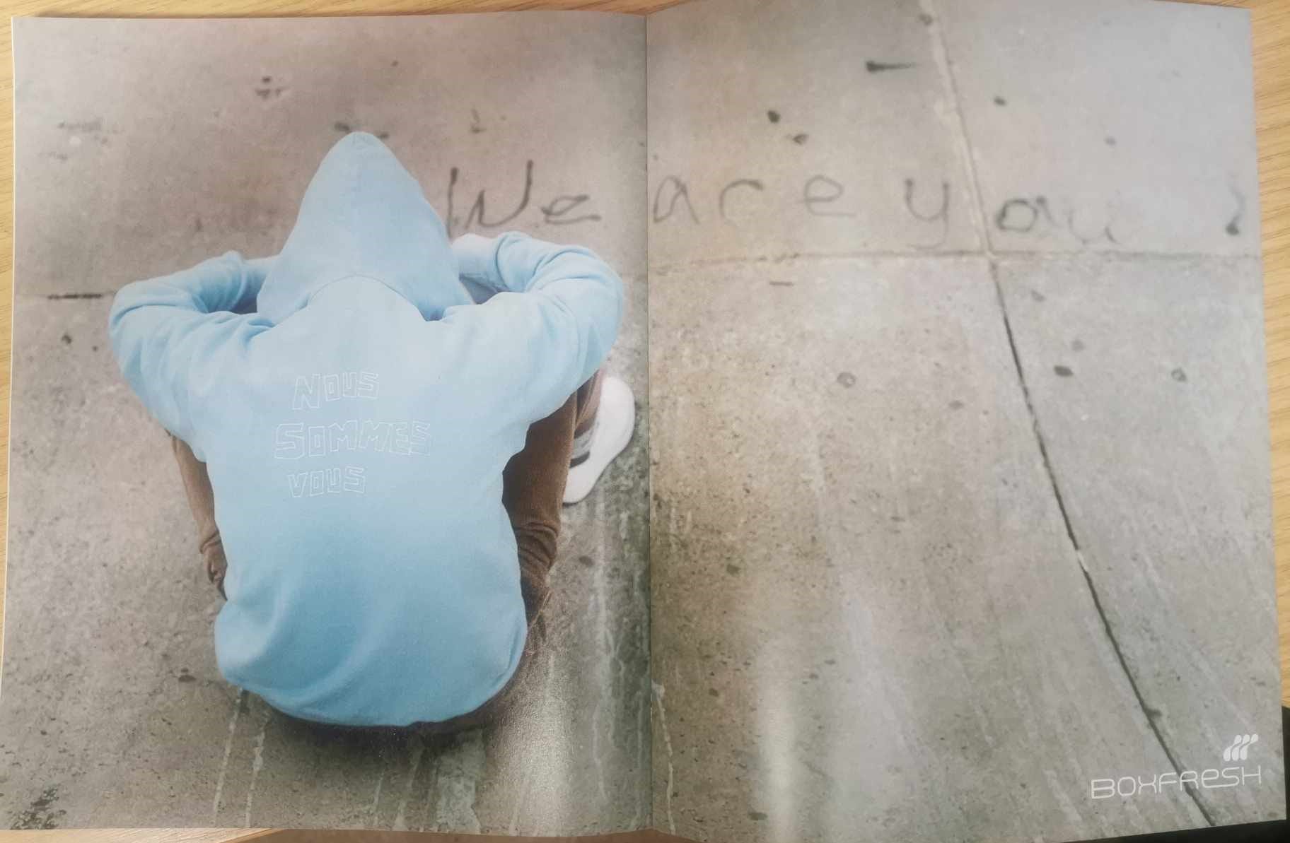
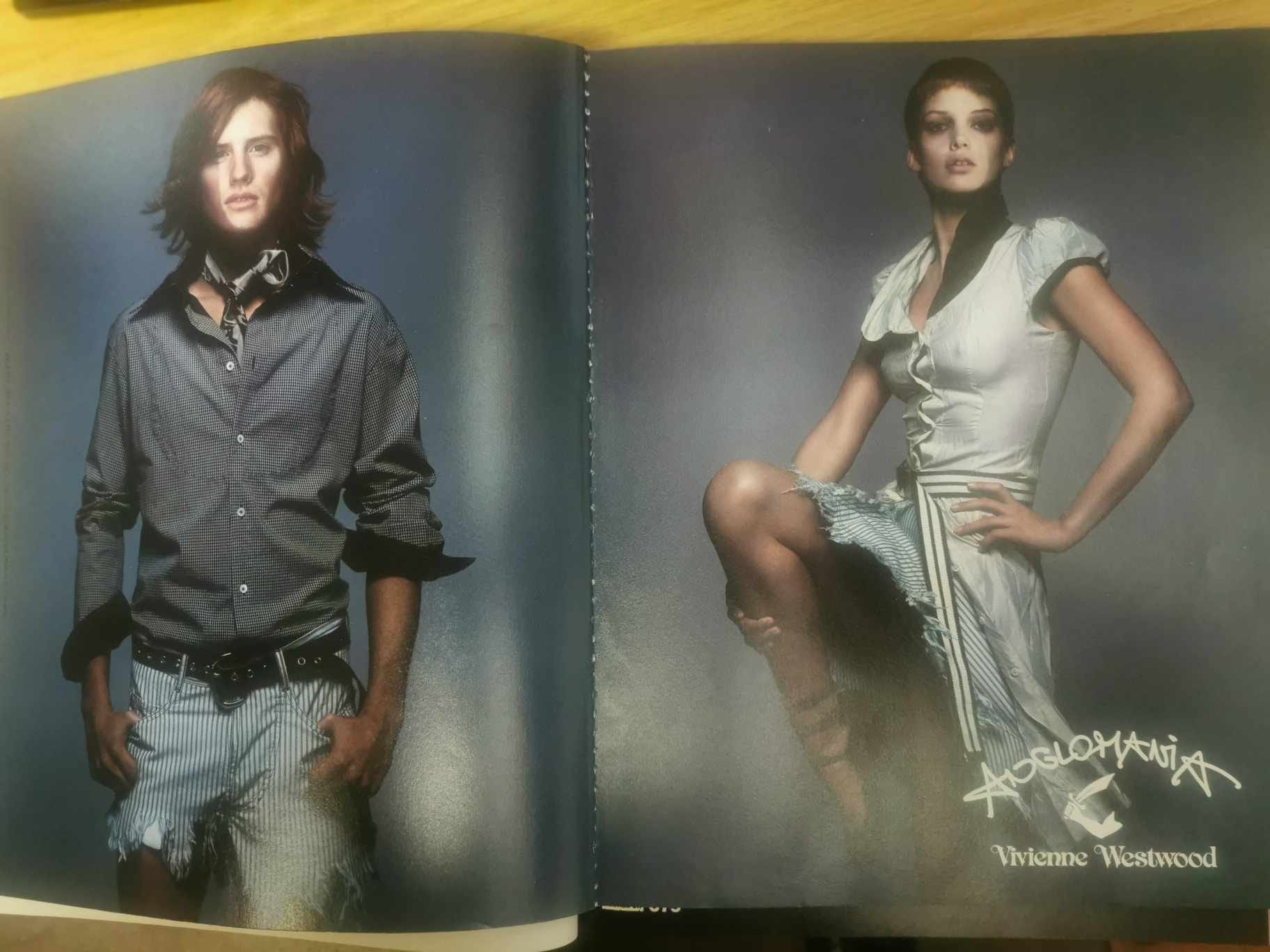
The clothing advertisements squared up with the looks adopted by the bands rather than the avant-garde explorations of the main features. It was a plethora of toned-down streetwear that was favoured by skaters and smokers: Carhartt, Boxfresh, Cat(erpillar), Bench, Ben Sherman, Stussy, Fenchurch, Firetrap, 555 Soul, etc. The era of Mandarina Duck technical fabric and single-strap backpacks.
I can identify myself here, crawling out of the blanked-out 90s and trying to get on board, so to speak. I had a fair bit of Mandarina Duck (including a full-length olive green ‘flasher mac’ made of their experimental paper fabric) and some better pieces by You Must Create. That was a positive. But my spending (in terms of financial limit and extent of exploration) was hobbled. I was drawn forever to TK Maxx as I saw this as the way out of a certain malaise, without releasing it was just another (non)flavour of malaise. Clueless. Perhaps what made me think I was making some kind of progress was that all those brands that advertised in Sleazenation filled the bulging and endless rails of TK Maxx.
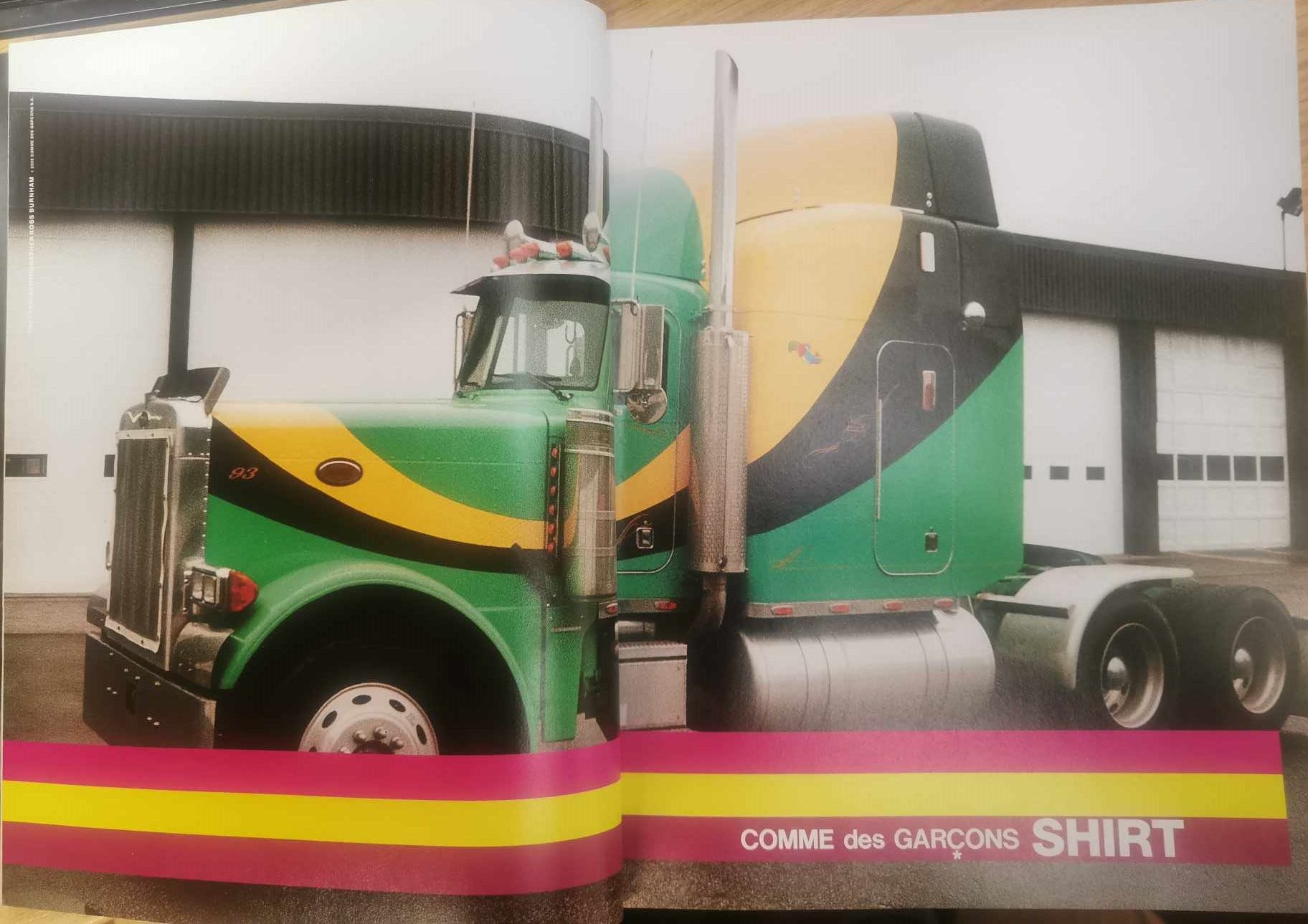
I now realise that (I guess) the magazine was somehow failing to make some kind of jump. It longed for the avant-garde fashion that obliquely occupied its features, but had to settle for the lowest common denominator of a tee-shirt by Bench (that said ‘Bench’) and a tee-shirt by Fenchurch (that said ‘Fenchurch’). The lowest common denominator permeated the pages and connected seamlessly to the glistening and rummaged rails of TK Maxx. There was an odd advert for the diffusion line Comme des Garcons Shirt (never featuring clothing), and a first advert for Vivienne Westwood parallel line Anglomania in March 2002. But nothing resembling the high-end advertising in magazines like Arena Homme +.
It wasn’t until mid-2003 that something changed in me and I ditched the drawers of bargain-rail 10to10 sweaters and Fly53R jeans, and started to explore avant-garde clothing. By then the magazine had all but finished. Twenty years later, after cold storage in the Pitsmoor attic, I was surprised on re-reading to see all of the avant-garde designers that I pursued in the latter half of the 2000s were dotted about in the features, hiding in plain sight. It must have just passed me by. And it is through this re-reading that we can go back to Martin Margiela (damn, just as you thought it was safe to go back in the water and all that).
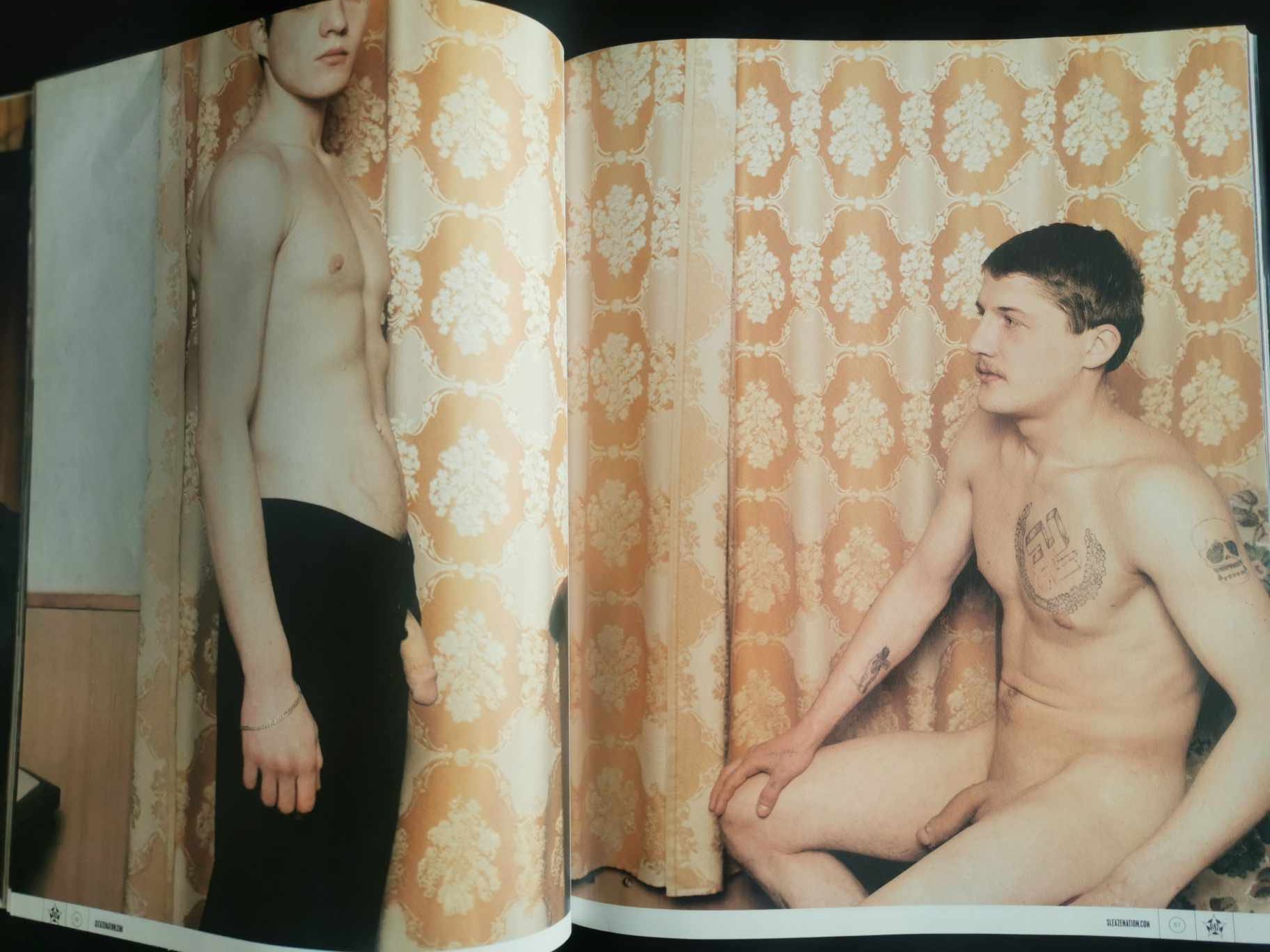
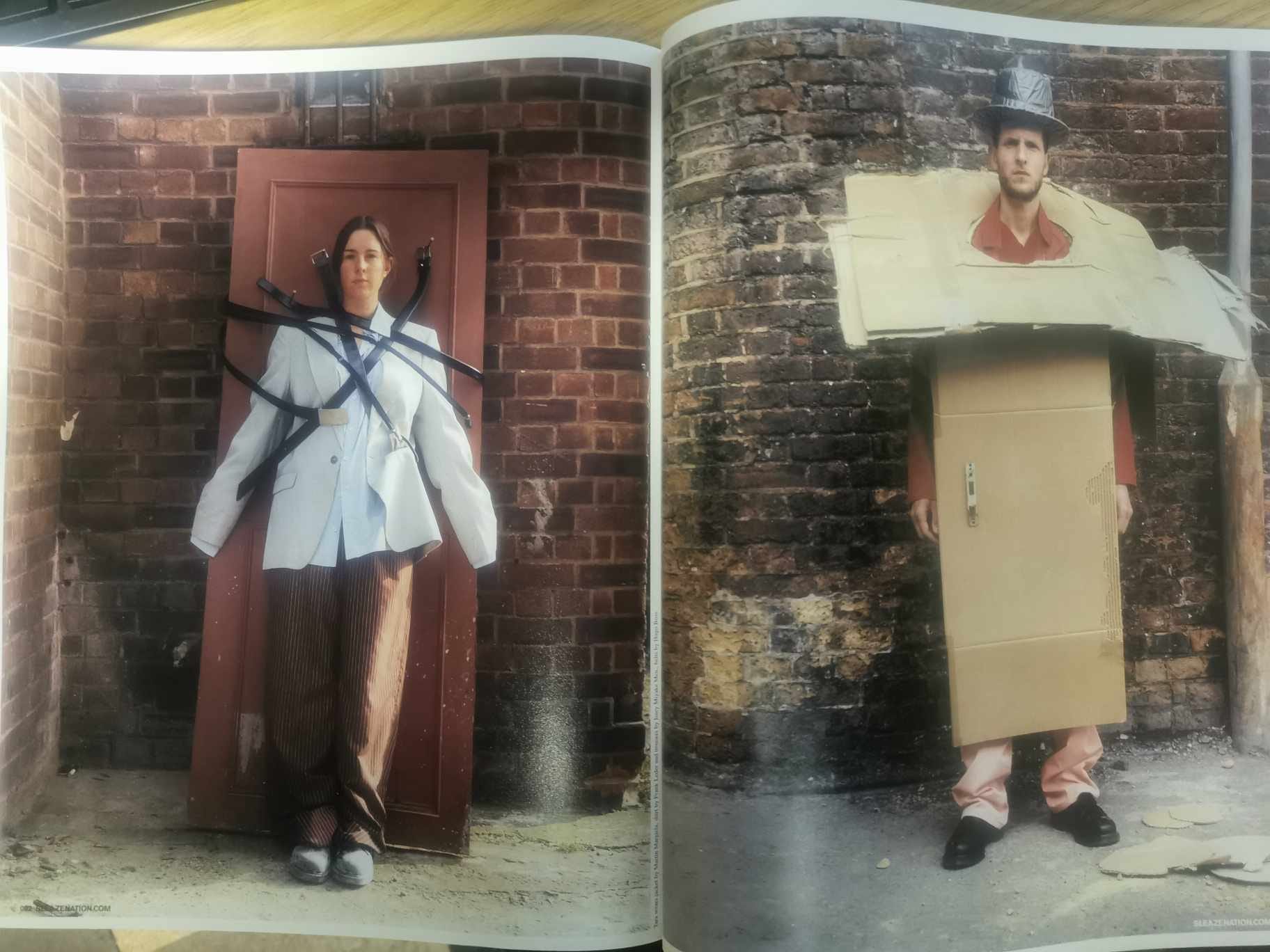
Margiela introduced a menswear line in 1999, and this appears very swiftly in Sleazenation, so they deserve some underground kudos. However, it is a very bizarre photoshoot for the September 1999 edition under the title ‘We are all Prostitutes’. As is the way, a number of designers are featured, so we also get an early glimpse of Raf Simons. But perhaps you will forgive me for passing over it. Both Margiela’s and Simons’ clothing at this point was deliberately anodyne and disconnected from obvious subcultures past and present. Or so it appeared. They were doing suiting that was simultaneously superbly tailored and unspectacular. I think, now, I have some kind of a handle on this, after much deliberating. The article that follows this article will explain that as Margiela kept on with this non-clothing (Simons took a break and then came back with his ultra-subcultural clothing – the subject of a series of articles to come later in the year).
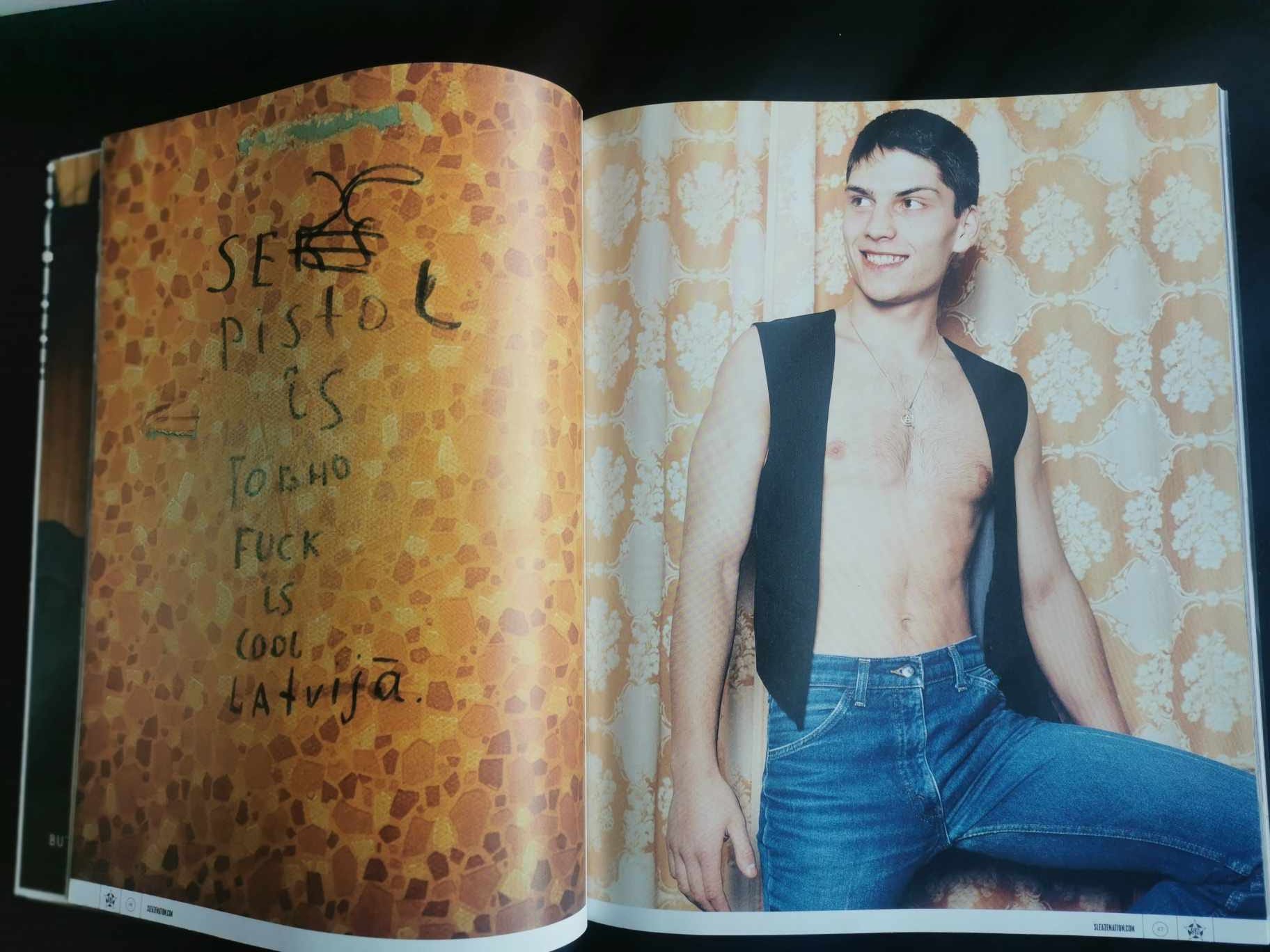
But, there is the troublesome nature of the photoshoot, which did very little to sell the clothes. Two guys in a drab hotel room, facing up to each other with their flaccid cocks hanging out of the open flies, some grotty nazi tattoos thrown into the mix. Oh yeah. Can we dig out some reference points or ironic context? Obviously the article title derived from the classic Pop Group single, which is revealed at the end of the frames, putting it into the early post-punk mix which gathered fashion pace in the early-00s. The opening frame left side has a graffiti reference to Sex (Seks) Pistols possibly as scrawled as a message inside a toilet stall. So the squared up dicks could well be the infamous ‘cowboys’ tee-shirt that caused punk luminaries to be arrested. It could also explain the swastika presence (perhaps). Or maybe it’s a modern subculture – grotty cottaging nazis.
On the right side of this first frame is a fairly innocuous male with a nervous grin giving the impression of an amateur male contact ad shoot. He has a waistcoat and jeans, looking like he’s dressed from an East European enclave that has not quite caught up with style culture. But, as I now realise, that’s the Margiela ‘style’ of his inaugural menswear.
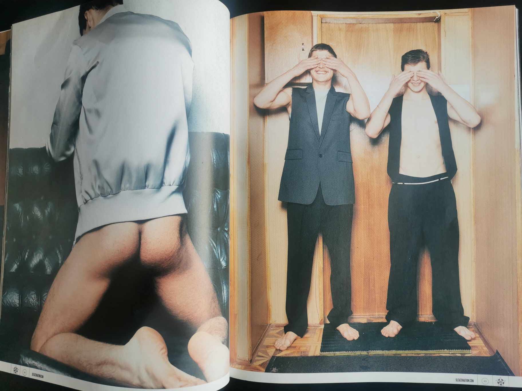
It gets weirder with frame two – a hairy arse in slightly too much close-up and two guys standing in a cramped and tired hallway wearing cut-off uppers, too-long semi-flared slacks, and bare feet. They cover their eyes – which we will come to know as another Margiela trait. But I’m not sure how much editorial say Margiela has had in this photoshoot. Possibly none at all?
And then we get to frame three. Look away now. Draw the curtains, make sure there’s no gap, and then get down to business. There is an element of Robert Mapplethorpe’s very uncomfortable (for me) photograph ‘Polyester’. For once, I’m lost for words.
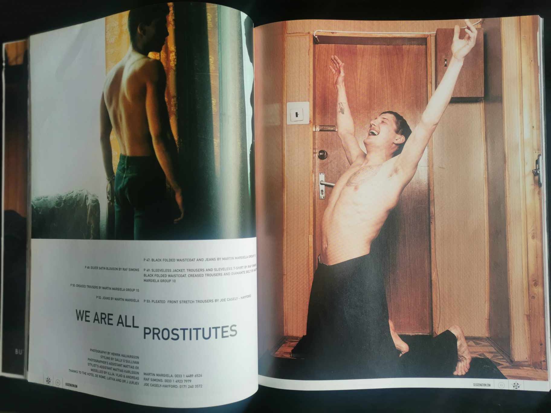
The fourth and final frame has maybe a resolution. The nazi guy seems elated. He’s back in the cramped hallway but in front of a different door (to quote The Associates: “doors, lead to other doors”). It’s even grottier with a wonky switch, broken chain lock, and wire that emerges from the upper left edge of the door and drifts rightwards out of the picture frame above some kind of wooden storage box. The end.
As you may guess, the feature didn’t lead me to beat a path to the avant-garde retailers to enquire about this Margiela fellow.
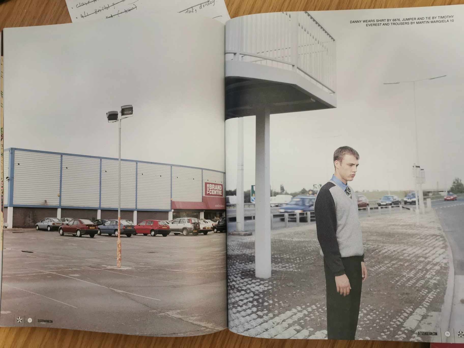
Three months later, in December 1999, we get another glimpse of nondescript Margiela attire in a feature titled ‘Waiting for the Second Coming in a Concrete Wilderness’. It’s a Joy Division reference sneaking in, so good work by Sleazenation – as this is my reading of Margiela’s initial menswear. But it still didn’t get me rushing to the shops. Not yet.
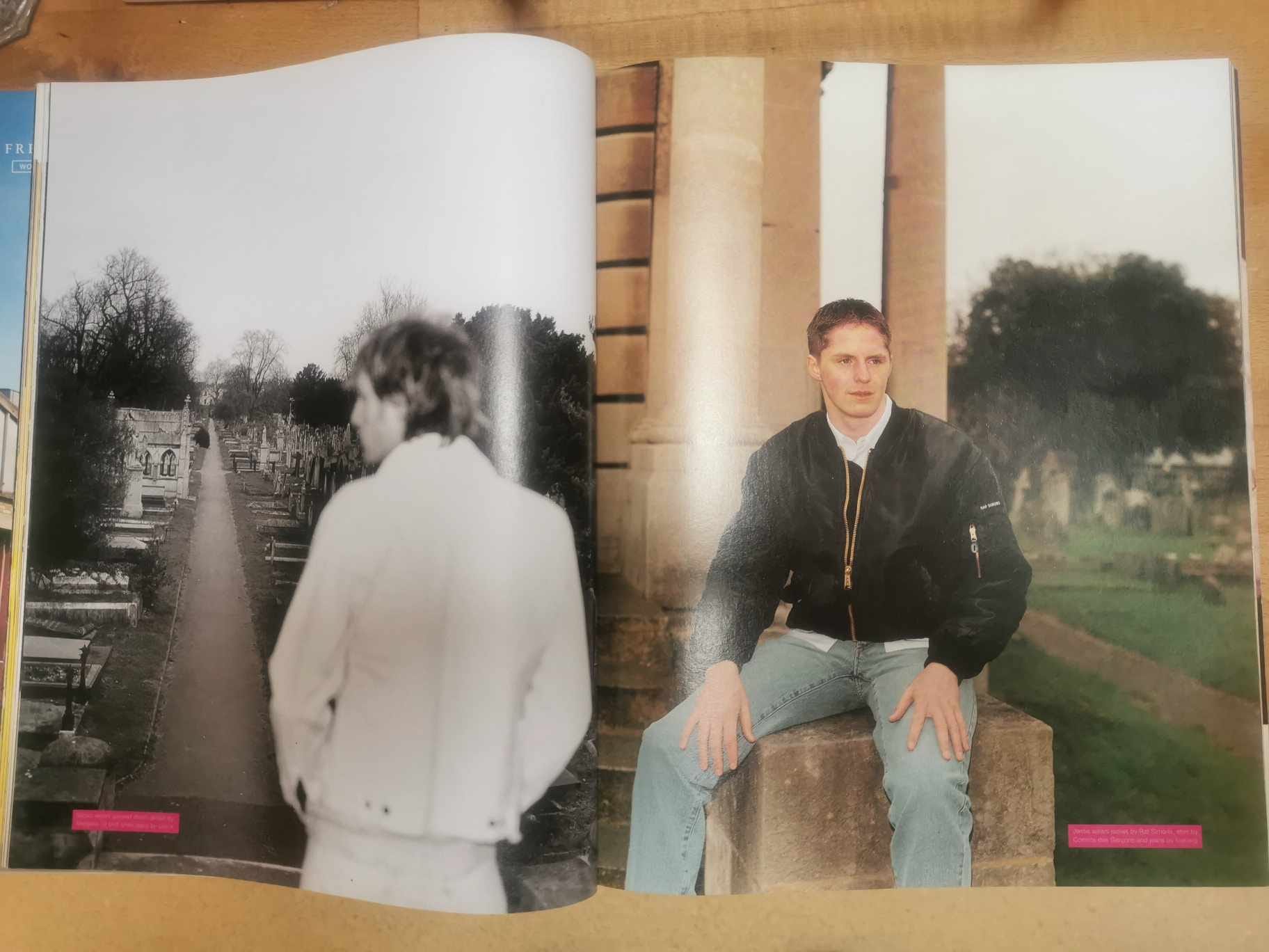
Margiela and Simons unite in various features through 2000, with a surprisingly contrived feature in March 2000 shot in a cemetery. Maybe Joy Division again, but that funereal aesthetic of the post-Curtis albums always felt a bit forced. By now Simons’ classic MA-1 jacket is in the mix, and we see Margiela’s early work in utilising 80s faded denim and painting things in white emulsion.
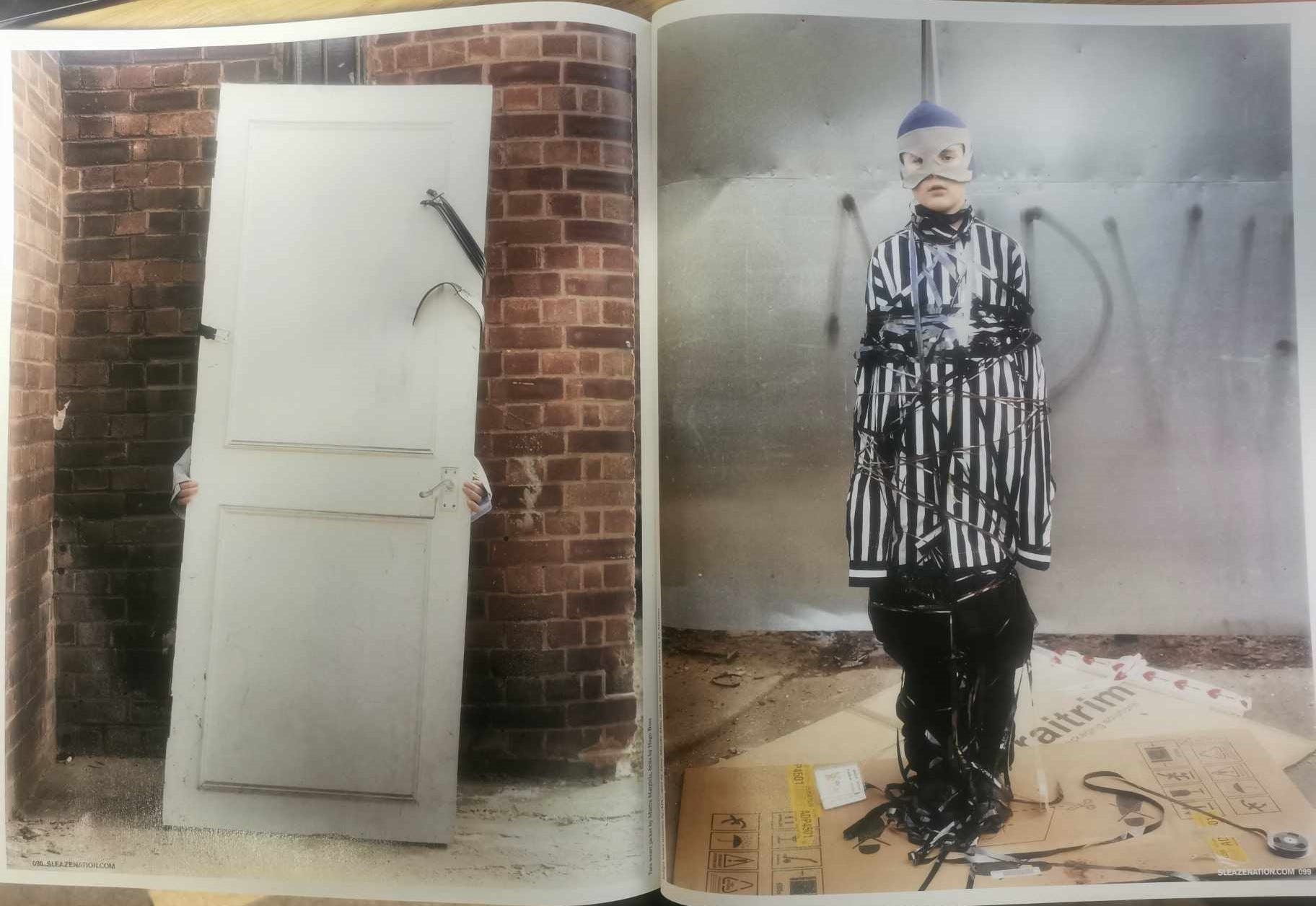
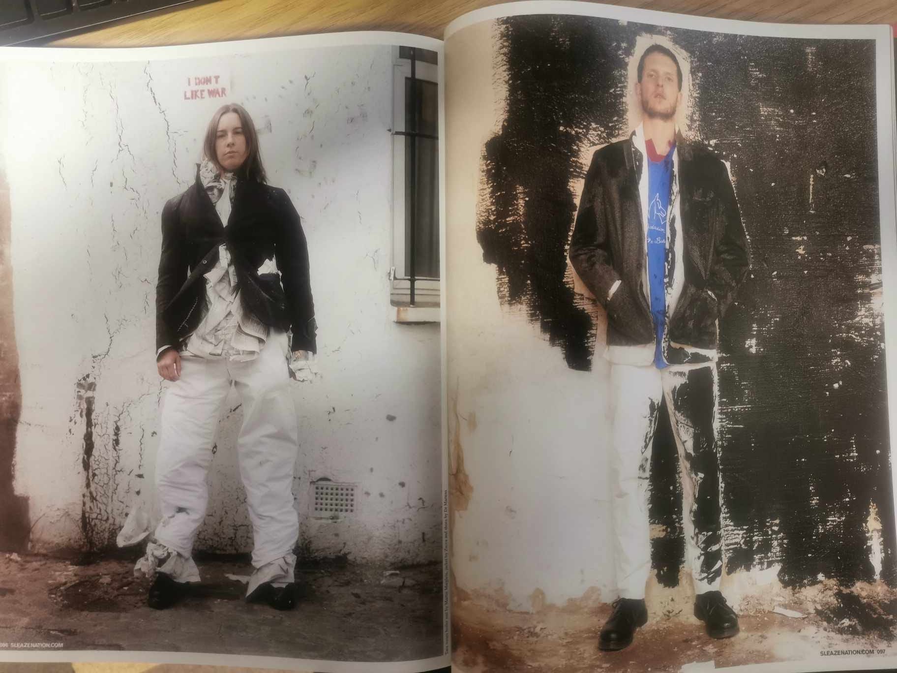
There were some classic shoots in Sleazenation, not least the ‘Protect and Survive’ from May 2002. I opened the article with a paired image from this spread, and I add a couple more. There’s even a bit of Margiela inserted here with the blazer and housepainted aspects.
I think we are now ready for a deeper delve into this strange style that Margiela inhabited for the first few years of his menswear line…