
Start the Dance
Rave culture and 1990s artwork on the fairground (part 2)

Having looked at the general overlap between dance music and the fairground, and the strengthened links between rave cultures and funfairs, I’m now going to get down to the serious business of visual culture. With rave music entering the fairground, and the fairground entering the domain of the rave, how did fairground art adapt?
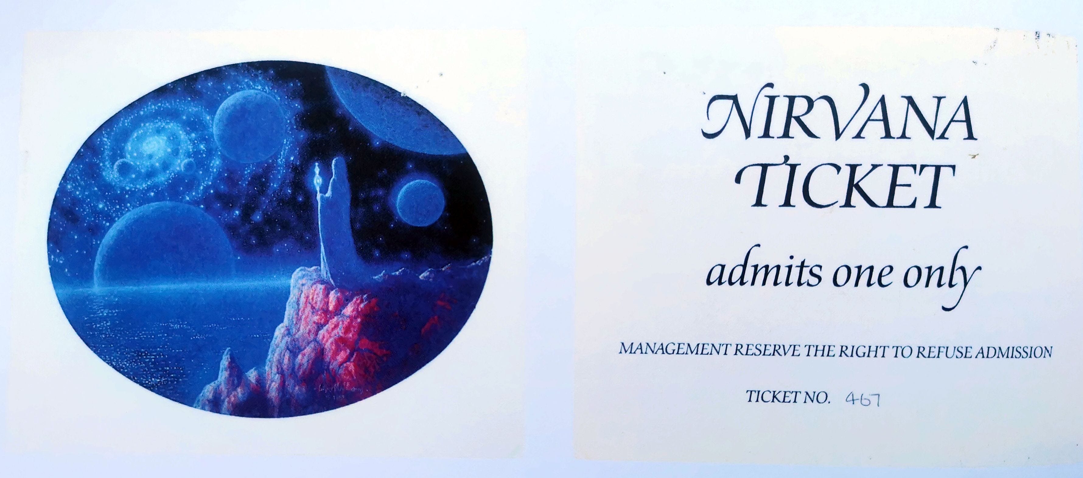
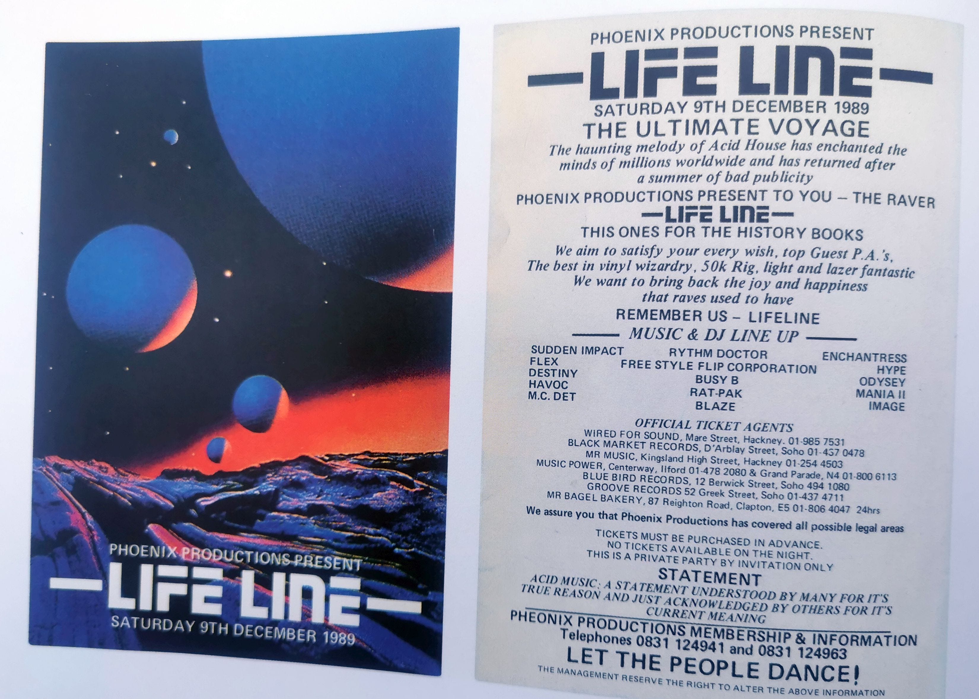
It is slightly more complex, needing a little more background. The visual imprint of rave music was different to pop music, and there were initially no marketable figures such as a Tina Turner who dominated much of the figurative fairground art around this time. Also, record production (and circulation) was different. Records were produced in a low production run, mainly home-made, with the intent of them acting as ‘tools’ to be taken up by DJs and wannabe DJs. Thus, picture sleeve artwork was not something considered, ruling out another mode of visual transfer between the scene and fairground. In its place there was a burgeoning culture of flyers and posters that developed a strong visual identity using the ubiquitous smiley symbol and a glut of sci-fi and quasi-prog psychedelia.
There was also the act of raving itself, the euphoria of the crowd with arms aloft, stripped down, perspiring and gyrating, adorned with stylised accoutrements such as bucket hats, whistles, glow-sticks and bandanas. This was followed by the gradual rise of the superstar DJ, depicted as a superior craftsman or deity, stood (or stooped) behind the decks and preaching to the flock. All of these would gradually form the visual toolkit – or lingua franca - of the fairground artist wanting to tap into the rave or clubbing style, even if it took a little while longer. But if you look around now, at this very moment on the British fairground, this artwork is everywhere.
Without doubt, the new ride that defined the 1990s decade would be the Miami Trip – as seen above. These rides also ushered in the next phase of fairground art, with a singular dynamic backflash pushed into the immediate foreground, necessitating a new approach to non-repeating figurative artwork and a new technique of airbrush work. It was, effectively, a huge billboard that bounded the fairground – a blank canvas for new ideas and themes staging the next incarnation of fairground art.
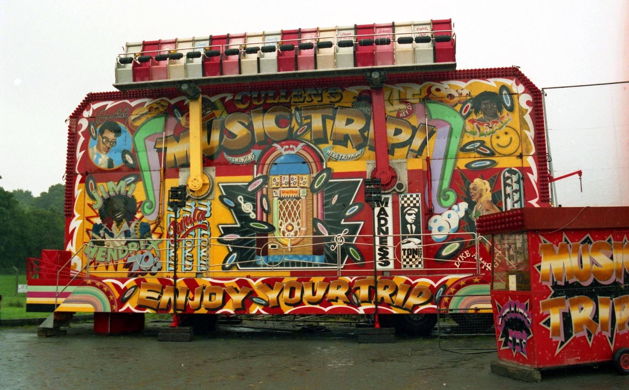
However, it was not a straightforward leap to rave and dance music iconography on the Miami Trip; through 1992 and 1993 we had a plethora of beach, surf and carnival themes, a preponderance of Planet Hollywood and Hard Rock Café Americana (allowing Tina Turner to hold forth well beyond her sell by date), and an outgrowth of action movies. One artwork that stood out was by London artist Mark Gill who produced an ingenious ‘Music Trip’ concept which saw four decades of music tumble around as if in a spin dryer, mimicking the sweeping, cyclical movement of the ride. The only slight flaw in this idea is the attempt to represent the 1990s (by Seal, KLF and Vanilla Ice) at the early 1992 point, though at least an acid smiley and a gas mask raver capture the dance culture of the early 1990s.
Throughout 1993 and 1994 much artwork was painted by the mysterious Pat Doonan based in deepest Suffolk. He drew from a mix of comic books and prog-rock style artwork similar to Roger Dean’s album cover work for bands like Yes. Pat’s artwork was not rave as such, but could – at a push – be considered to have some synergy with the scene. For example, there was a tendency for rave flyer art to reproduce prog-rock style alien planets.
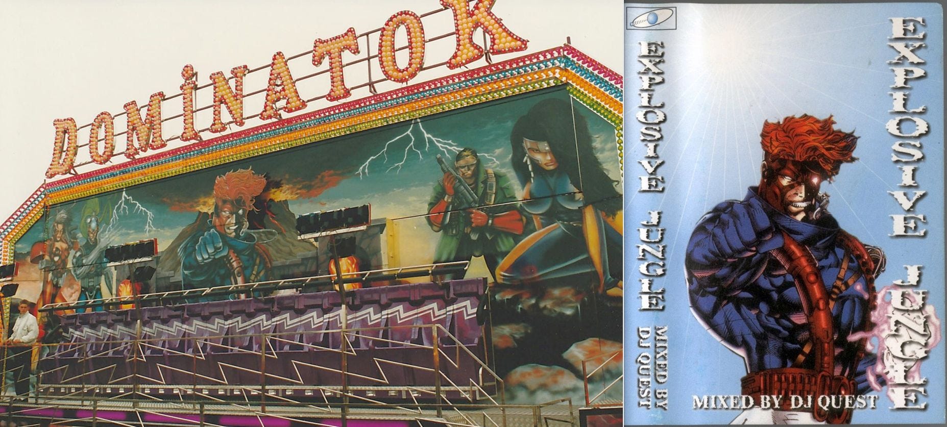
The synergy between Doonan’s work and rave culture is best exemplified with the final artwork of 1993, the Dominator Miami for Brighton Pier. As an artwork it is a typical Pat Doonan effort, using characters from a 1992 comic book series called Wild C.A.T.S. set against a devastated planet backdrop. The future-primitive punky nature of the figures gives the artwork a rave inflection, though this might be circumstantial on the artist’s part – in later years the same figures could be found on the homemade cover of a mixtape. More certain, the name of the ride is drawn from the classic 1991 dark-rave track by Human Resource, released on the much-admired R&S Records, and underpinned by what is known as the ‘Belgian hoover sound’ as pioneered by techno artist Joey Beltram.
However, it is the subsequent Hi-Energy Miami that can lay claim to being the first 100% dance music themed artwork. It was decorated as a debut work by the new artist ‘Matt’ from Bristol, who worked in airbrush and came from a motorbike and truck painting background. Most trained fairground artists (like Mark Gill) had been tutored using brushwork, but the 1990s saw a switch to airbrush sprays, meaning new artists from other realms such as vehicle customisation or graffiti could come in.
Matt was such an example. The decoration of Hi-Energy was a difficult job, as the original theme was not planned to be rave-related, and the showman changed his mind at the last minute. Matt, learning the nuances of working for showmen, had to improvise, made worse by painting in a farmer’s barn in the frost-biting February of 1994. He recalls: “I even remember at one point we were drawing around each other’s shadows cast from the only halogen lamp in the shed, then colouring them in”.
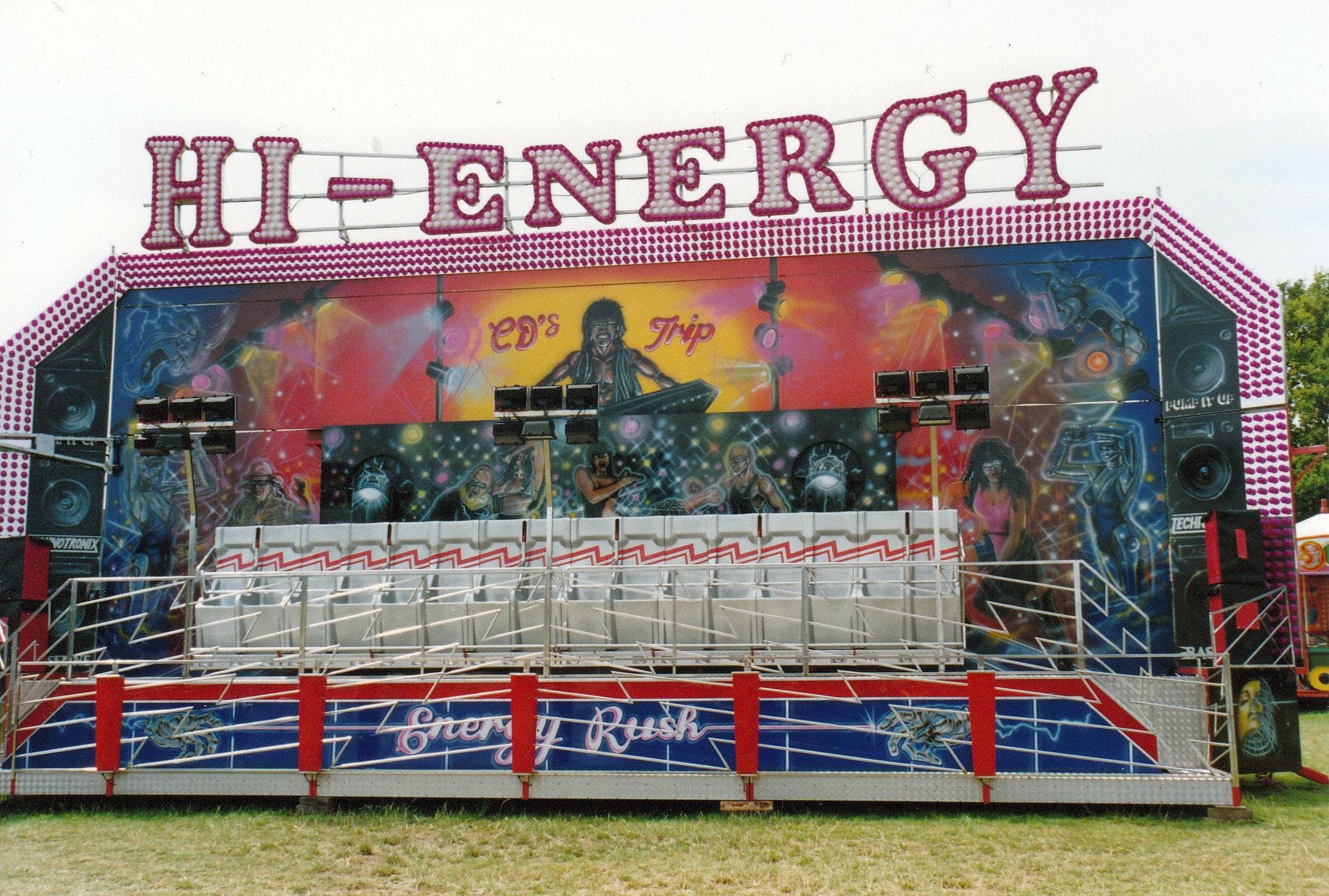
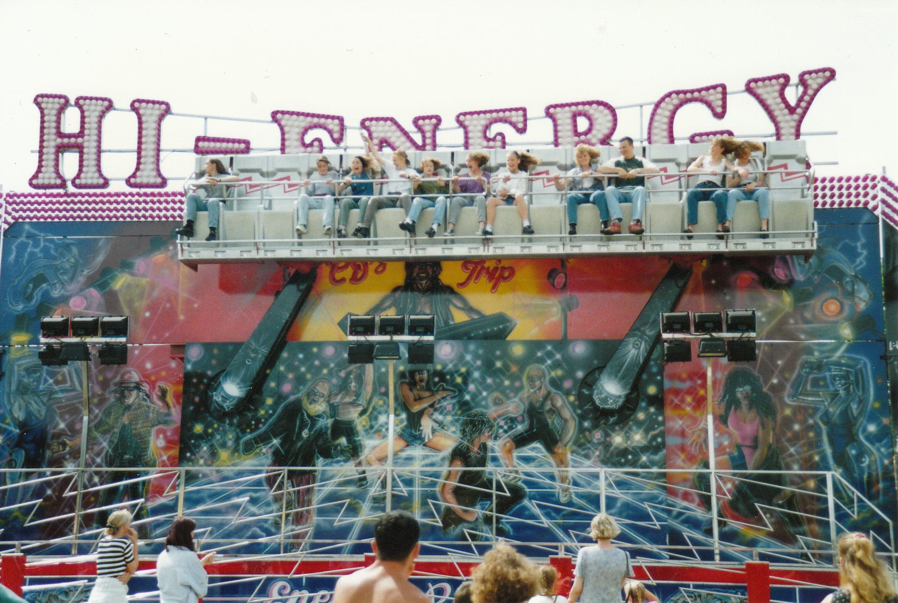
The ride arrived at the peak of the rave scene, opening at everything from large gatherings on the south coast to word-of-mouth events in remote fields in Lincolnshire. Chart crossover act the Prodigy released the single ‘No Good (Start the Dance)’ in May 1994, signalling a harder edge to their sound away from the ‘kiddie rave’ style they were famous for. It’s a great single, looping a cheesy pop sample with a scuzzy hook, and arriving just a few months after the Hi-Energy ride. A new era of tougher sounds and darker themes. Hi-Energy tries to capture this, with the retractable wings of the backflash replicating huge speaker stacks and stencilled phrases ‘PUMP IT UP’ and ‘TECHNOTRONEX’ prominent.
The final artwork borrows slightly from the disco-era with its hi-tech club stage scene, raising the question as to how a rave theme could be painted, without any standardised reference points at this moment in time. The main scene on the backflash is an odd one, with perhaps the lack of reference points being a limiting factor.
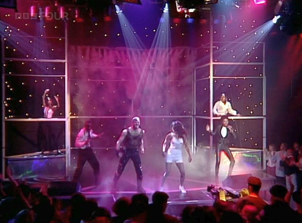
Early rave and dance acts, when featured on Top of the Pops, often didn’t have a way to present themselves, particularly when tracks consisted of a vocal that simply lifted a hook from somewhere else and looped it on endless repeat. It caused a dilemma to studio producers, who tended to just put the artists (and some associated dancers) onto a stage type area with raised sections and let them jump round while miming the lyrical samples. Check out the Top of the Pops broadcast of Cappella’s 1993 smash ‘U Got 2 Know’ to see how it perfectly matches the configuration on Hi-Energy. ‘U Got 2 Know’, an Italo-house stomper with its sampled riff from Siouxsie and the Banshees’ pop-punk classic ‘Happy House’ and distinctive range of synthesized sounds, was a big hit on the fairgrounds. You can see the pictorial similarity with Matt’s artwork.
In Spring 1994 Matt painted his second rave-themed Miami, a ride named Energizer. In between Hi-Energy and Energizer Matt had painted around 20 rides - his work rate was phenomenal. However, this was a steady continuation of beach and holiday scenes, action movie themes, and Hard Rock Cafe style Americana montages that had roots in Continental fairground artwork. Tina Turner cropped up on most of them, much to the disparagement of the artist. The older generation of showmen who commissioned the artworks were momentarily anachronistic in their musical tastes, but the younger generation soon started to dictate the visual culture.
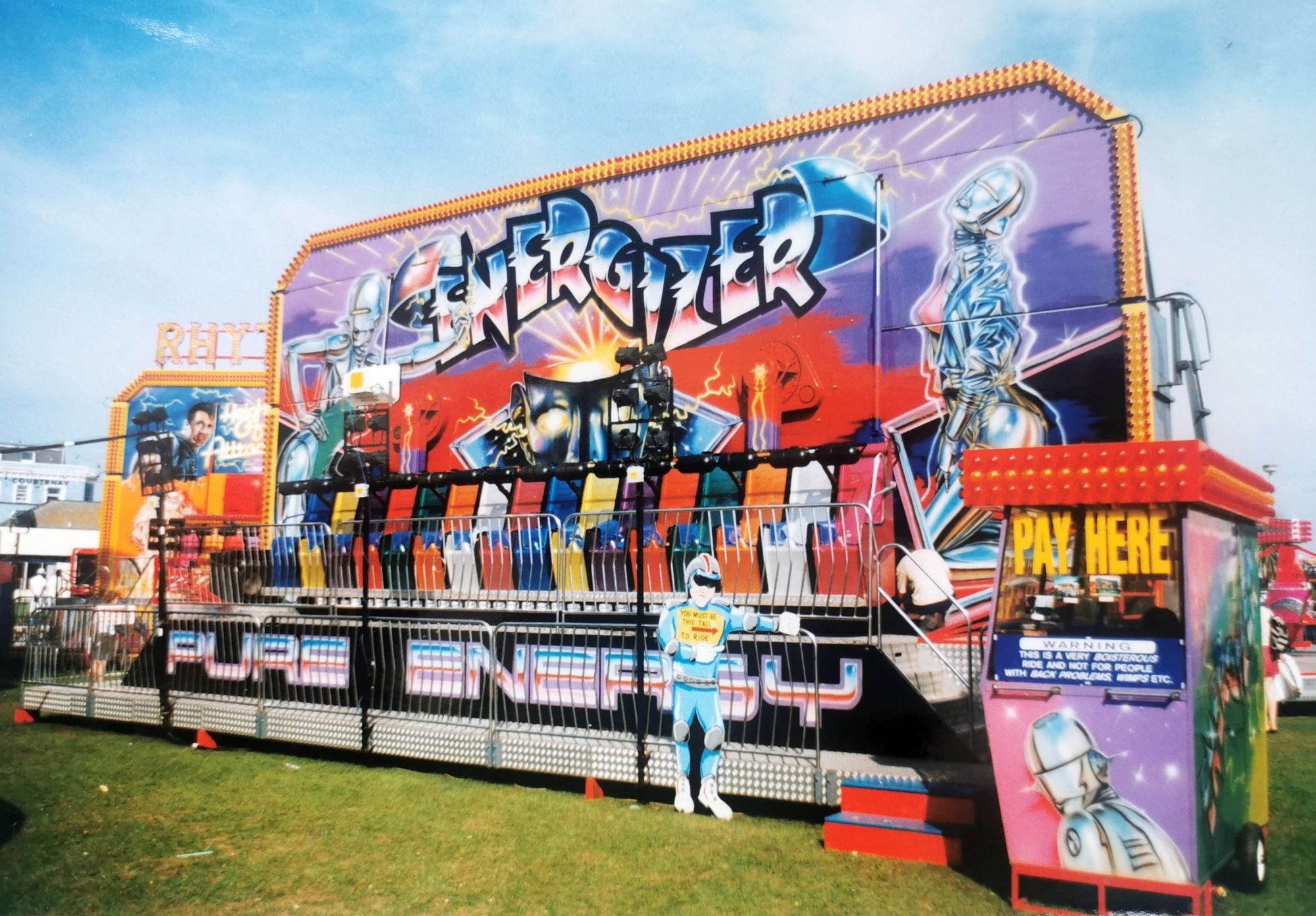
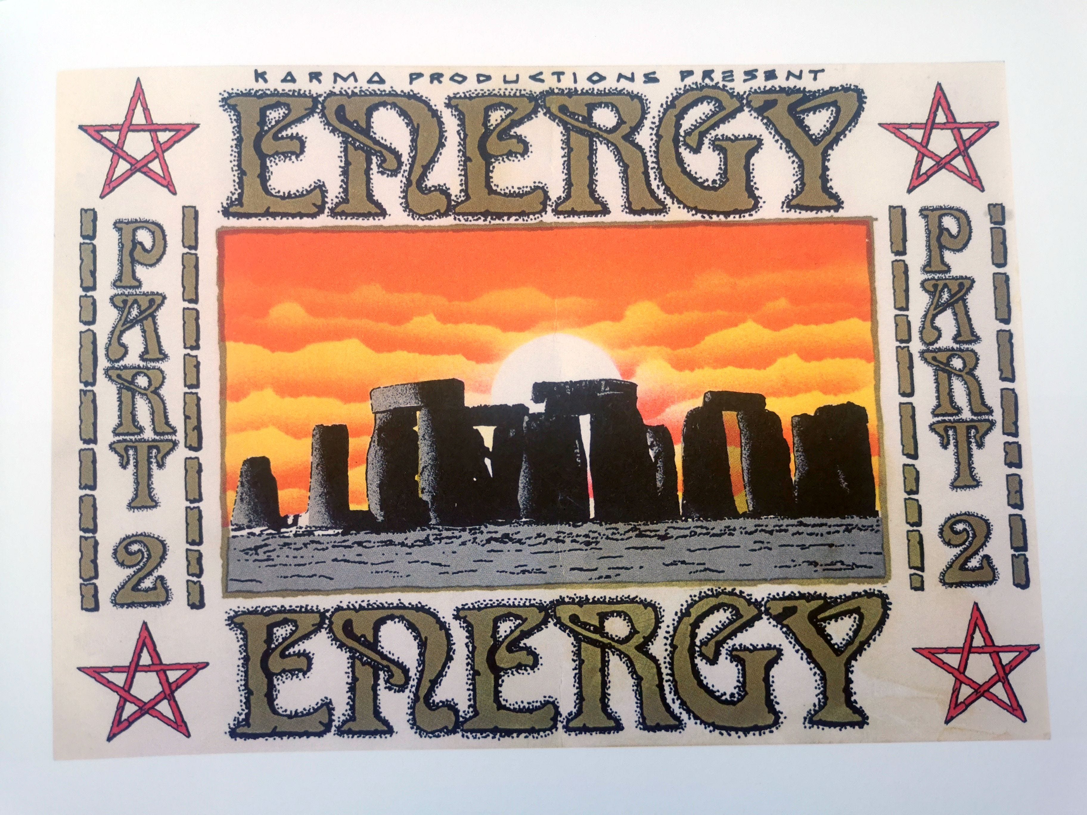
Energizer is a futuristic artwork in both theme and style - it looks to the future of fairground decoration and also depicts a science fiction future of liquid-metal female-robot-hybrids. Why is this a rave artwork? The actual choice of name is certainly key. Firstly, Energizer is typical of the nomenclature for raves in the early 1990s – names tended to portray processes of the mind and body going beyond normal constrictions and sensibilities and there were a number of large events that used the name Energizer. Secondly, Energizer was also an alias adopted by Leicester DJ and music producer Dave Charlesworth to release a series of hardcore breakbeat records in 1991 and 1992. Thirdly, rave iconography (like fairground art) also had a Pop Art sense of mischief, reclaiming everyday brands into a new purpose – so Energizer was the brand name of an American battery company! It also signifies a type of energy drink, with similar products used by ravers to stay awake into the early hours.
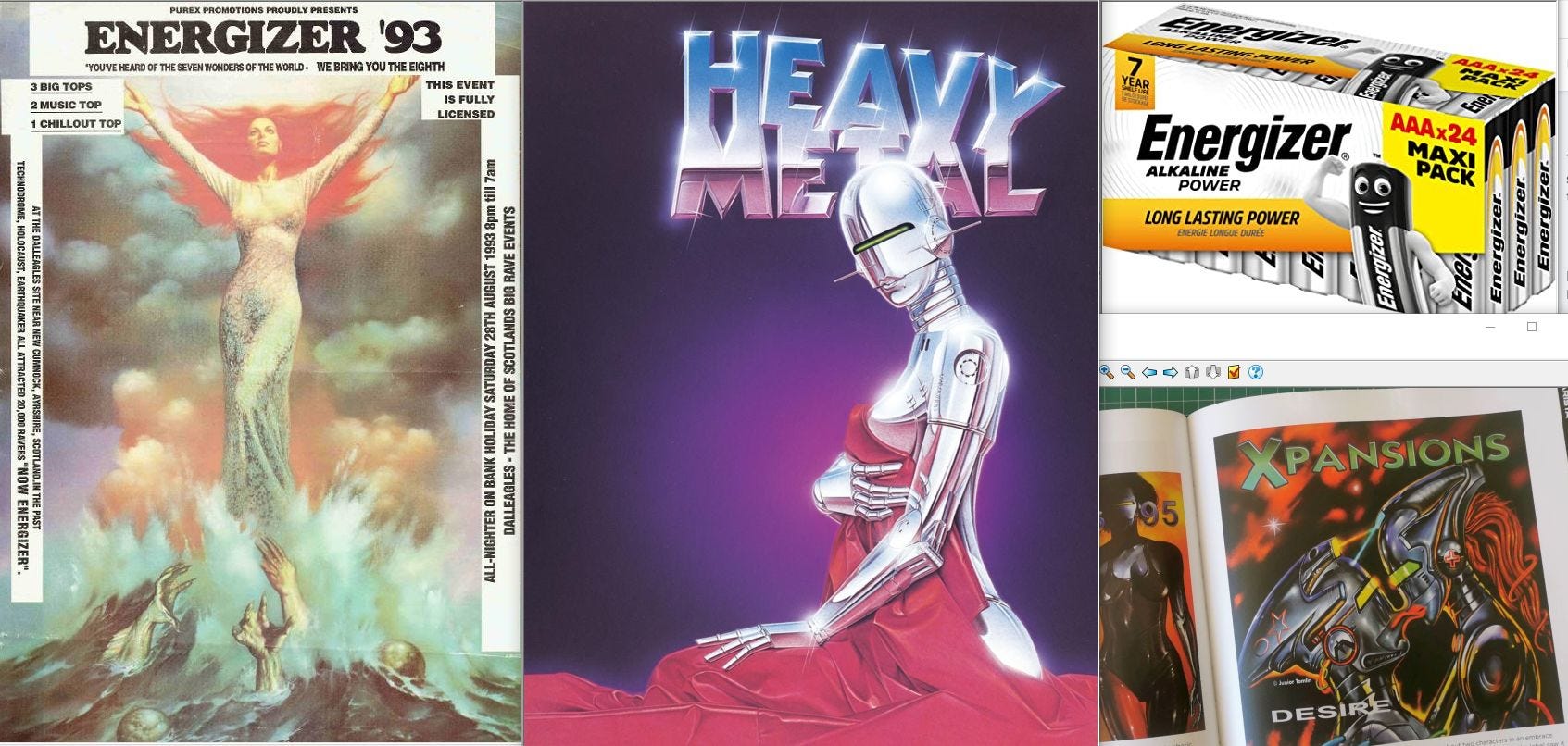
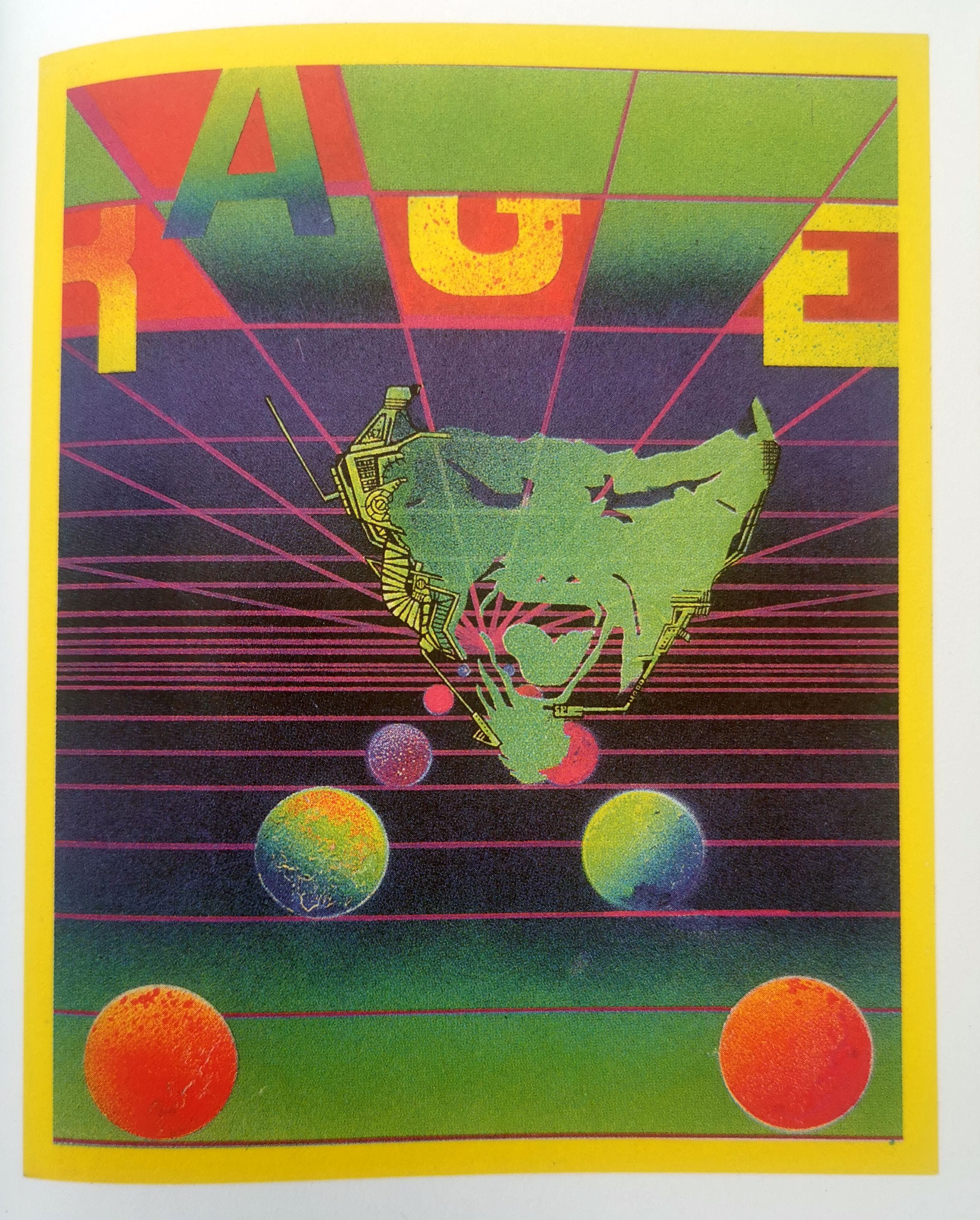
The artwork itself is also rooted in rave history, such that this imagery was a key part of rave flyers and posters during the early 1990s. These ephemeral objects, from new designers such as Junior Tomlin, were the lifeblood of the rave scene, allowing potential participants to find out what was happening and where it was to happen. All of this flow of information escaped the regular music press in the UK. You can see the crossover between Matt’s design for Energizer and the Helter Skelter brand rave poster from around the same time (I used this image in part 1) or the flyer for Rage (below).
On Energizer there is a central image of a metallic head and various metal frames that partially hold their objects. The main robot figures are both straight copies of ‘sexy robots’ designed by renowned Japanese illustrator Hajime Sorayama, whose work influenced the rave scene. The left robot provocatively holds her hand on her hip and leans into the artwork, the right robot kneels down and tilts back in a cybernetic rapture – Matt adds in a bit of real flesh to ramp up the controversy. In the centre a large silver robot head is split apart such that the top hemisphere has been raised and split again in what are called tetartospheres or quadrants. The interior of this head glimpses a bright glowing core which is the source of energy feeding the two robots – this visualisation of breaking open the mind is key on the Helter Skelter poster.
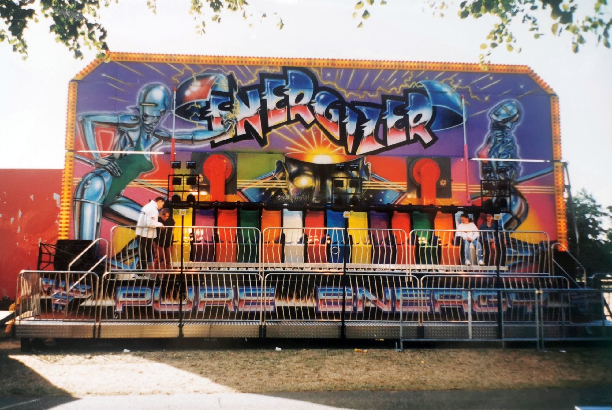
The name of the ride sits within this cranial explosion, Matt combining the heavy metal font developed by Sorayama and embellishing it with robot-themed curves and proboscis. A trio of lines, further rays of light or energy, emerge from the left and right ears of the central head, forming a pattern that bisects the backflash. The head looks towards us, the spectators, and we see that its eyes are glowing, firing energy out of the picture plane and in to us. Underneath the bench there are two hands pointing towards each other, copied from Michelangelo’s Hand of God artwork in the Sistine Chapel and reused on the opening titles for ITV’s The South Bank Show. The electrical current forms the word ‘mindblowing’, commentating on the split-apart robot head. The strapline across the bottom states ‘Pure Energy’, lettered in molten metal font, on a plain black background, with a line of flames. Energy from all sources - godly, chemical and cybernetic - flows through the design making it something of a classic moment in UK backflash art.
Phew. Let’s take a break. In part 3 I’ll look at the up-to-date work of the artist Paul Wright and also explore a couple of examples where we can (perhaps) draw down ideas from canonical art.