
Subculture Degree Zero
Sounds 29 November 1980

In the late 1970s and cusp of the 1980s the music newspapers such as NME and Sounds were a way in for a teenager looking to become part of a subculture such as punk rock. Particularly for someone living out in the provinces. Record shops and specialist clothing shops existed, but could feel off-putting to an exploring novice. John Peel’s late-night Radio One show proved invaluable. Gigs were a constant fixture, but often had an age barrier combined with what felt like at times the intimidating nature of an aggressively conspicuous and sometimes conspicuously aggressive scene such as punk. Music newspapers could be imbibed in a private, personal space, or discussed amongst close friends with shared intents, a laboratory of taste and image construction. Trialist tribalism in the school playground.
The obvious lines of connection were record reviews, interviews with bands, live gig reviews, and learning to trust certain journalists who you felt spoke for your tastes. That became increasingly difficult as music journalists adopted various postmodernist and post-structuralist poses, locked into a private battle that made little sense to readers such as me who were midway through a secondary school education that had an endpoint in either a factory or on supermarket checkout. More so, the music newspaper was also a space to facilitate the acquiring of a correct image or fashion linked to a subculture, afforded through photographs of bands, occasional photographs of fans, and advertisements for record releases based around visual material. This gave you a basic set of ground rules of how a punk (or post-punk, or punky-rockabilly, or rude boy) looked, or you could mimic (partially or wholly) a particular musician who stood out in their scene – though over-egging this copycat gesture often brought a certain amount of peer group opprobrium. The onset of glossy magazines that catered for punk and post-punk music and style, touched on by Smash Hits but pioneered by The Face and i-D, would not arrive until 1980.
This need for both learning how to look, and acquiring that look, was quickly exploited by a number of mail order advertisements in the back pages of music newspapers, set out with crude sketches or blotchy contrast photographs depicting people with the requisite look. Other advertisements portrayed grids of punk tee-shirts in a numbered system, where you simply picked a design and hoped it looked okay and didn’t disappear in the wash. The quality of all of these goods was questionable, and the manufacturers were not esteemed names like the King’s Road fixtures Seditionaries or Johnsons, even if their wares seemed to mimic these classic (but hard to acquire) designs.
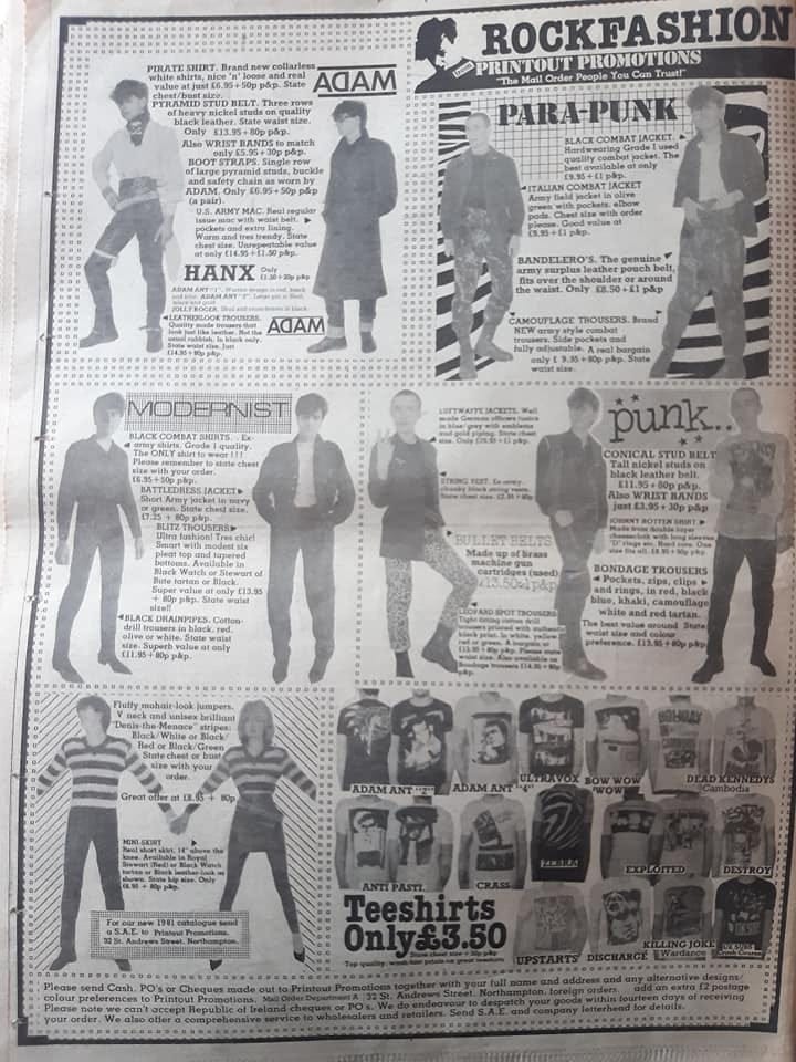
My own purchasing went as far as tee-shirts, and I recall sending off for a luminous UK Subs spray-paint stencil design, a plain dropped ‘C’ The Cure (repeated twice) design, and a Psychedelic Furs reprint of their first album sleeve. These were promptly posted to my suburban address, coming in a polythene shrink-wrapping with the shirt tightly folded into a ball. To be fair, I got good wear out of them. Some of these tee-shirts are evident in my parents’ holiday snaps, when I was in my early teens and tentatively trying to look punk against the twin current of a disapproving dad and having to sport a kitchen-as-salon haircut created by mum. The small advertisements offered punk clothing as either part of a smorgasbord of subcultural themes, a punk only arrangement, or occasionally a range of clothing dedicated to a particular band – such as a regular advertisement for “Clash Gear”. Punk goods included bondage designs based upon the Westwood and McLaren Seditionaries range, bandmaster trousers, adopted military jackets and trousers died black with added studs and zips, and drainpipe trousers in either tartan or fluorescent animal print.
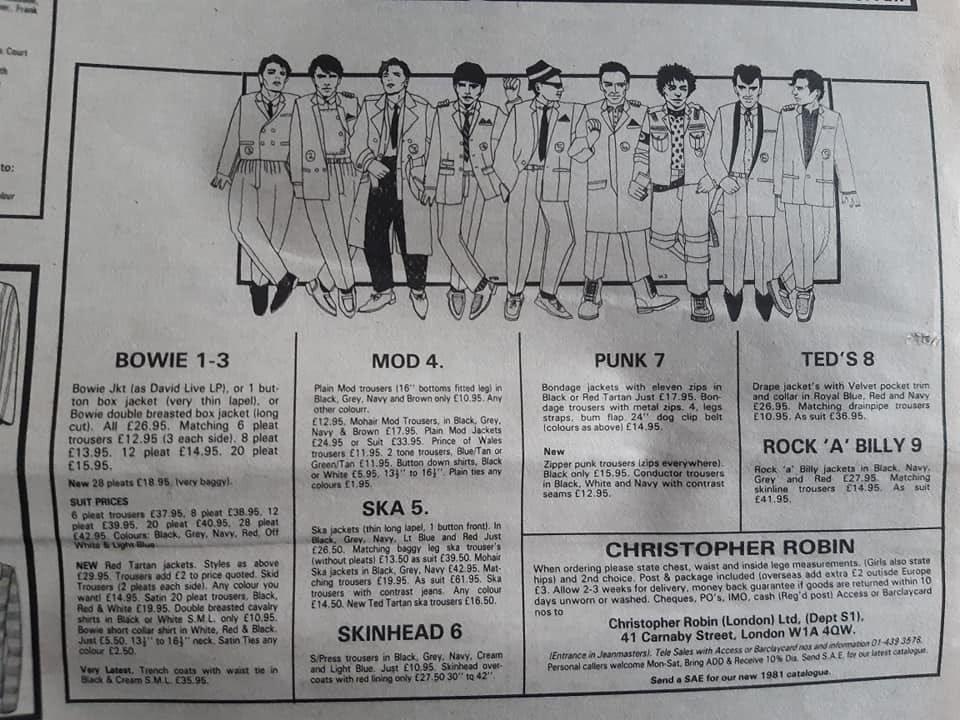
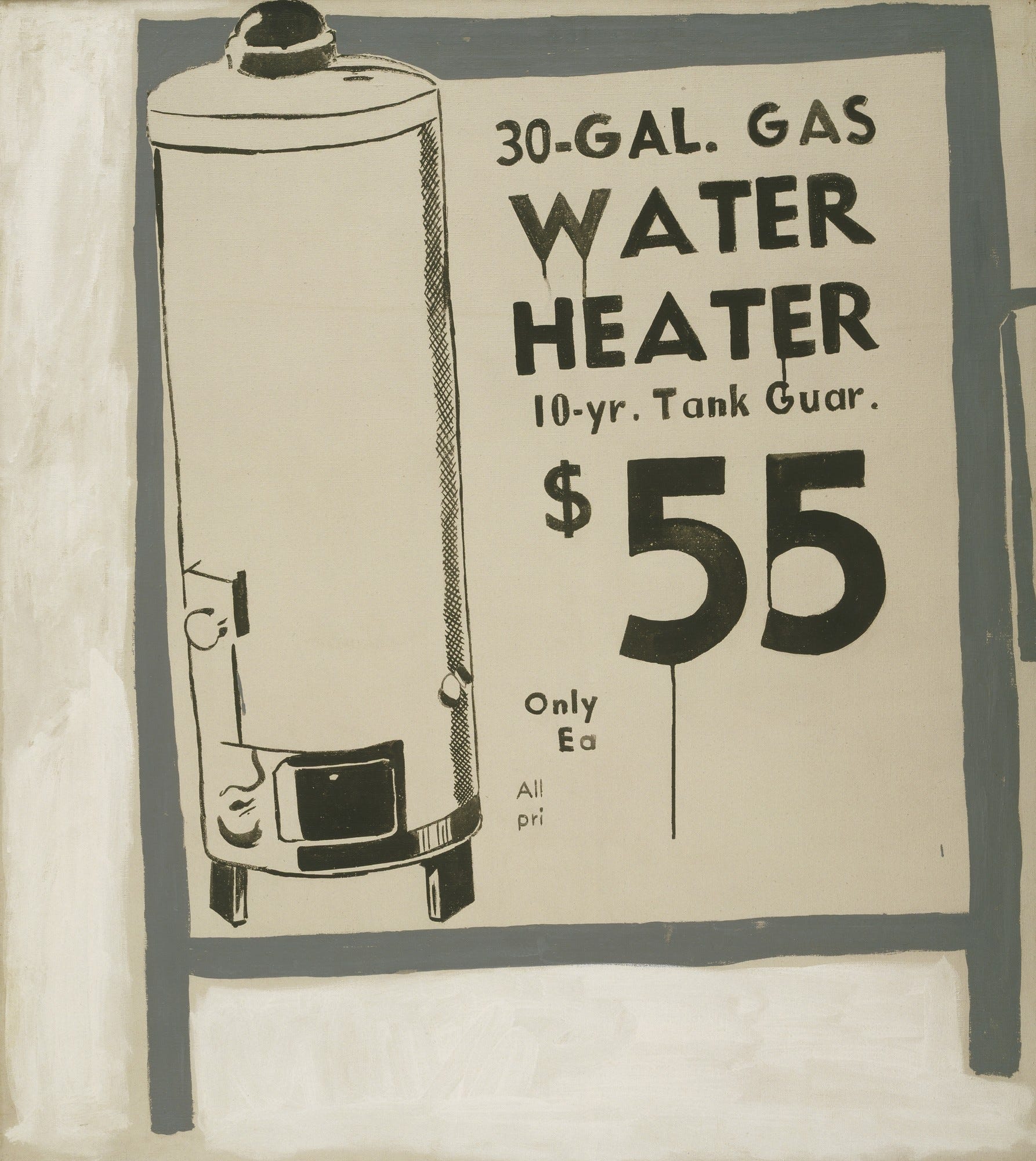
The advertisements for Christopher Robin of Carnaby Street were (to me) the most adventurous and encompassing, their chosen format being crude line drawings showing different suits in a kind of ‘rogues’ gallery’ of subcultural characters, with mischievous touches like the characters seeming to burst out of the constraining box. This gave the impression that the box defined the page area that the advertiser had paid for, and the characters were rebelling against being both penned in and being accountable in pounds and pence. This visual device of boxes within frames, and an optical confusion playfully interpreted as a resistance against constraint, has a striking similarity to Andy Warhol’s early work Water Heater (1961). Warhol produced a sequence of works that bridged between making artful advertisements to repurposing and modifying advertisements as art, a key part of his move to conquer the world of high art on his terms. These early works were slightly nervous, and had tentative dialogues with the main schools of American art at the time – abstract expressionism and a nascent pop or non-objective movement. Warhol produces a semi-erased advertisement for a water heater (with description and price alongside embellished with Pollock-esque drips) that is drawn onto what appears to be a crude A-frame advertising board, however the heater escapes the boundaries of the frame of the board whilst sitting within the (framed) space of the painting. The 3-d and 2-d are muddled up.
In Christopher Robin’s November 1980 advertisement, the queue of figures inside (and outside) the frame approach a subcultural critical mass. Nine characters lined up in a type of fantasy cockney knees-up configuration, a subcultural menagerie. Miss World contestants from another dimension, each figure sports a badge with their allocated number, just in case you get confused counting to nine or the subculture associated with the figure isn’t obvious. That said, customers are asked to always state a second choice, so maybe they anticipated a mod buying a rockabilly jacket if there was a run on their first choice.
In these posts/essays we are going to spend a considerable amount of time looking at photographs, drawings, advertisements and other visual manifestations. This process or technique of visual culture and critical art history is traditionally the domain of academia. In the case of critical art history it is universally applied to art from the ‘canon’, classic works that have merited academic attention and produced endless mileage in written analysis, criticism, and debate. This means I will take some diversions to look at classic works and set out how they are read and discussed, to see what we can learn and re-apply. Our visual trove is less so canonical and high status, and more pop culture or ‘non-art’. Never mind, there is a value in applying it here, reclaiming it of sorts and applying it to low culture to see what happens. It provides insights, and it also dusts off a little of the exclusivity of high-end theory, disarming its precociousness, loosening up so to speak. So, Warhol is a starting example, and he will crop up at other points in later posts. His work is slippery, mired in the popular culture of advertising, trashiness and celebrity, but also forever circulating with canonical currency. Art historians are attracted to Warhol as they get a chance to play at slumming it.
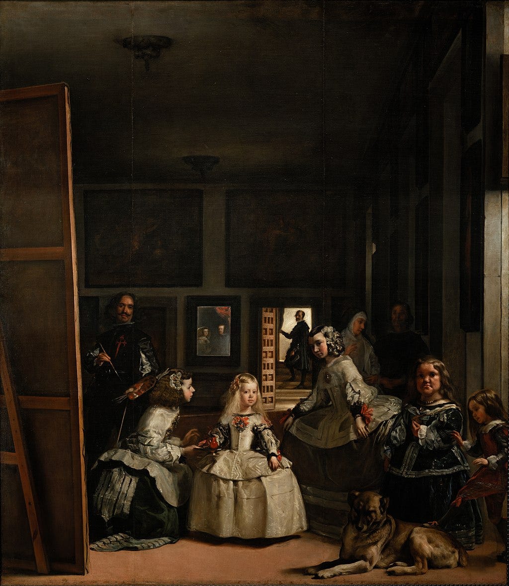
We can move now to a classic anchor in visual interpretation theory to help us with our Christopher Robin advertisement. French philosopher and renegade thinker Michel Foucault (who crops up in later essays) famously began his 1966 uber-work The Order of Things with a forensic visual analysis of the Diego Velázquez painting Las Meninas (The Ladies-in-waiting, 1656), setting out a register of stances and glances to open up a micro-physics of presence in the complex work. As well as offering up a rich tapestry of relationships within the figures of the artwork, the painting also has numerous lines of visual engagement between the figures in the scene and the onlooker. In Las Meninas this is complicated, with the scene depicting the action of preparing and painting a royal portrait with a small audience shown scattered around or in covert glimpses. We don’t properly see the important people having their portrait painted (we glimpse them in a mirror, or possibly we glimpse the portrait so far in a mirror), but Velázquez composes the painting so that we (the onlooker) also become the King and Queen – crazy stuff!
Las Meninas is clearly an important painting, and attracts the attention of philosophers, critics and art theorists alike. It’s a game, to try and outdo or destabilise a previous theory or interpretation in favour of a new theory or interpretation. In referring to Foucault’s critical inception into this painting, is not my intention to contribute to this game without an end (or point). Nor am I trying to be trite, clever or flashy. As I said, I want to disarm the precociousness, not the theory itself. Las Meninas depicts status and power, and depicts depiction so to speak – who has the power to see and who is relegated to see things in a certain way. It is a moment of both history and of historiography. Foucault argues that we have to capture these moments of certain ways of thinking and ordering, called an episteme, using terminology from both genealogy and archaeology. My passionate argument is that the record sleeves, pop features and clothing advertisements have an equivocal power of their time for a certain audience which included myself. I (we) combed such images for minor details and clues – we were beholden… subsumed. This Carnaby Street scene at the dawn of the 1980s is a sedimentary layer, and closer to the surface than seventeenth century aristocracy, but the speed of accretion is accelerating.
Therefore, the first step is to apply an importance to the Christopher Robin advertisement, and to imbue it with a bit of reality. To imagine these figures as real people, posing for an important moment. Then we can apply a bit of Foucault’s renegade rigour, as we have a rich array of stares and glares to unpack alongside the fine clothes. Starting on the immediate left of this motley crew we are presented with the three Bowie clones and their outfits – two based on suits and one sporting a trench coat as a “very latest” offer. For this advertisement, very much trailing edge, Bowie still has an importance. The relatively high count of his inclusion is nominal and cardinal – he both outnumbers the others and precedes them in order.
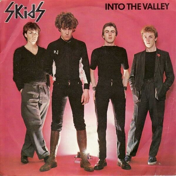
The trousers are demarcated by the number of pleats in the trousers (up to 28 as “very baggy”), with a note for new red tartan jackets and “Skid trousers”. These are presumably from the band fronted by Richard Jobson and not relating to an unfortunate stain? The Skids were at their commercial peak in 1979 with their single ‘Into the Valley’ becoming an instant anthem. The band are pictured on the sleeve in something of line-up similar to our advert here – there are some great new wave suits on display and the heavily pleated trousers (modelled to fine effect by the late Stuart Adamson) that would leak over into the new romantic scene. The third Bowie figure in the raincoat is also distinguished by being the only one wearing dark trousers – he possibly misread the brief before turning up to model for the drawing.
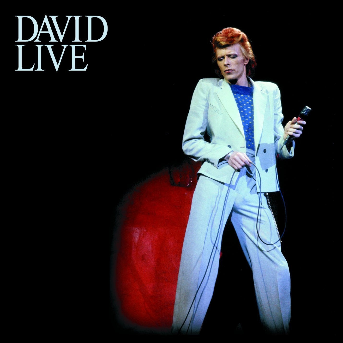
The jackets are split between a one-button boxy cut and a double-breasted design, though the descriptions of the lengths do not match the pictures. There is note referring to the David Live LP, which was released in 1974 as Bowie famously killed off his Ziggy persona and headed to America to make soul and funk inflected music. In doing so he cultivated the phenomenal wedge haircut that would define his look in the 1976 film The Man Who Fell to Earth. The official cover of this album shows an orange-haired Bowie picked out in the spotlight twisting into a contrapposto position, wearing an immaculate Tommy Roberts pale blue suit with a boxy double breast fastening. Very much a soul-boy look. Always posing, you can imagine Bowie being born in a contrapposto position
Let’s move along the line. The three Bowie boys are followed by a phylogenetic subcultural trio akin to stratified layers of fossilised styling: a mod, a ska fan and a skinhead figure. It is approximately chronological but these subcultures loop back with ska informing skinhead informing ska once again to give rise to second (or third) incarnation of skinhead. The clothing description for the mod figure bears a simple wording of “mod trousers” and “plain mod jackets”, requiring some subcultural faith on behalf of the buyer, and it feels a bit like a half-hearted effort. The ska jacket is defined as having thin long lapels and a single button, the trousers come in multiple colours including “Ted Tartan”, however the pork-pie hat and tassel loafers are not offered for purchase. The model must have brought them in and insisted on wearing them. The skinhead sports what we would call a Crombie, complete with ticket in the breast pocket.
Next up is a punk wearing the bondage garments initially designed by Westwood and McLaren for Seditionaries but quickly reproduced by BOY and then countless other market traders as they became a first-generation punk imprimatur. He tops this off with a low-slung bullet belt, studded dog collar and leopard print tee-shirt. The final two figures are a traditional Ted in a royal blue drape jacket with velvet pocket trim and a rockabilly who looks to be struggling to assert an identity.
The date of November 1980 places it just prior to the mainstream emergence of new romantic, whose styles would most likely supplant the Bowie figures through 1981. I’m sure these three would be the first to jump ship to this new subcultural craze and be back in the frame for a future call-up sporting an array of lop-sided fringes and frilled shirts. Christopher Robin and the similar companies selling out of box numbers or back-of-the-shop workspaces were not cutting edge, more trailing edge, and the figures called upon to model the clothes in the drawings are tired and typical, more stereotype than archetype. Extras not actors. The intention is to lure in punks, mods and skins from the provinces. People like me. The trailing edge.
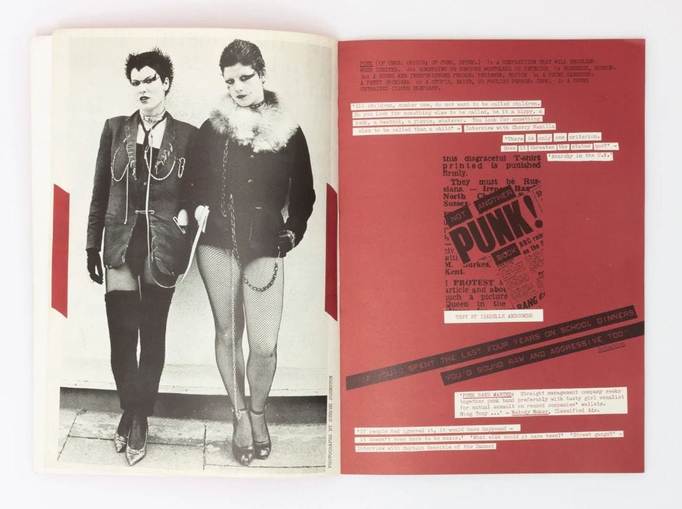
As well as the lined box bordering the advertisement, the figures are also superimposed in front of a dropped box outline, akin to the white wall of the ‘straight up’ style pioneered by i-D magazine in summer 1980 and prefaced in the one-off publication Not Another Punk! Book by Isabelle Anscombe (and Terry Jones), published with a sense of urgency in 1978. The nine models are in a classic criminal line-up and are all facing the viewer apart from the ska figure who looks to his left and the rockabilly figure at the right-hand end who looks to his right. Maybe they are both leaning forward slightly and checking each other out or, if a snide remark has been passed down the row like a Chinese whisper, staring each other down. It is hard to tell with the dark shades worn by the ska figure.
Of the seven forward-facing figures, five of them give the impression of looking back at the viewer and two look elsewhere. The third Bowie figure (in the raincoat and contrary dark trousers) seems to be in some kind of style rapture, a pose that the highly-regarded art historian Michael Fried in his discussion on anti-theatricality would consider as absorption. The other figure who does not look back at the viewer is the skinhead, who instead looks decidedly shifty and refuses to engage eye contact – a pose that is not considered in Fried’s canonical art schema. Society documenter Peter York, in his 1980 book Style Wars, captures and describes this skinhead countenance perfectly: “these little side-to-side head movements and the eye flickering, looking like British soldiers on the Derry streets”.
Four of the figures have relaxed crossed legs, the skinhead and punk have a complex foot swing and retraction arrangement, whilst the other three have a planimetric stance (side-by-side, splayed flat and facing forward – as identified by art historian Heinrich Wölfflin). At first glance, the punk figure looks as if he is being propped up by the skinhead and Ted figures either side, maybe groggy after a bout of substance abuse or a session in the pub. On closer examination he looks slightly discombobulated and his face is contorted as if he’s come off worse in a fight, indicating a bit of potential friction before all the figures lined up to showcase a staged harmony. His right leg is bent back at the knee hiding his brothel-creeper shoe but showing his hobble-straps on the bondage suit. Again, looking closely, the skinhead to his right has swung his left boot out, making it feasible that the punk has just been the recipient of a hefty kick to the shin. Ouch. Poor old punk, everyone out to give them a good hiding. The artist is struggling to capture the required bonhomie that Christopher Robin wants to portray. It is breaking down before our eyes.
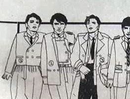
Aside from this potential infraction there appears to be contiguous subcultural coexistence with two of the Bowie figures in a minor embrace and leaning in to each other. The other Bowie figure with the blissed-out expression and out-of-synch dark trousers places his hand on the shoulder of the mod. A gesture of friendship and subcultural ecumenism, as nuanced proximal codes are cast to one side. In turn, the mod props his arm on the back of the ska figure who surprisingly seems unimpressed, causing a slight rupture in the harmonious flow. Something may have gone off in the past between these two – mods can be precious and precocious about their rights to an image.
The ska figure has his right hand in his trouser pocket and puts his arm around the skinhead to resume continuity, or maybe to try and calm down any animosity between the skinhead and the punk. Meanwhile, the tired looking Ted hooks his finger into his belt-loop to show the cut of his jacket for the purpose of the artist creating the image for Christopher Robin, but he appears out of time and place, knowing his fashion days are numbered, adumbrating his subcultural obsolescence. New scenes and looks are around the corner, and he won’t get the call for the next advertisement. Soon he will be little more than a caricature in television programmes like Hi-de-Hi with their Ted Bovis entertainer character. A subcultural atavism. He places his hand on the nearside shoulder of the rockabilly – more as a prop then a gesture of affection, possibly even thinking “it’s you after me in the subcultural redundancy queue”. Welcome to the 1980s.