


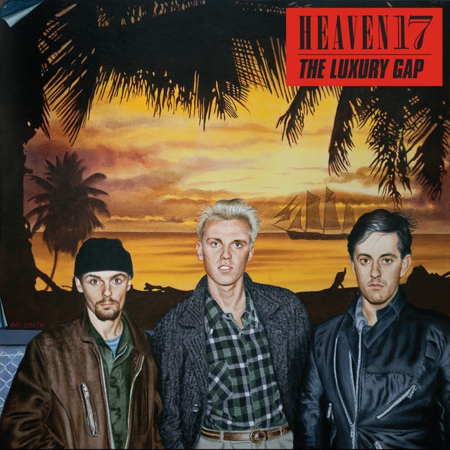
Why the Long Face?
Heaven 17, anti-imagery, and The Luxury Gap (part 1 - formation and 1981)

// note – this post started out as short enquiry into Heaven 17 and their second album The Luxury Gap released in early 1983 – the idea: explore the mechanisms of their proposed ‘anti-image’ within the wider purview of early 80s new pop and image culture – it grew – and grew – I turned to look at Heaven 17’s arrival, with a series of memorable records, and their cultivation of a conceptual ‘yuppie’ look – the more I delved, the more I realised we have broadly (and incorrectly) compartmentalised the visual and semantic understanding and labelling of the 80s – so, in short, it’s a long essay which I have broken up into 5 (maybe 6) parts which will take up the business of SUB>SUMED for the next month or so //
Heaven 17, emerging as one half of the sudden rupture within the Human League at the tail end of 1980, were a typical Sheffield band that blended conceptualist pranking, electronic music and a simmering sense of (anti) fashion and attention to visual detail. As seemed to be briefly de rigueur in the post-punk early 1980s, their name was coined from the Nadsat wordscape of Anthony Burgess’ iconic novel A Clockwork Orange, with Heaven 17 being a fictional band riding high in the Top Ten of a dystopian future. The fireside fable tells us the story of Phil Oakey retaining the original band name, retooling with a pair of singing and dancing teenage girls, and working with Martin Rushent (plus the crucial additions of Sheffield musician Ian Burden and later ex-Rezillo Jo Callis), to gain astronomical success – leaving founder League members Martyn Ware and Ian Craig Marsh severed, bewildered and beleaguered. That’s a rough approximation. There are important nuances depending on which version of the story you are reading (“night of the long knives” etc), normally a product of either side of the split. It’s a pretty standard (meta)narrative of pop music and acrimonious split – the story of the story etc.
Even though I have started telling the well-trodden story of Heaven 17 and the 1980s chapter of Sheffield’s electronic pop dominance, this is not my main aim. You don’t need to hear this again, nor see an overwrought effort to get at ‘the truth’. For the purpose of this essay I want to look at visuals and image projection in the hectic period of the early 80s, and probe the numerous conceptualist wrangles that Heaven 17 constructed and acted out as they wrestled to nurture and promote a critical-ironic stance. One of my interests in this wider collection of blog posts and essays is to plot, demystify and contextualise the image culture of 80s new pop alongside the concomitant diversification of subcultures. Heaven 17 contoured the limit points and tested their structural durabilities, and so their narrative visual arc is of great interest.
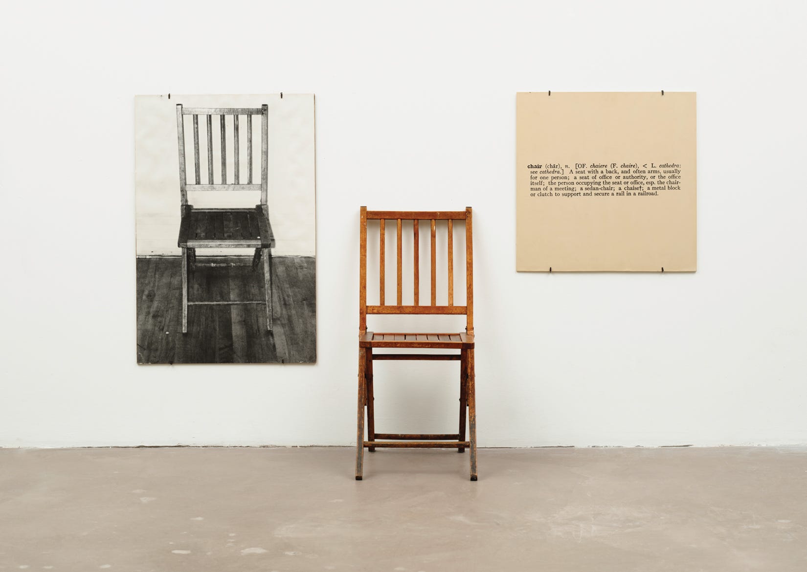
The root definition of conceptual simply means relating to mental concepts or ideas rather than ‘real’ things. The term gained new traction with a 60s and 70s turn to conceptualism in the art canon. This ‘concept of conceptualism’ applies to a batch of my forthcoming essays on post-2000 fashion design whereby avant-garde designers tried to tether high-end art theory with tailoring and/or fashion circulation. Conceptual art was initially the replacing of a manifested output with an idea that may (or may not) in turn produce a physical manifestation, or change in status, or series of events. Commonly seen at the outset of conceptualism was an artist simply printing a set of instructions. However, there was a wider understanding of conceptualism than simply replacing the doing or making of something with the inscription and dissemination of the idea to do or make. It created an overarching thought about what art is and what art could be – a process of destabilisation that pokes at hallowed concepts such as authenticity, aura, creative genius, and the imperative to link the tangible with the marketable (a piece to exhibit and sell). The classic example is Joseph Kosuth’s work One and Three Chairs (1965) which, in a similar way to the old semiologist visual gag with a road sign declaring “sign ahead”, conceptualised the art method and conceptualism itself. It exposed process… which is where Heaven 17’s conceptualism came in.
Throughout the extensive contemporaneous literature on Heaven 17 we see the term conceptual bandied around, to be claimed and denied at various points. Music journalists such as Paul Morley who were keen to extol an awareness of artistic and literary theories would happily pin the term on his interview subjects, and the band would push back as if refusing to be intellectually pigeonholed. In other environments, such as in a more accessible pop magazine like Smash Hits, the band would play up their conceptual angle.
However, Heaven 17 applied conceptualism to their own looks and images with a dual purpose. Firstly, they wanted to critique the music business in a deconstructivist manner – they openly and brazenly styled themselves (appearance and mannerisms) as a nominally embedded cog in the machine. Secondly, by presenting themselves with a series of prescriptive looks they simultaneously deconstructed the image process. Or at least attempted to. The band were good looking, stylish and well-versed in the ‘game’. They were also highly motivated, not least to outflank the huge success enjoyed by The Human League mark II. This meant that they were a supremely ‘natural fit’ to the pop-as-image system, and their attempts to expose and distort (in a loose Situationist manner) was always a tenuous affair. For a plethora of reasons, they wanted to ‘make it’…
And so, for better or worse, I am going to perform what we might call a ‘style audit’ of the band. I appreciate that all three members of Heaven 17 were politically motivated and activist, so I shudder a little when I propose looking at them solely through the lens of style culture. I will include a number of political reference points, but for those searching for a more deeply rooted political reading of the band it is worth seeking out the original interviews in the music press (both the ‘inkies’ and ‘glossies’), Simon Reynolds’ chapter in his Rip It Up and Start Again, Martyn Ware’s recent autobiography, and John Gill’s sleeve notes to the 2006 reissues of the first three albums. There’s also a typically strong essay on the Electronic Sound website.
Somewhat against the grain, my principal reference point (and titling of the essay) is the arrival of the second Heaven 17 album The Luxury Gap in spring 1983. My rationale is that this album is a pivot point in many ways, not least because it coincided with finally giving the band (and the Virgin label) their much-desired success in the singles market with the cut ‘Temptation’. However, it was prefaced with and created around a further conceptual shift in image projection (even image annihilation) that effectively referenced what had been and determined what was to come.
The band had spent 1981 and 1982 moving from a fringe quasi-art experiment to searching for a hit. A combined output of seven singles had failed to dent the all-important Top 40 allowing access into the nation’s living rooms through Top of the Pops. The 1981 single ‘Play to Win’ had grazed the edge of the charts giving the band their only appearance on the programme in these initial years, though the band were included in the inaugural broadcast of Channel 4’s The Tube (5 November 1982) and the arty BBC2 programme Riverside at the end of the same month. It was happening, almost. But The Luxury Gap was a key strategic moment.
As noted in the preface, this is another long essay, so I am going to split it into logical chunks. This first part covers the inaugural year of Heaven 17 up to the album Penthouse and Pavement (and the single with the same title). The second part looks at the album, coming with great critical fanfare at the end of 1981. It arrived with a highly stylistic and conceptual presentation, and this second part will look at the concept of the yuppie which is post-hoc applied to Heaven 17 (or at least their mimical intention). In addition, 1981 was a year (in its second half) dominated by The Human League who would claim the coveted Christmas number one spot with ‘Don’t You Want Me’. The third part covers the year 1982, the period when BEF focussed on Music of Quality and Distinction Vol. 1 and Heaven 17 released the record that should have been a hit – ‘Let Me Go’. The fourth part focusses on the artwork and anti-image strategy around The Luxury Gap, released in the spring of 1983. The final part of the essay reflects on what happened next in terms of this anti-image strategy coming head-on with the wider success of the single ‘Temptation’. This leads on to a few reflective remarks around the broader concept of 80s pop and visual culture.
Surrounded by old imagery – post-split early 1981
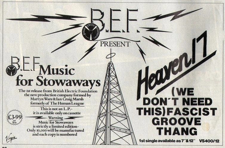
Following the manipulated schism within The Human League, founder members Martyn Ware and Ian Craig Marsh retooled to start a new musical and artistic journey with the establishing of the British Electric Foundation (BEF). At the time, this was conveyed as a kind of quasi-corporate umbrella for wider projects commencing in March 1981 with the cassette-only release Music for Stowaways (later re-jigged as the album Music for Listening To) and an offshoot/retractable project Heaven 17 who released the single ‘We Don’t Need This Fascist Groove Thang’. The single was a reworking of the instrumental track ‘Groove Thang’ given a vocal by new recruit Glenn Gregory (an original Sheffield extrovert who had been in and around the proto versions of The Human League as a potential frontman pre-Oakey).
A quick aside on the cassette. This has recently gained more critical acclaim, and it was interestingly described by go-to post-punk guru Simon Reynolds as an “electronic remake” of the Fire Engines album Lubricate Your Living Room. I have to bow down to Reynolds’ astute insight here. He grounds this comparison on Bob Last who managed both bands and was always adding playful rebus elements to design and production – Lubricate is described as an album of “music to go out to”, and I can confirm that this would be an album I always played when getting ready to go into town, with its low-fi guitar sound and swirling, pounding drums.
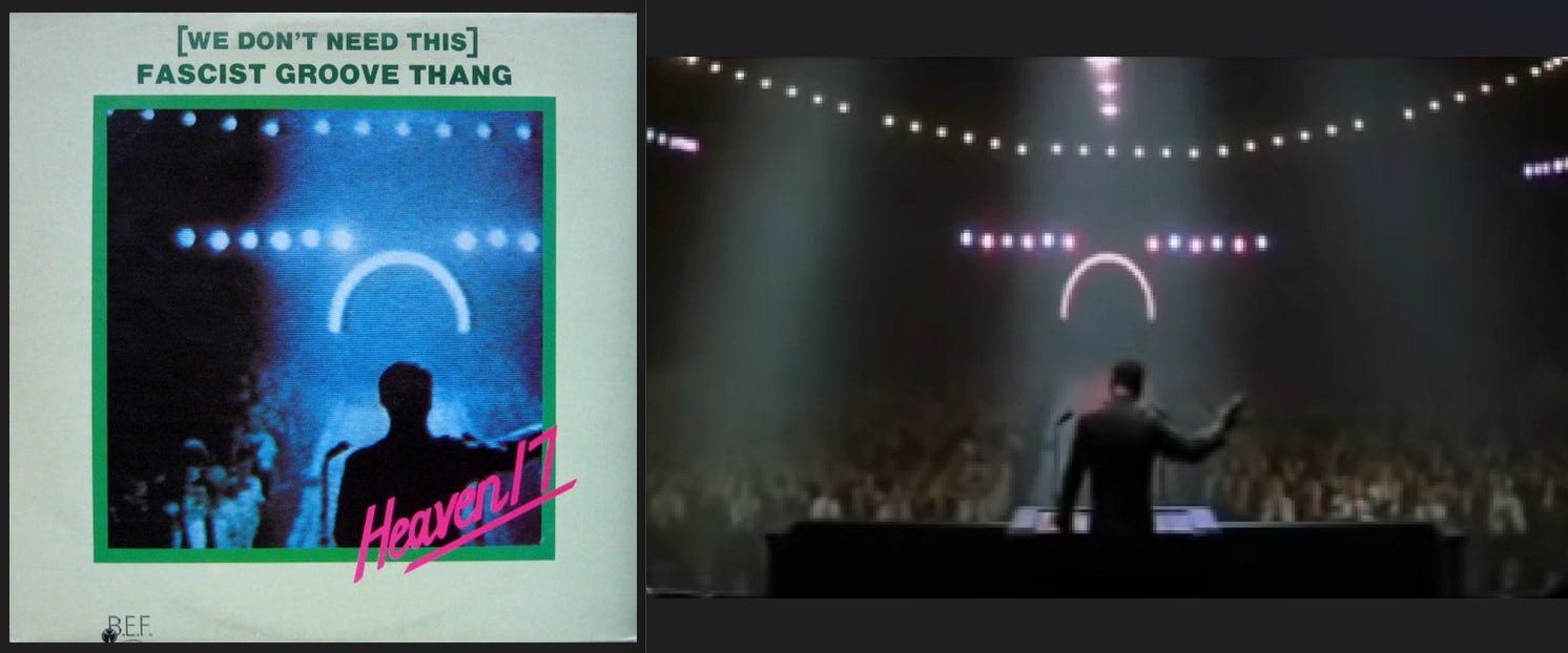
Heaven 17’s ‘Groove Thang’ hit the shops in March 1981, twinned with the shuddering instrumental ‘Decline of the West’. I recall it having a prominent display rack position in HMV Derby, on St. Peters Street, coaxing me to buy a copy with its mint-green sleeve. I never bought the Stowaways cassette album, but this 12” was a deeply memorable purchase. I didn’t’ have many 12” records, apart from Boney M’s ‘Painter Man’ which I bought because it came in a semi-translucent red vinyl and pop-punk had nurtured a kind of addiction to coloured vinyl. Boney M didn’t last long in my collection, but 43+ years later I still have ‘Groove Thang’. It’s only recently that I have had the sleeve decoded (thanks Simon Dell), with a not-so-discrete Hitler image taken from 1969 film Battle of Britain. It is such a clever screen grab as the arc of light suggests a modern 80s nightclub such as New York’s Danceteria. The sleeve and the audaciously direct title of the track drew me in. The reverse artwork - which also doesn’t include a photograph of the band at this point in time - is more typical with the Suprematist craze of a slight diagonal tilt and demarcating cross that creates four uneven boxes for lyrics and production details. The packaging is credited to “BEF in association with Bob Last”.
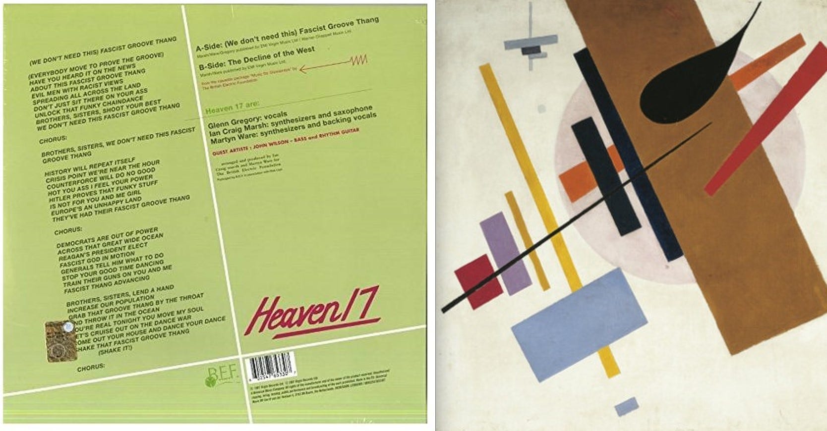
The record (and its b-side) is a funky-synth masterclass, aided in no small part by the crucial inclusion of multi-talented but then-unknown John Wilson. It also had an obvious political punch that expounded the not-to-be-silenced socialist sentiments of the band members. Arch, funky, controversial, and confrontational - it was and remains an incredible track, thundering in with such a frantic tempo of drum patterns that it is akin to facing an oncoming train in a tunnel. It garnered good music press reviews and looked set to make the Top 40 before it was unsurprisingly banned from airplay which presumably curtailed a further assault on the charts. Had it succeeded, it would have put Marsh and Ware in pole position for the post-Human League fallout, with Oakey’s revamped Human League foundering in the lower reaches with ‘Boys and Girls’ after its rush-release the previous month. Sheffield’s synth-pop history is criss-crossed with these counterfactual what-ifs.
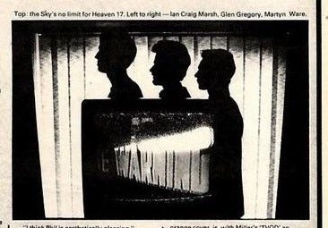
How could I find out further information, and (for me) more importantly – what did the new band look like? The earliest national music press feature is by the twin NME big guns of journalist Paul Morley and photographer Anton Corbijn, coinciding with the single. It’s in the issue dated 14 March 1981, with a colour cover featuring perennial favourite John Lydon ensconced in a roll of wallpaper. It is a frustrating read, as Morley prefaces the article by vacillating between his usual self-aggrandising word games and poking the wound of the still-raw split. We get a little of strategizing by the trio regarding BEF, but as with most things NME, it is a supporting feature to the Paul Morley show. Strangely, Corbijn’s photospread harks back to typical early Human League imagery, utilising foregrounded TV screens showing missile sequences and backgrounded silhouettes of the trio. It’s that dystopian edge of the future feel that The Human League mastered so well. But, for the time being, it is old imagery.
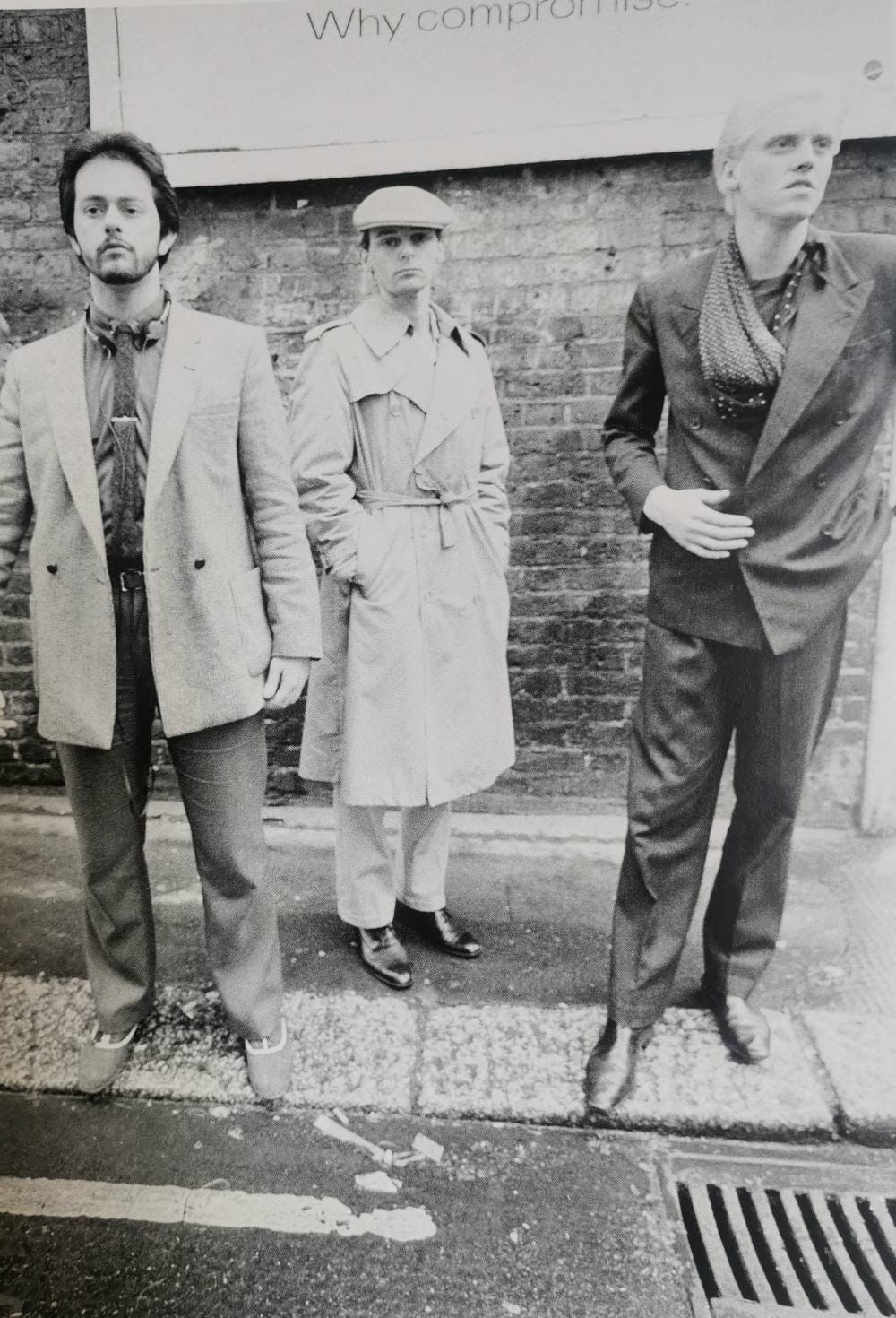
A month later there is a feature in Sounds, spread over two pages with photographs by the acclaimed documenter of punk and post-punk, Harry Papadopoulos. The article includes three photographs, with the main image a head-and-shoulders shot of the trio behind a metal mesh – it is bleached with light, as if capturing a nuclear flash (still very Human League). A second image has the trio in full portrait but obscured by a door and deliberately out of focus. A third image finally shows the band as popstars-to-be on parade; Ware still has the bearded and blazer look, Marsh now sports a flat cap and tightly sealed trenchcoat, and Gregory with his bleached blond hair can almost pass for a new romantic trendseeker with a double-breasted suit and billowing scarf. In Papadopoulos’ book What Presence! (2013) we have a single image from this photoshoot, and one that is not used in the article – it shows the band perched on a pavement edge, all looking slightly askance, with an adjunctive billboard inclusion. In this photograph we see a glimpse of Ware’s stowaway portable cassette. It’s not quite a strategic and aligned look at this point.
Chris Burkham’s article is a more balanced piece – he gives the band room to expand and they come across strongly. There is a résumé of the break-up minus the bitching, and a grounded explanation of BEF’s approach and the ‘Groove Thang’ single. The organisational approach (with Bob Last) is given slightly more flesh, though they are quick to question the efficacy of PiL’s attempt to present a similar approach. Musically there are mentions of potential linkups with fellow Sheffielders Cabaret Voltaire and Clock DVA, and a distrust of the disclosing of too much idea-wise to the music press in regard to a fear of being ripped off. An interesting snippet is a refusal of the tag ‘futurist’ which was gaining credence at the start of 1981; this had been applied to, and rejected by, the original Human League quartet who felt that such labels allowed less creative bands to jump onto a ready-made scene. The feature closes off with an informed discussion around the politics of nuclear manoeuvring within the cloak of cold war paranoia. These themes would contour Heaven 17’s debut album at the end of the year.
Shortly after the Sounds feature the band followed up the stymied ‘Groove Thang’ with ‘I’m Your Money’ in May. Annoyingly, this record also failed to chart without even the handicap of attracting a boycott. It’s an interesting track that is easily overlooked by its superficial similarities to Kraftwerk – clonking computer process sounds and an ironic context of machines standing in for human emotion and action. It is certainly more energetic than a standard Kraftwerk track, keeping up a frenetic disco pace that was introduced in ‘Groove Thang’. It has stood the test of time, and is now revered as part of the canon of early British synth-pop.
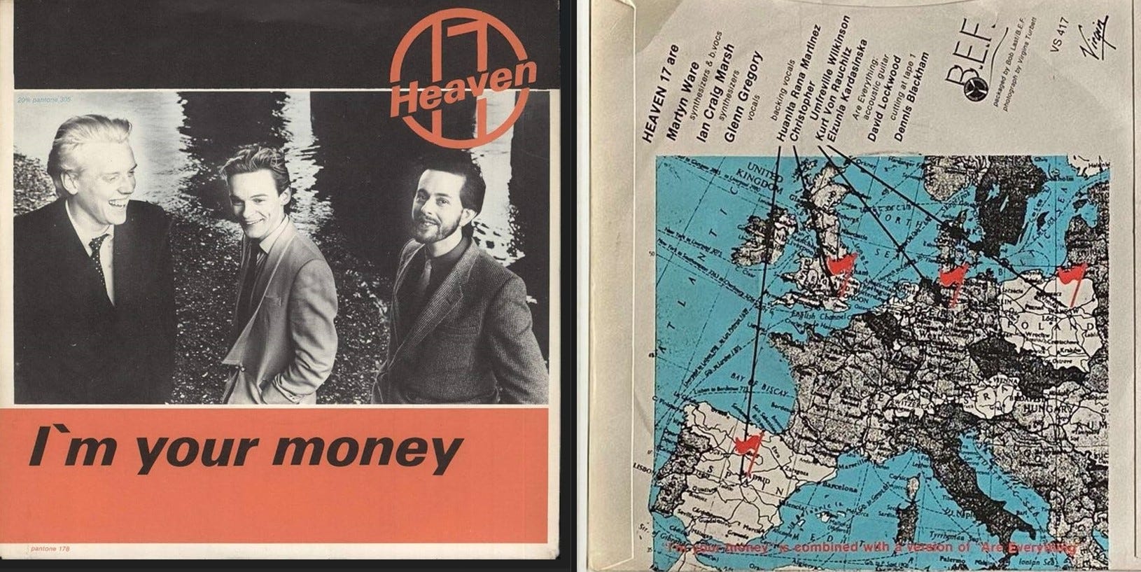
The sleeve design was relatively unadventurous, with the trio depicted from a raised position alongside the Thames (under the Waterloo bridge) sporting smart suits and glib smiles. The sleeve production has heavyweight design pedigree with it being a Virginia Turbett photograph and a Bob Last concept (with a reverse image of a Dad’s Army style European map with flags and pointers), but it doesn’t really hit home in any ironic context or otherwise.
It is not quite the slick business look that would develop through 1981; Ware still sports a Human League era trimmed beard and moustache and wears his geography teacher jacket, Marsh has a striking avant-garde grey blazer with deconstructed/oriental lapels and pin fastener (this is possibly his celebratory Antony Price purchase), and Gregory has something approaching the executive style that would soon evolve into the communal look.
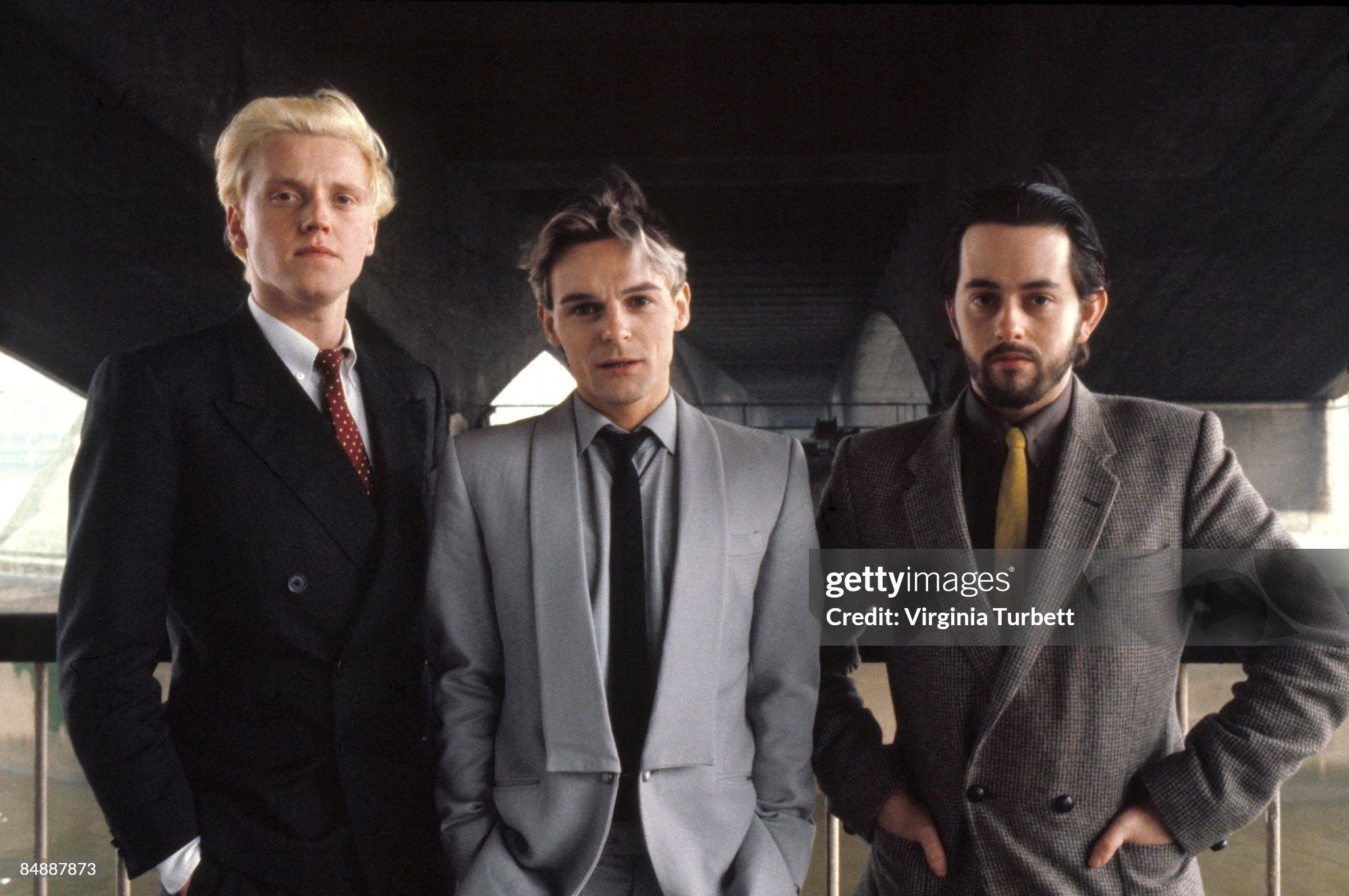
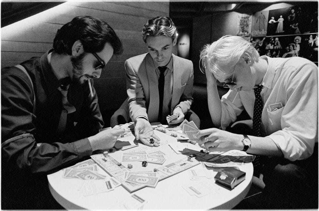
We get a better view of this when we examine the commissioned set of photographs taken in an exhaustive session with Turbett in and around the brutalist surrounds of the South Bank complex. Hints of a Sheffield feel are now evaporating, and the proposed work with other South Yorkshire experimenters is seemingly not on the roadmap. They are a London-centred band now, and the evocative “now then” raincoat and flat cap that Marsh wore only a month previous is forgotten. The photographs include images of the band smoking profusely, chalking Heaven 17 graffiti on a riverside wall, and having an impromptu but FIERCE game of Monopoly in what looks like the subterranean café of the theatre. It is the beginning of a fostering an image of business-hungry young executives.
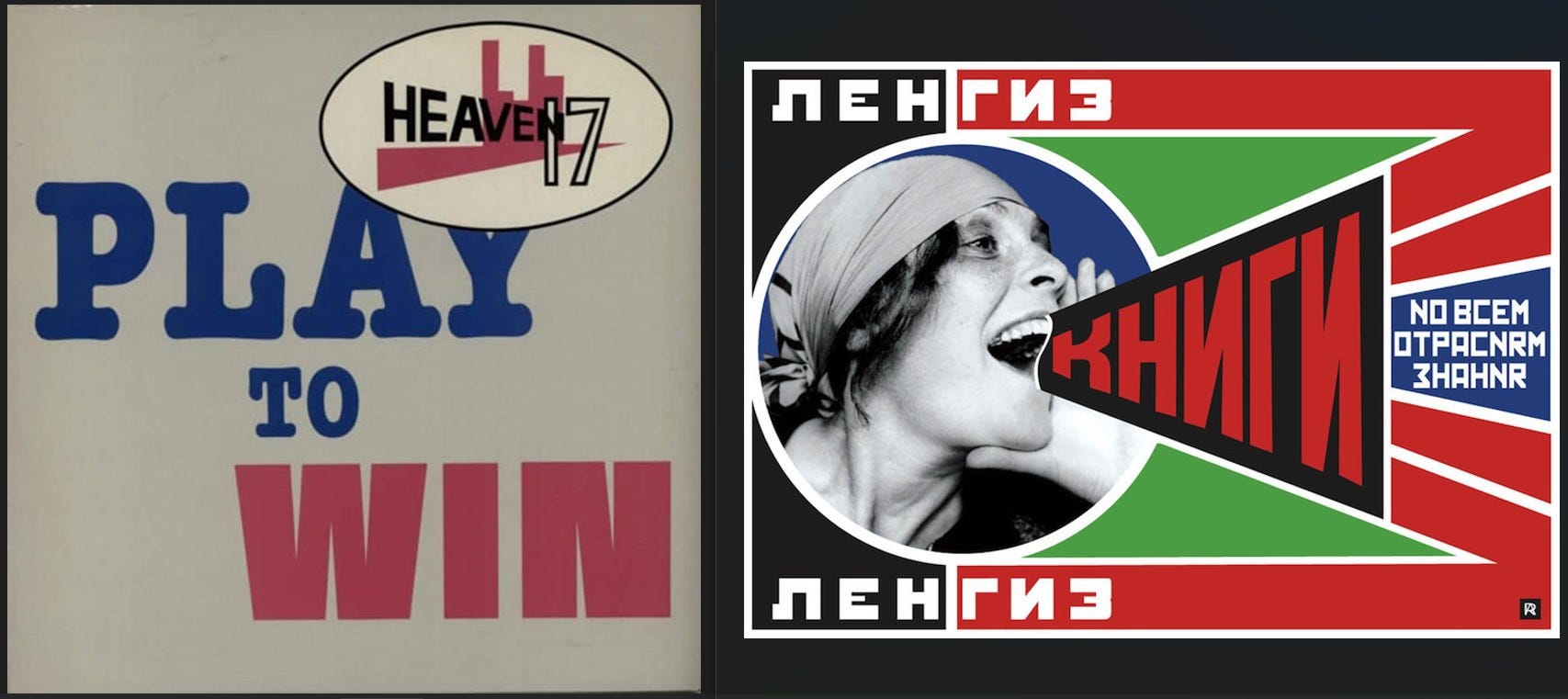
Heaven 17 moved forward with a third single ‘Play to Win’ in late August – this is another 12” I bought from new and still have. I never tire of hearing the extended synth solo (and marimba freak-out?) that sounds like the rattling chaos of a Vegas casino. The sleeve saw a shift in concept with a Factory Records style quasi-Constructivist arrangement incorporating a new band logo – Rodchenko meets Star Trek. Three singles and three different band logos - they were restless and still formulating. According to the credits it was designed by Taurus Studios in Sheffield.
‘Play to Win’ got close enough to the Top 40 to give the band their first (and only) appearance on Top of the Pops in the early years, the trio gracing the programme on Thursday 24 September. The band get into a party swing wearing their banker’s outfits (Marsh in a chromatically shocking yellow shirt and braces) whilst the crowd sway and whoop in the background. The communal ponytails are now evident, and there is some imaginative over-miming from Marsh as he pretends to whistle the synth hooks and handclap the beats.
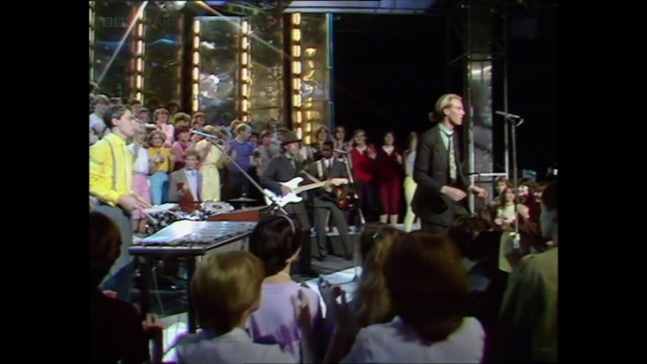
Joyous bankers on Top of the Pops – what was the world coming to? Heaven 17 had now entered the highly-visible pop game, and the second half of 1981 would see them take their conceptual organisation approach to a new level within the image culture of the time. This will be covered in part 2 of this essay.
Many thanks to Simon Dell for helping with resources for this article, and to Virginia Turbett for allowing me use of her incredible photographs.
Interesting. Thanks Ian. Look forward to the next part. Martin Ware’s podcast was a good listen too.