Why the Long Face?
Heaven 17, anti-imagery, and The Luxury Gap (part 2 - Penthouse and Pavement)

// continuing my documentation of conceptual gamesmanship and a ‘style audit’ of Heaven 17, part 2 covers the intense period of activity around the album Penthouse and Pavement and the title track released as a single – this saw that ICONIC artwork and the construction of multiple interesting looks by the band as they get caught up in 80s pop image culture with lots of suit wearing – it also sees a more contemporary ascribing of the term ‘yuppie’ to Heaven 17’s ethos and look, which I feel needs some cautious consideration – I will flag this here and unpack it in part 3 //
Uptown and downtown
The release of the hedonistic anthem ‘Play to Win’ is, in the contemporary era, portrayed as a clarion call to yuppie capitalism. As with many things concerning the band in this period, it is more complex and has been factually blurred through the modern lens of compacting the whole of the 1980s into a yuppie decade. A slow and steady revisiting of Heaven 17’s activities in the tail end of 1981 will help us understand the start of an important decade much better.
Firstly, the near success of ‘Play to Win’ was also enough to earn the band a feature in Smash Hits (17 Sept 1981 with a cover featuring a trilby-hatted Gary Numan promoting his post-synth-pop new style album Dance). In many ways, this is an important moment for Heaven 17. Though Smash Hits did actually support emerging independent and post-punk artists, it is historically remembered as a crossing point to a different realm of music articulation and audience engagement. For the feature (by Ian Birch) we have the song lyrics printed alongside a short two-column interview/overview where the band outline their business-organisational approach and also (for the purpose of potentially fragile Smash Hits readers) dispel any residual bad blood with The Human League.
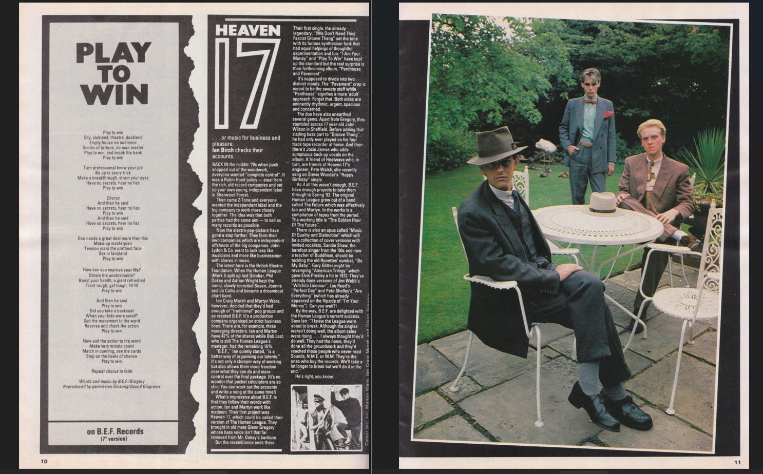
We also get a small inset photo and full-page photo of the band which reveals the campaign for the imminent single ‘Penthouse and Pavement’ – the title track from the new album scheduled for a September release and twinned with an instrumental version. This was the reengagement of the more concerted image campaign, but at the same time a hiccup in visual strategy. The pinstriped proto-yuppies that would define the visual impact of the album are put on ice, and we get something different…
The imagery for the single is curious, with a bipolar look that splits between ‘Penthouse’ (an uptown look of quasi-sleazy Panama hat and zoot suited splendour) and ‘Pavement’ (a trio of frankly comical looks consisting of a hoodlum-rocker-type thug for Ware, a Frenchified cat burglar for Gregory and – I think – a type of svelte mime-artist for Marsh). It is the first fully-fledged ‘picture sleeve’ by the band, and the images are split across the front and reverse. The Smash Hits ‘penthouse’ photograph comes from the same photoshoot, as they assemble around an ornate decorative white metal table. The foldable tubular legs give it a Homebase feel, although the incidental flamingo in the background is a nice touch - and definitely not from Homebase.
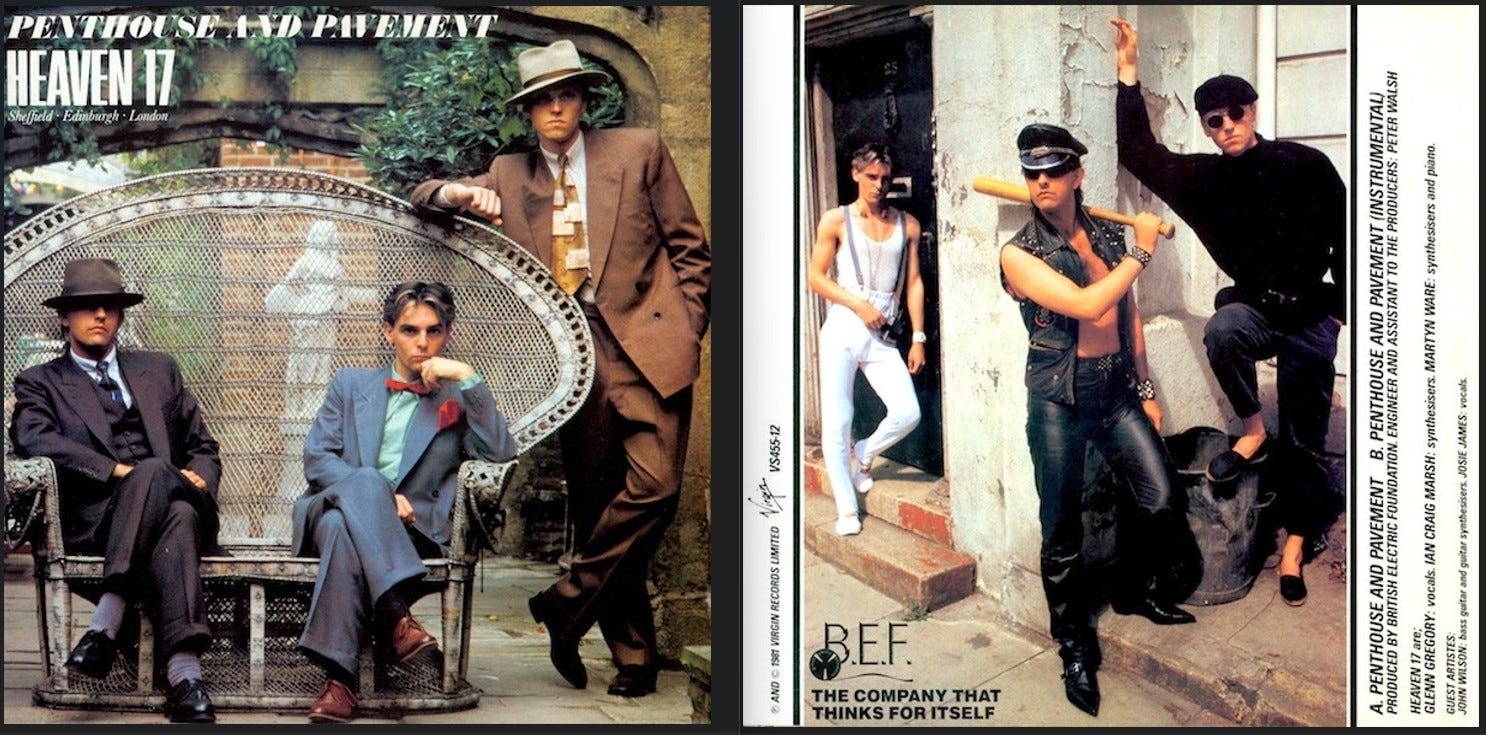
This look is set in the art deco premises of Kensington Roof Gardens, with a postmodernist mix of landscapes. The remarkable garden (and menagerie) was on top of the Derry and Toms department store (later Big Biba), and in 1981 the upper reaches of the building (gardens and nightclub/restaurant) were taken over by Virgin, the record label of the band. Heaven 17 sit in the English water garden in a grand peacock chair, a remnant from the lavish Biba days.
The slightly threatening downtown look sees the trio lurking outside shabby doorways amidst dustbins and detritus. There are now a few outtake images of both looks which made it into the repackaged CD in 2006, and a loose photograph where they take the vintage suited look to the modern glass-fronted façade of a modern building (in the finance district?) and are in danger of meeting another version of themselves as contemporary corporate activists. This photo shoot remains uncredited – presumably an in-house job - although there is a second photoshoot by Sounds photographer Steve Rapport. This is taken closer to home for the band on Westbourne Grove and around the low-wall-fronted Georgian terraces in the area where both Ware and Gregory lived. You can spot the difference as there’s no bowtie on Ian Craig Marsh, even though the hired clothes are still being strutted.
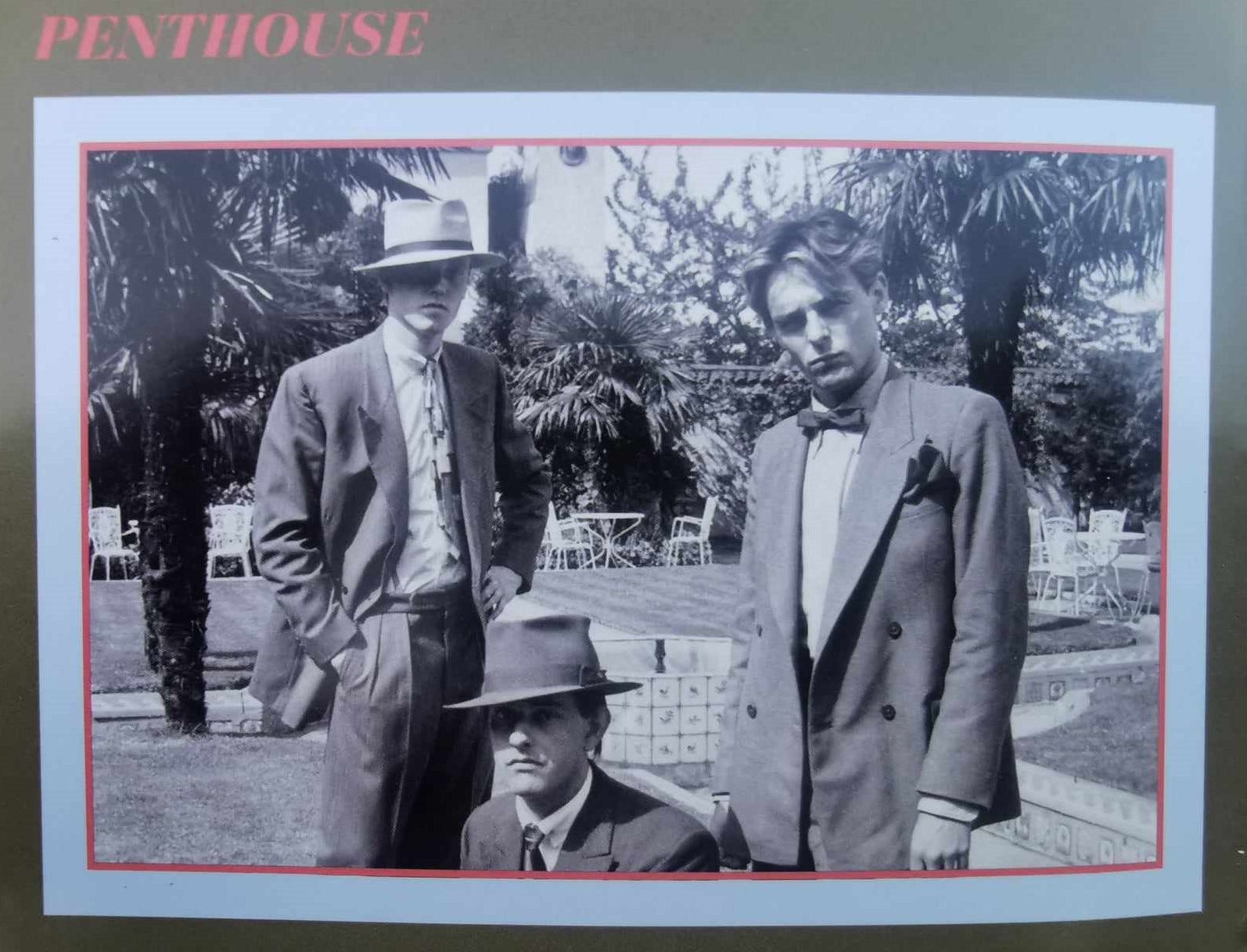
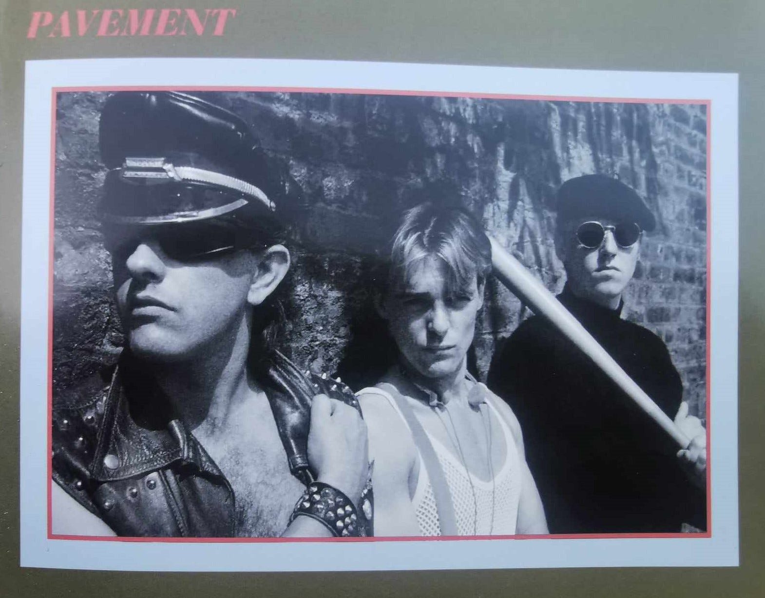
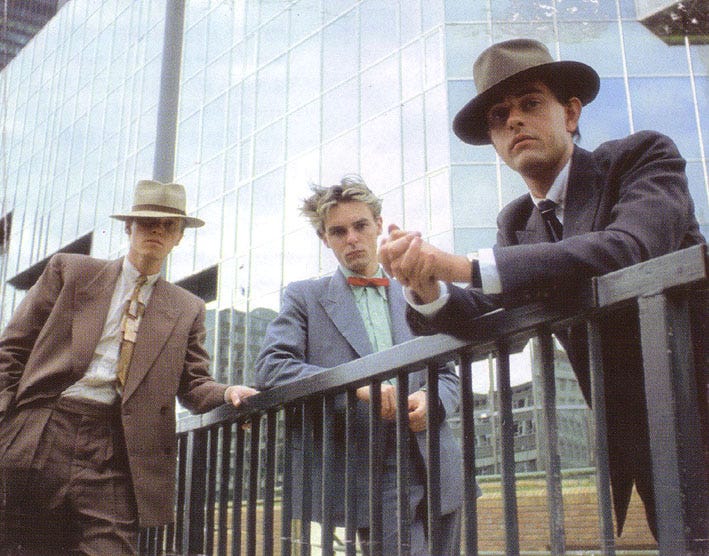
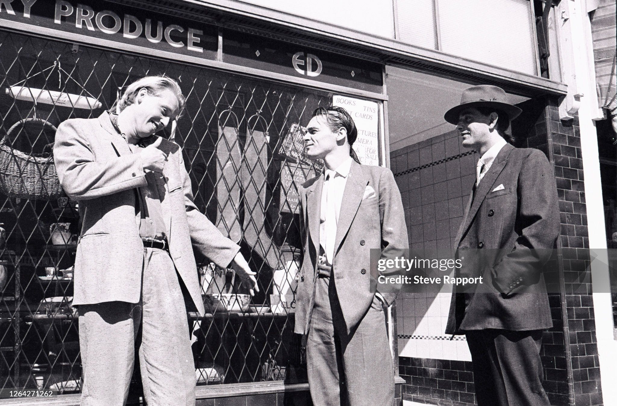
A strident attempt to pay heed to the new pop game, it is a somewhat ‘painting by numbers’ approach, very much of the times, with each look trying to riff on the themes of the track – think here of acts like Tenpole Tudor dressing as knights and singing about being knights. Heaven 17 have headed for the dressing up box, and then gone back for seconds. We get a ‘bought-into’ image indicative of the emergent new pop period from late 1981 onwards, although this is a trait that they had avoided up until this point.
Exotic suiting – the ‘Penthouse’ look – had make a big comeback in September 1981 with The Face having the famous issue on zoot suits and Kid Creole finding success in the UK charts, so they were very much on-trend here with a voluminous and slightly sleazy cut matched with garish kipper-ish ties. Ware’s autobiography mentions Contemporary Wardrobe as a supplier, and this links to an earlier essay where I discussed Terry Hall’s iconic zoot suit for the summer 1981 ‘Ghost Town’ release. Contemporary Wardrobe was the brainchild of Roger Burton, hiring out his meticulous collection of subcultural garments for budding pop groups shooting videos or posing for photospreads. With ‘Penthouse and Pavement’ coming slightly after ‘Ghost Town’, Ware & Co were still early adopters of this new resource. I can’t say at this point where the pavement look came from, or whether the clothes were hired or owned by the band.
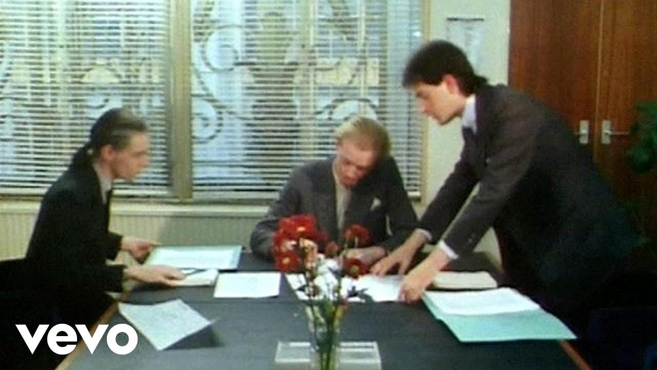
Following the photoshoot for sleeve artwork there is a first video produced for the single, but it sadly includes no reference to the two image constructions used in the promotional artwork. Instead, we get a tale of corporate sabotage and double crossing, with an extended boardroom scene and the band members now assuming their better-known roles as pinstripe businessmen sporting ponytails (there’s a metanarrative of Gregory dressed down in a black cap-sleeved tee developing some incriminating photographs).
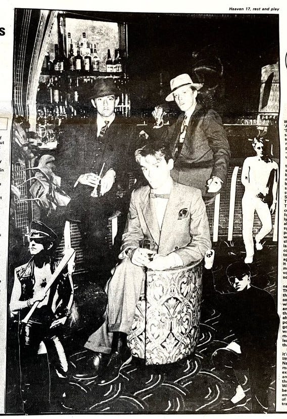
The album is released in mid-September and is accompanied by a clutch of articles and reviews. As expected, these were generally strong, not least from NME’s Paul Morley who entered a contest with himself to break records for alliterations and chiastic dexterity. Common for the time, the review was accompanied by a shoddy montage that revisited the two looks from the single (the suited look is of the band reclining in a fancy 80s bar). The Melody Maker review by Lynden Barber, equally positive, uses an old photograph from the Virginia Turbett South Bank shoot.
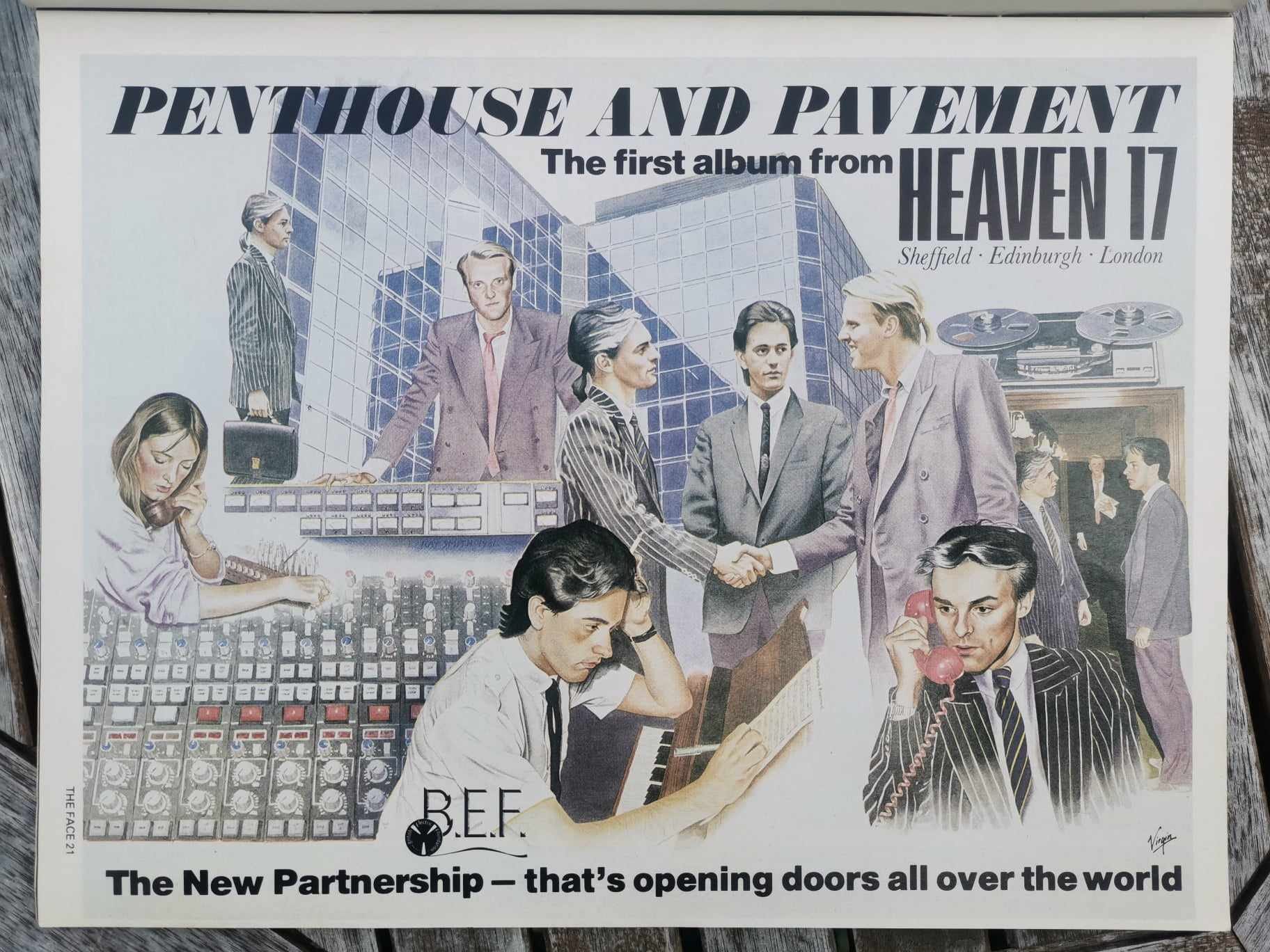
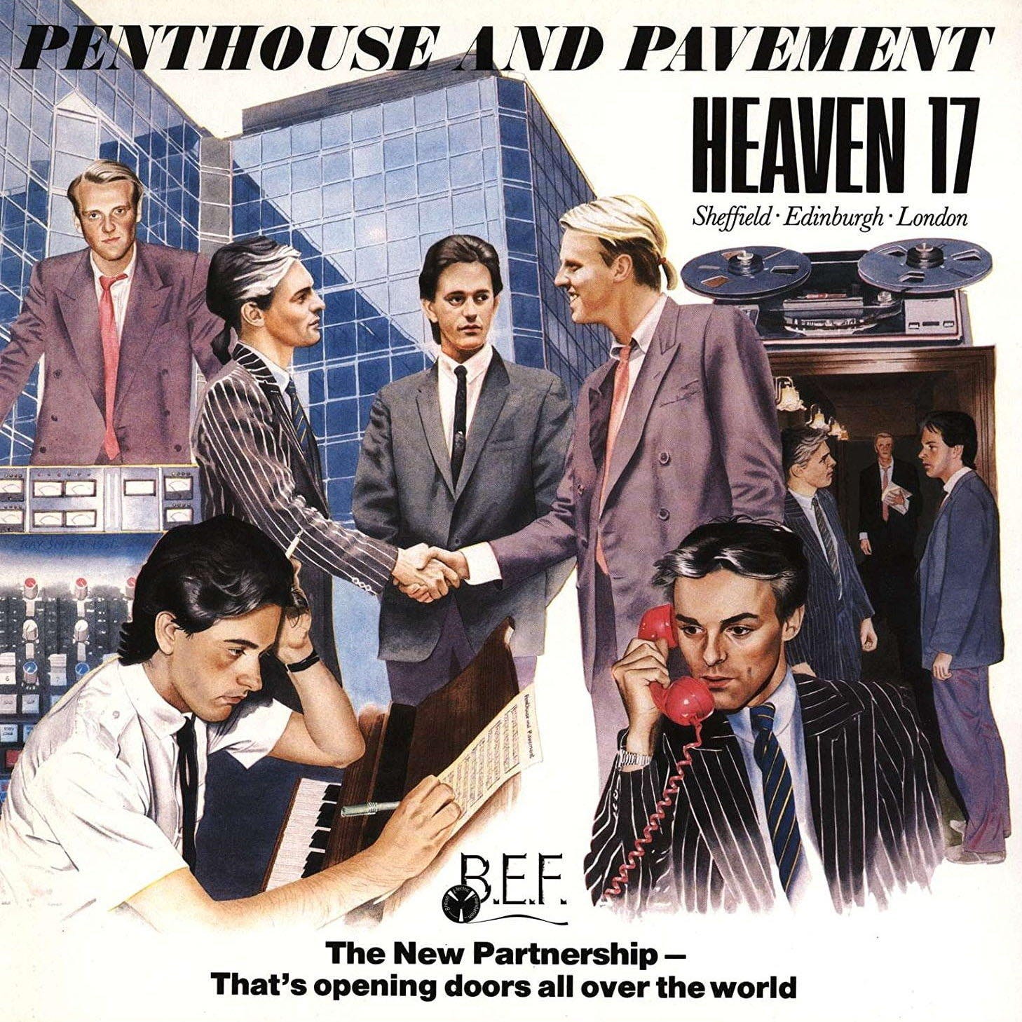
Let’s now look at the iconic album sleeve, and deconstruct this famous artwork and accompanying look. This is displayed in all its glory through various adverts, including the landscape spread in The Face which unfolds the wraparound image of the album sleeve. The sleeve art and design are by Ray Smith – an offbeat but inspired choice. Smith had previously worked with early and mid-70s experimental artists, whilst also working as an artist and art teacher. According to Ware, the band were introduced to him by Virgin’s Mark Draper, with Smith having just designed the sleeve for a recent Skids album (Joy, released autumn 1981).
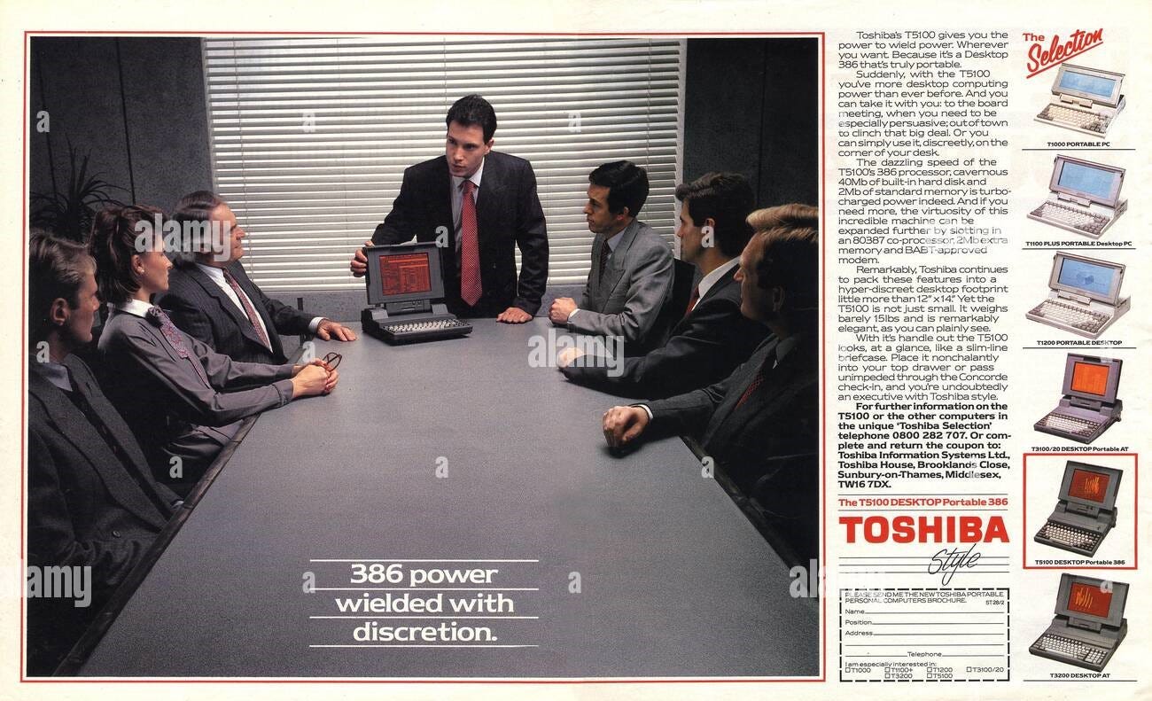
Whilst some designers have a more visible credit in record sleeve work, allowing their names to carry forward on websites such as discogs, Smith’s canon seems to be mainly unrecorded. In Ware’s words: “We loved his work, got on really well with him, explained our ‘faux-corporate’ concept, showed him a Toshiba advert in a similar style from Newsweek. We did a Polaroid session at the Townhouse studios, from which he compiled a composition, then he painted it in a similar style as the Toshiba ad”.
There’s a possible misremembering in Ware’s account, as a contemporaneous interview in Sounds (dated 3 October 1981) has mention of Newsweek, but the suggestion of an advert for OKI International. Marsh, the instigator of the idea, excitedly added more details: “It was one of those classic drawings, a guy with a pipe, cigars, case, contracts, lots of people in the background and telecommunications satellites all merged, and a slogan about keeping ahead since 1881 and being ready to meet the challenge of yet another century”. Laborious library research into back issues of Newsweek gave us the answer, with an OKI advertisement nestled in issue dated 11 May 1981. It is as Marsh describes in the interview, and you can see directly how the designer Smith lifted the concept. It is a montage of sorts, though uses layered figures that represent a melange of times, spaces and (business) moments. Montage work can be notoriously (and deliberately) flat to the picture plane, though the OKI advert is a kind 3-d space of flattened objects, each with an apparitional quality. The desired effect is not an accumulation of figurative or indexical strength and accuracy, but time and business, never stopping, reaching into the future.
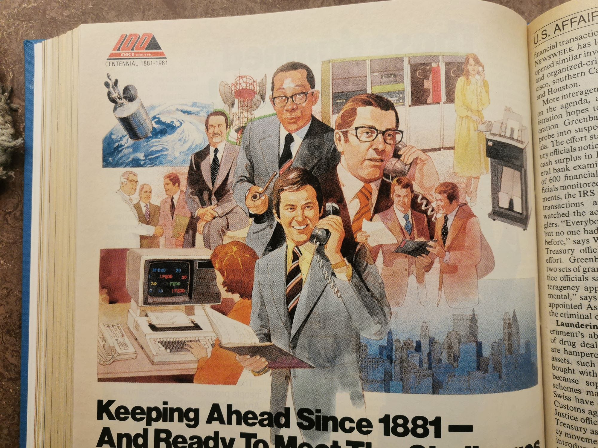
The OKI advert, and also subsequent Toshiba ones I unearthed through following Ware’s red herring, convey an important point – a figurative picture of the ‘classical’ and old-fashioned image of businessmen with pipes etc. It’s a minor point for now, but strongly supports the idea that in 1981 we were not at the idea of yuppies as either a concept (swish-looking young businessmen making the suit a fashion item) or a named thing. I’ll return to this in the next essay, but we can briefly look at a later advert by the Toshiba from 1987 (promoting the T5100 laptop) which shows how the business-advert stylisation persisted through to the actual yuppie encroachment of the mid-to-late-80s. Heaven 17 were predicting the future.
Pipes, cigars and handshakes… what figurative details can we establish in Smith’s artwork? In an advert style, we have four or five separate ‘moments’ with Gregory standing assuredly and front-facing over a console, a dominant middle image of Gregory and Marsh shaking on a deal watched over by a nervous Ware, a smaller image of an encounter in a corridor, and two foreground images of Ware smoking (cigs not a pipe) and composing music and Marsh answering a big red telephone (no mobiles and Filofax at this point in time). There is a figure-background inclusion of a glass-fronted monolithic building (possibly the one in the photoshoot) and a strangely floating reel-to-reel set against a pure white background proper, allowing the title, band name and branding to stand out.
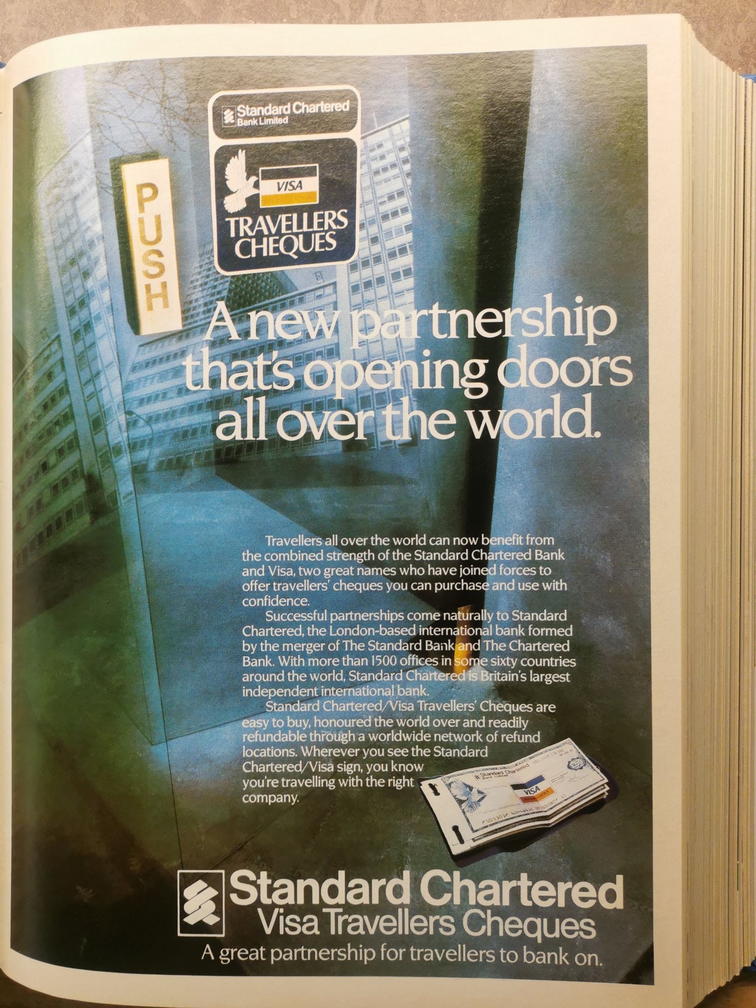
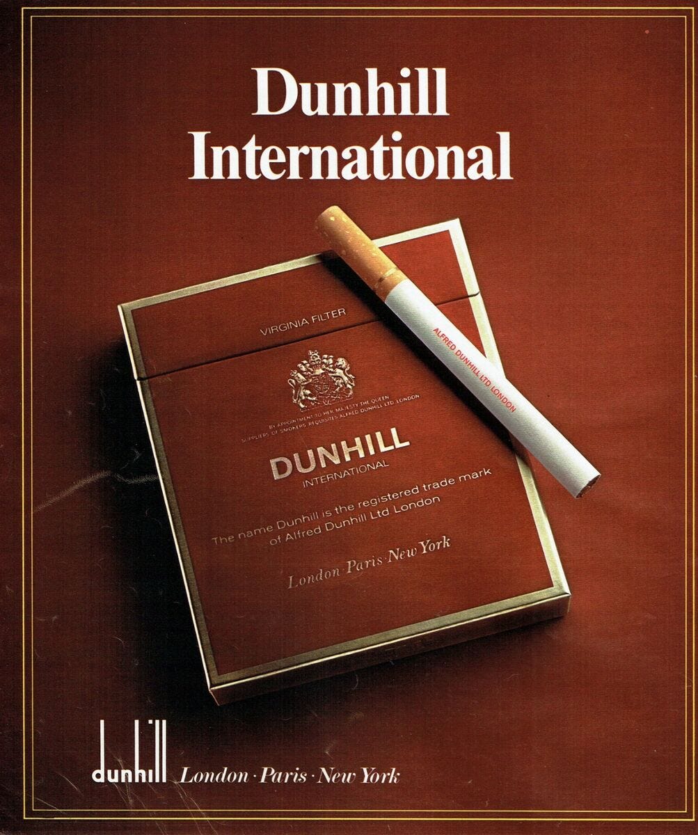
The branding includes numerous facets such as a BEF mission statement / strapline declaring “The New Partnership – that’s opening doors all over the world” lifted from an American Express advert and a band-as-brand logo stating “Sheffield-Edinburgh-London” (the band, the manager, the label) apparently inspired by a Dunhill cigarettes campaign. These adverts were all featured in Newsweek.
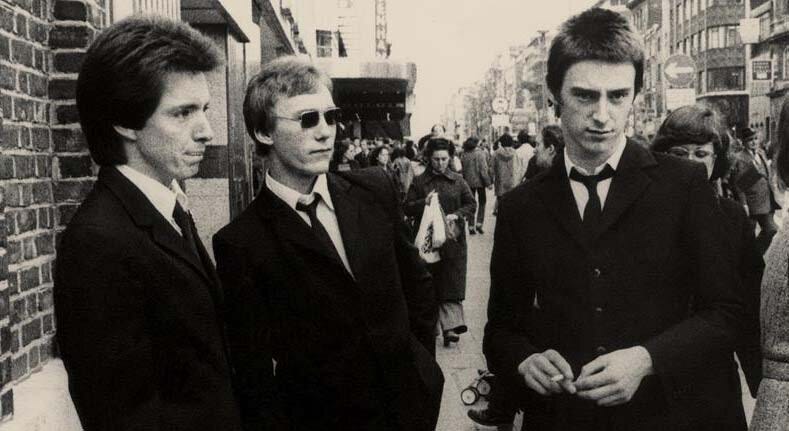
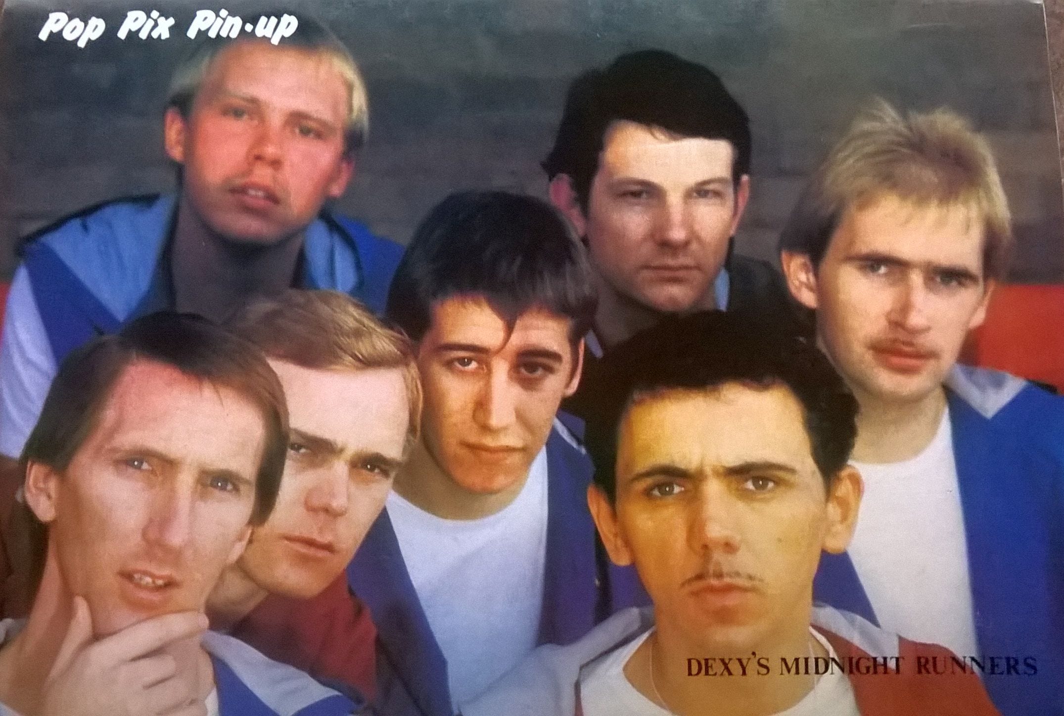
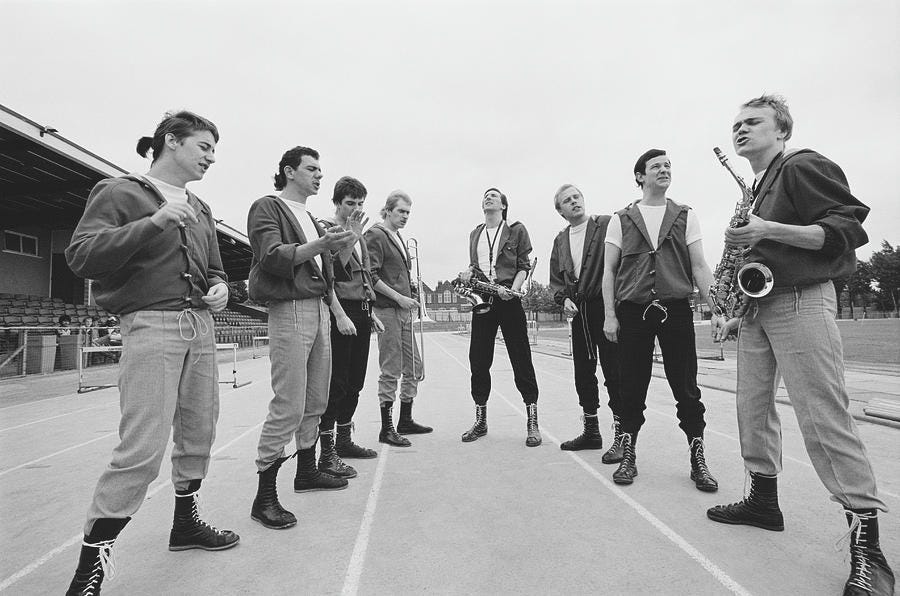
The album sleeve, though only an imaginative impression, is the culmination of the assembling and disseminating of the mock-corporate look and modus operandi that the band had spoken about in their numerous interviews throughout the year. This approach is echoed in a batch of interviews following the album. In the pictures it is not billowing zoot suits or post-punk arty suits, but high-end and very current pinstripe suits accompanied by neat ponytail haircuts. The ponytails, perhaps a riff on Dexys who included ponytails in their ‘athletic monk’ look of early 1981, is a key element as it contrasts with any stuffiness associated with business suits. It was – visually and conceptually - as far from punk or even post-punk (which favoured scruffy Oxfam suits and plimsolls) as could be possible. It was also separate from bands like The Jam who had made a return to wearing sharp mod suits amidst a punk backdrop for their 1977 debut album In the City.
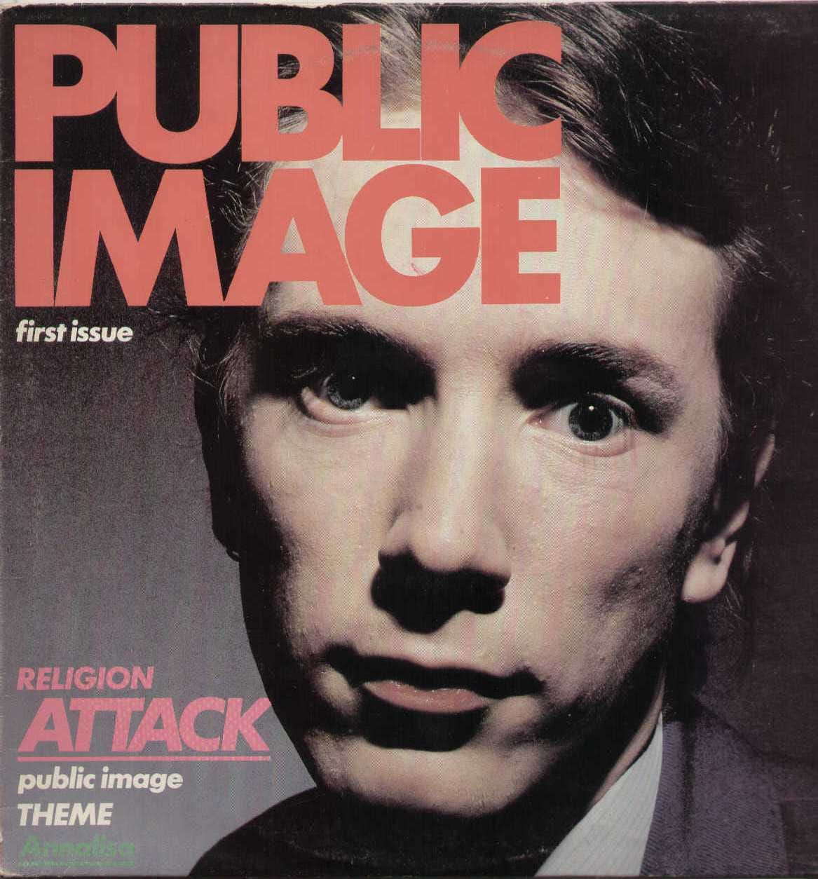
Formal business suits in an immediate post-punk environment were designed to confuse the expectations of anti-conformity-conformity. As already referred to by the band, an ironic corporate look had been tentatively trialled with John Lydon’s PiL project, with Lydon himself donning a stiff suit and business-like countenance for the cover of First Issue (1978) photographed by Dennis Morris (we tend to congregate all the band with this look, but Jim Walker is depicted stripped bare, and Keith Levine has an entertainer’s get-up). Lydon’s suit and slick-but-starch appearance felt slightly retrograde, rooted in the 70s. PiL would dip in and out of the mock-corporate look and concept throughout the 80s.
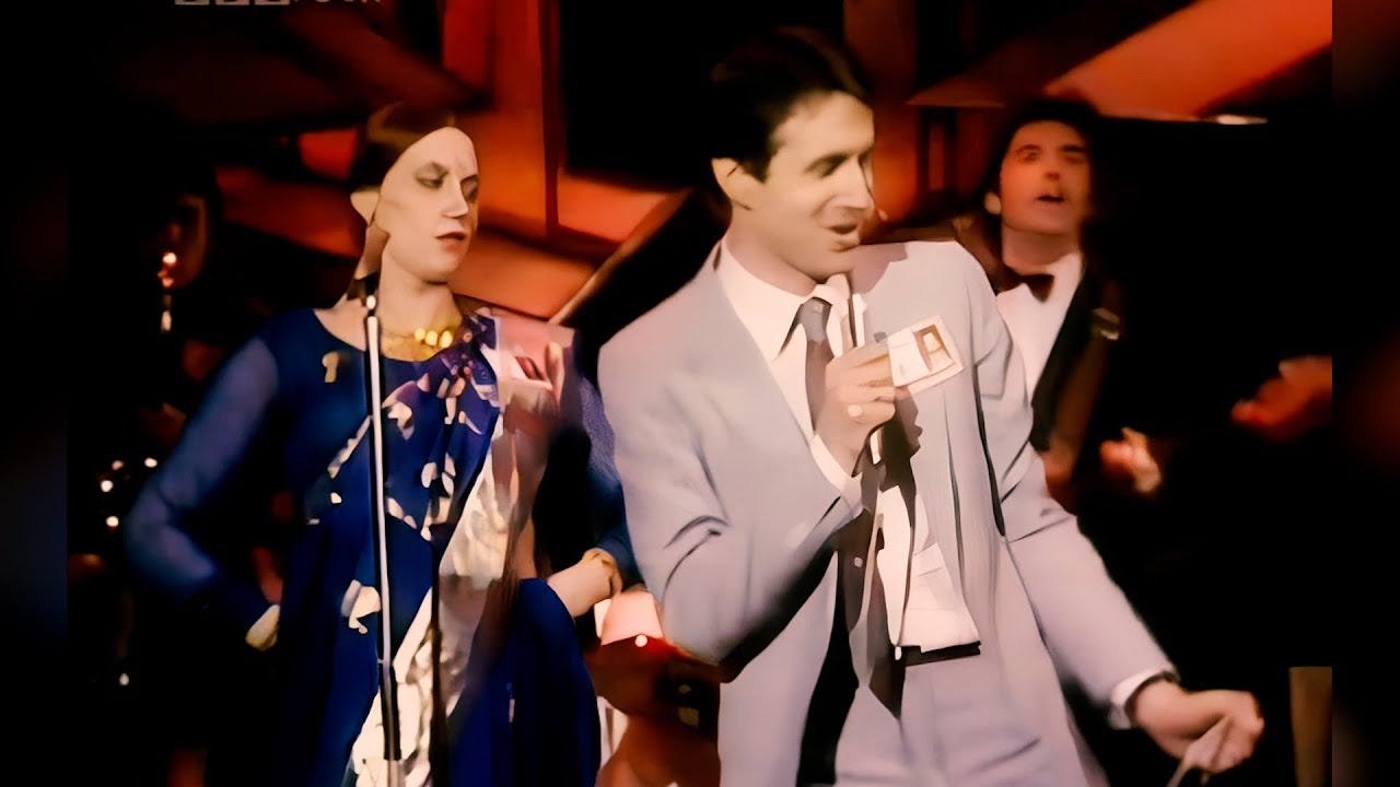
In another corner, Robin Scott and M appeared on Top of the Pops with their 1979 chart hit ‘Pop Muzik’, with Scott holding down a salaried look complete with photo-identity badge. It was a talking point… but like Lydon’s grey suit still redolent of the 70s. In early 1981 the pinstripe-wearing brigade might be more associated (in the popular imagination) with civil servant drones or stale Reginald Perrin types. However, with Thatcherist neoliberalism as an all-encompassing ideology taking hold, the symbolism of the businessman in the pinstripe suit was shifting – and Heaven 17 were on that pulse. But could we apply the term yuppie here? The next part will consider this in detail and look at how the album and the conceptual presentation was received by the music press.