
Why the Long Face?
Heaven 17, anti-imagery, and The Luxury Gap (part 5 - not playing the game)

// finally we arrive at the release of The Luxury Gap in which Heaven 17 apparently retract from image culture //
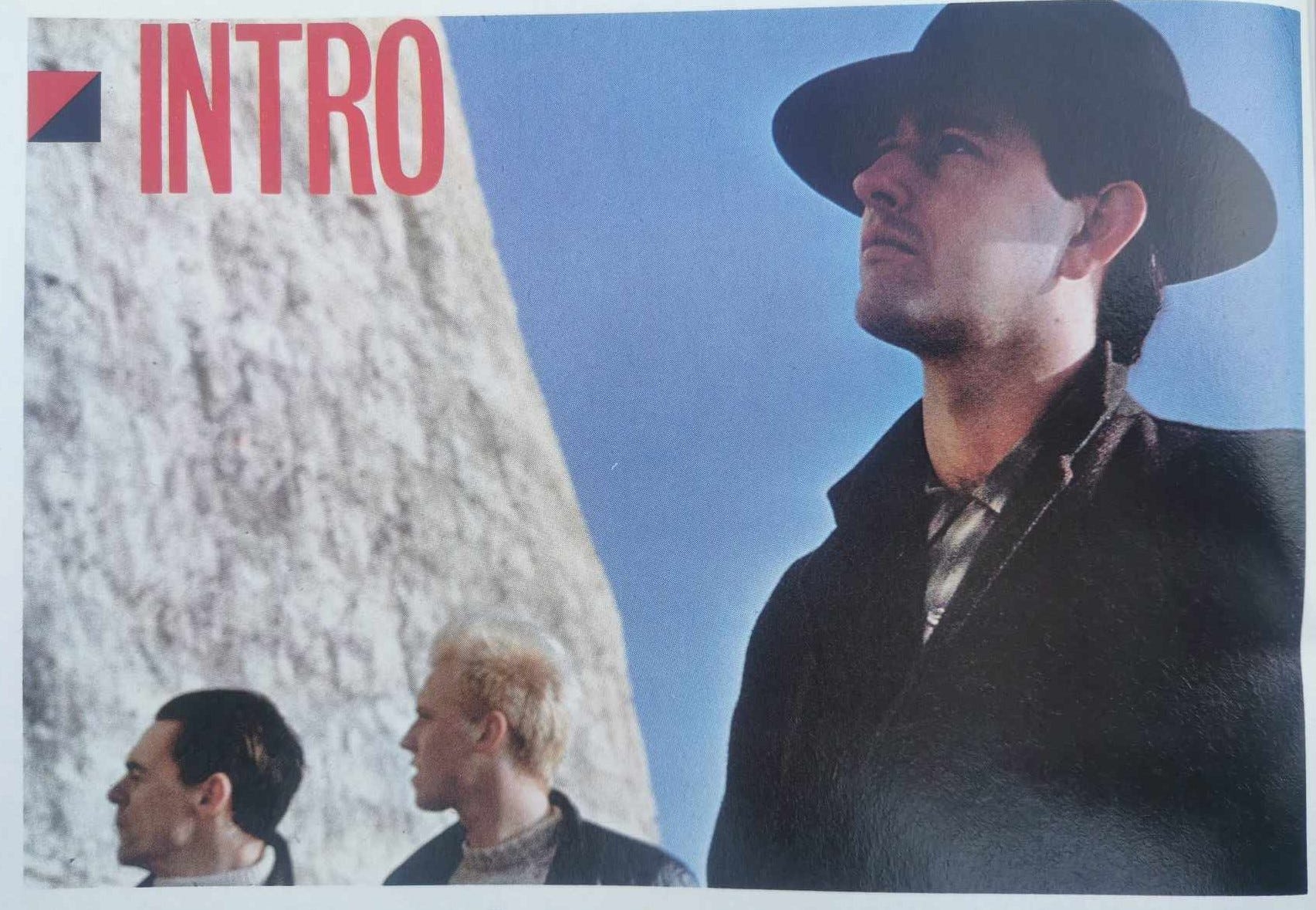
Heaven 17 re-emerge in April 1983, promoting a new album and single – The Luxury Gap and ‘Temptation’. They have now disconnected from their charismatic manager Bob Last who leaves to focus on maintaining the success of The Human League in what would prove to be a very tortuous follow-up to Dare. A first glimpse of the 1983 Heaven 17 is offered in a short photo-feature in the front ‘Intro’ section of The Face, marking the band’s reappearance and seemingly setting a path that went against the image culture of dressing up and play acting that marked out the first three years of this legendary decade. In fact, it was almost a reaction against the culture of The Face itself, as the magazine was mired in the dizzying array of scenes, subcultures and stylisations. Let’s not mince words, through 1982 and early 1983 the magazine was setting the tone of the time in terms of promoting bands via their distinctive looks.
The trio are depicted in front of what looked like a brilliant blue sky and a slither of pyramid structure with the band in a retreating line such that Martyn Ware fills the entire vertical extent of the frame with Glenn Gregory and Ian Craig Marsh relegated to head shots that occupy the lower fifth of the frame. All three figures are positioned at a slight angle and look at something we cannot see – a technique known as hors-champ (or off-screen) in art parlance. The camera is positioned at a low point, casting a view upwards. Ware looks straight ahead (from his angled stance) so we see a classic mix of front and profile. He wears an overcoat and fedora, giving off an unmistakable aura of Raiders of the Lost Ark (1981) which reinforces the pyramid image (it’s not a pyramid as per the ‘Empire State Human’ lyric, the photograph was apparently taken “near Brighton”).
The other two band members look at something else, so their heads are further angled away from us, giving us proper side profiles. Gregory’s bleached hair a perennial focal point, and Marsh always immaculately turned out. These two band members are also heavily attired with a glimpse of thick fishermen’s sweaters and overcoats – not suitable for the apparently burning-hot weather. As well as being a good-looking and stylish trio, they also had an instinctual and intimate knowledge about how the image factory worked, knowing all the stock poses of the pop 1980s. The short accompanying text allows them to explain how they had “tried and failed to find a suitably daft haircut”, instead making a bid for “image-less anonymity”. This would carry through onto the packaging for their album, which went squarely against the grain of the new pop times of the early 80s.
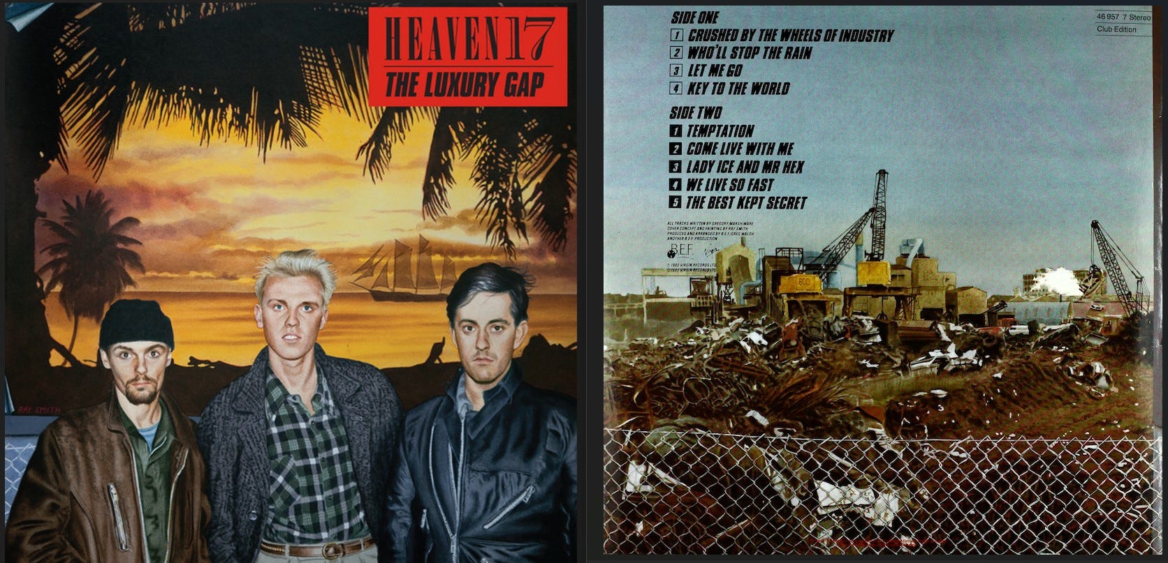
The artwork for The Luxury Gap is once again designed and executed by Ray Smith, who paints the front and back cover portraits as a linked sequence. As with Penthouse and Pavement, it is a great critical design, questioning image culture by playing upon an apparently banal and thoughtless sleeve of a pop band in standard face-on foreground configuration. Whereas the first album extolled its conceptual challenge in full view, The Luxury Gap hides in plain sight. Smith achieves this on various levels, requiring second and third glances.
The entirety of the work consists of the foreground figure of the band and the background of a tropical scene. One immediately thinks of the new romantic persuasion for glitz, glamour and ostentatious exoticism. The ‘Club Tropicana’ of Wham!, the Caribbean yachts, supermodels and Antony Price suits of Duran Duran. However, there is an immediate disconnect – alluding to the gap of the title – as the trio appear both overdressed and under-excited for the scene. And so, even before we absorb the small clues as to the illusion, we sense all is not (visually and conceptually) right.
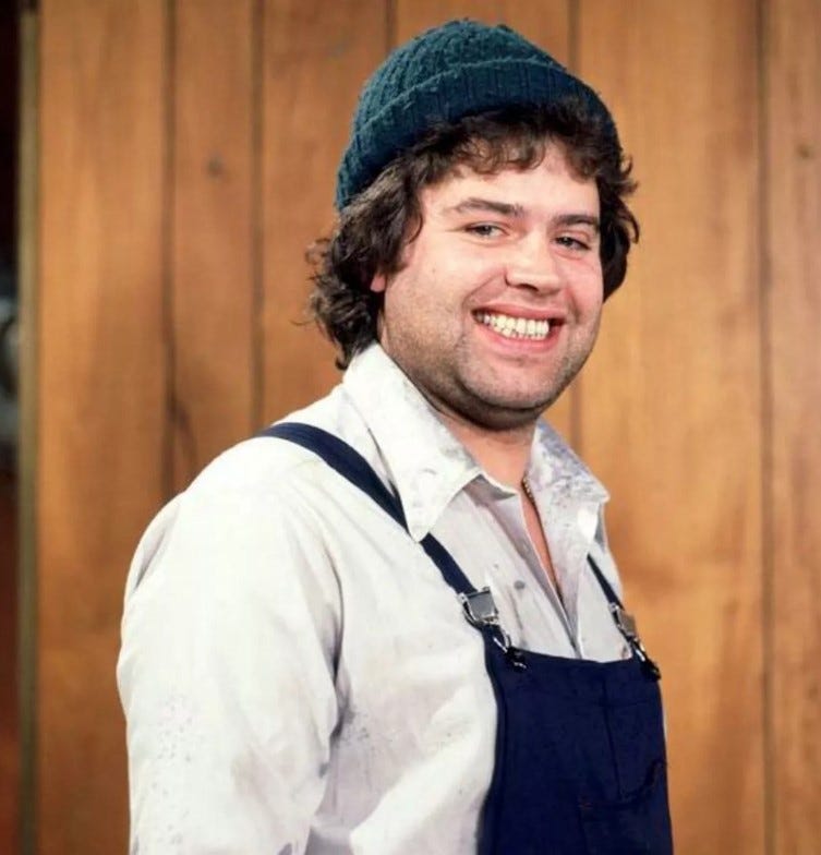
The band are painted by Smith as a dour trio, looking face on and showing head, shoulders and torso. Their strong looks and confidence in the 80s image culture is all but evaporated, as they look beaten down. Marsh on the left resembles an unkempt workman just knocking off shift with a knitted ‘Benny from Crossroads’ hat, leather jacket and dark shirt, his hands (not visible) presumably bunched into his pockets in an everyday sense of ‘ordinariness’. The woolly work hat was briefly popularised by Dexys, but in the early 80s it remained sartorially scarred by the simpleton character Benny. An immoveable anti-fashion. Gregory in the centre still holds a bit of panache with his shock of bleached blond hair, wearing a knitted overcoat and check shirt incorporating classic diagonal cut pockets. He looks like a chancer, about to say something to the onlooker… it feels like a proposal or altercation, on edge. Finally, Ware looks equally as miserable as Marsh, wearing what appears to be a biker jacket zipped up.
The background shows a tropical beach scene as a holidaymaking brochure stereotype – a frame-within-frame of silhouetted palm leaves, a four-master yacht (in the days before super-yachts became the modern imprimatur of mega-wealth), and a burning yellow sunset that reflects in the sea. The colour and figurative composition remind me of the fairground art of the 90s that had similar tropical scenes – too perfect to be true, verging on naff, and recently revitalised in the ironic vaporwave scene. Smith’s brush strokes depict the foregrounded trio as illuminated, but not within an illumination attributed to the background of the idyllic sunset. The illumination is harsher, as if from a bright streetlight. It’s bright, but it feels cold like a London winter.

The notable (and now sadly departed) journalist John Gill produced essays for the trio of repackaged Heaven 17 CDs in 2006. Whereas Gill applies a rich and poignant political timestamp to 1981’s Penthouse and Pavement, he finds The Luxury Gap more obtuse (he shouldn’t as 1983 was a momentous year for UK politics…). His later writing here can appear as typically overblown in the modern style, a remnant of the NME pseudo-intellectual overkill that Gill himself wasn’t particularly guilty of (Gill wrote for Sounds, and famously skippered the free-for-all ‘Forgive Us Our Synths’ article in Xmas 1980 where Phil Oakey went toe-to-toe with Throbbing Gristle).
Gill’s text accompanying The Luxury Gap is still a good read, even though we have rapid-fire references to dialectics, intertextuality, post-modernism, post-structuralism, pop culture and high modernism in the space of a few paragraphs. He undertakes a scan of the lyrics to thresh out art and literary references (although he misses the Proustian clue in ‘Come Live with Me’). Gill then alludes to the sleeve and the upfrontness of the band with an obvious emphasis on their attire in contrast to the stylisation of the previous album. He suggests: “tough-guy casual dress-down duds”. The wider mise-en-scene sleeve illusion is broached, but I’m unsure if Gill gets the ultimate joke here. Instead, he focusses on the immediate impact of wealth and leisure but sees the illusion crack with the sky on fire. He refers to this as “sickly yellow staining”, offering a swift meteorological lesson explaining how in tropical regimes the nightfall is “as fast as an axe”.
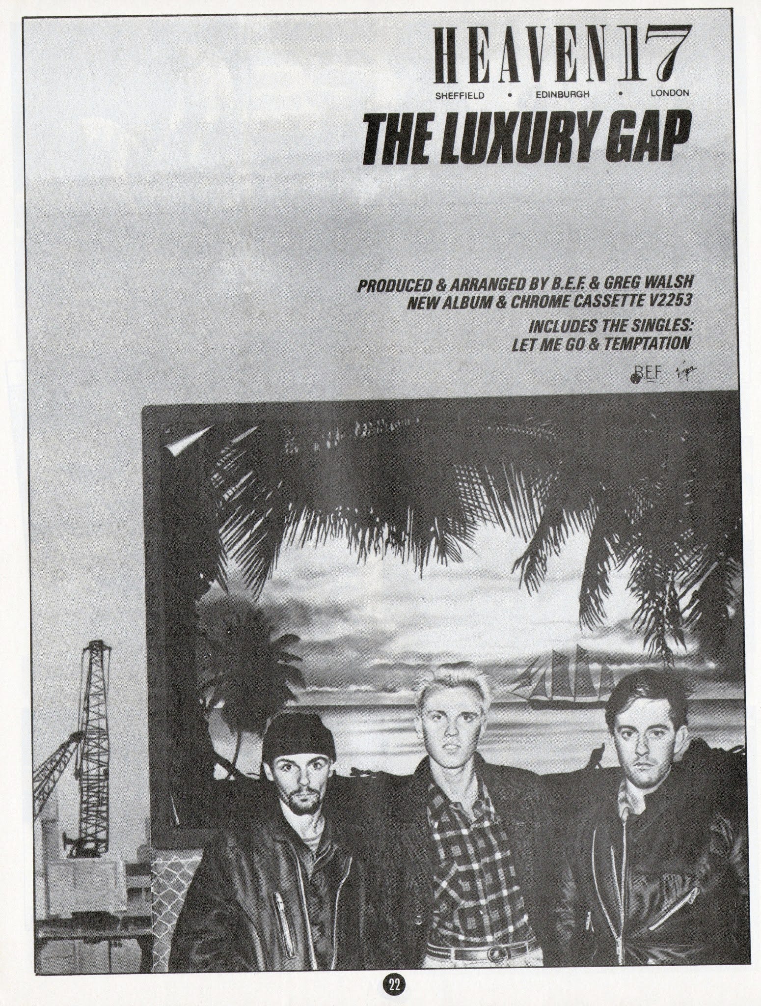
I’m guessing that Gill can see the illusionistic trick of the sleeve. He must do, as the press adverts for the album (above) revealed the constructed nature of the sleeve, showing a further sky-behind-the-billboard-sky that is anything other than exotic. Presumably he is working at a deeper level to critique and deconstruct the false impossibility of the beauty that is assembled. A glimpse at the reality gap of luxury itself, rather than the implied gap between austerity and luxury that forms the central conceit of the album sleeve (and songs).
Ray Smith offers several visual clues to the manufactured nature of his depiction – not least when combined with the reverse of the sleeve which shows the same view without the band and without the backdrop. A scene of transition from an industrial landscape to something else. It could be the landscape of decline of the band’s Sheffield home (and hinted at in the track ‘Crushed by the Wheels of Industry’), or it could be the rapidly changing landscape of London Docklands which saw the first wholesale redevelopment as the album went to press. Smith gives a symbolic montage – heavy industry such as container cranes, conveyors and smelting sheds etched as a line of scree across the middle of the frame, scrapped vehicles on the cusp of the foreground, and – behind a blast of white steam – the semblance of a high-rise block in stained grey. It’s about as dismal as can be.
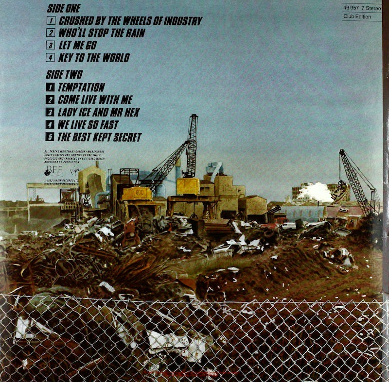
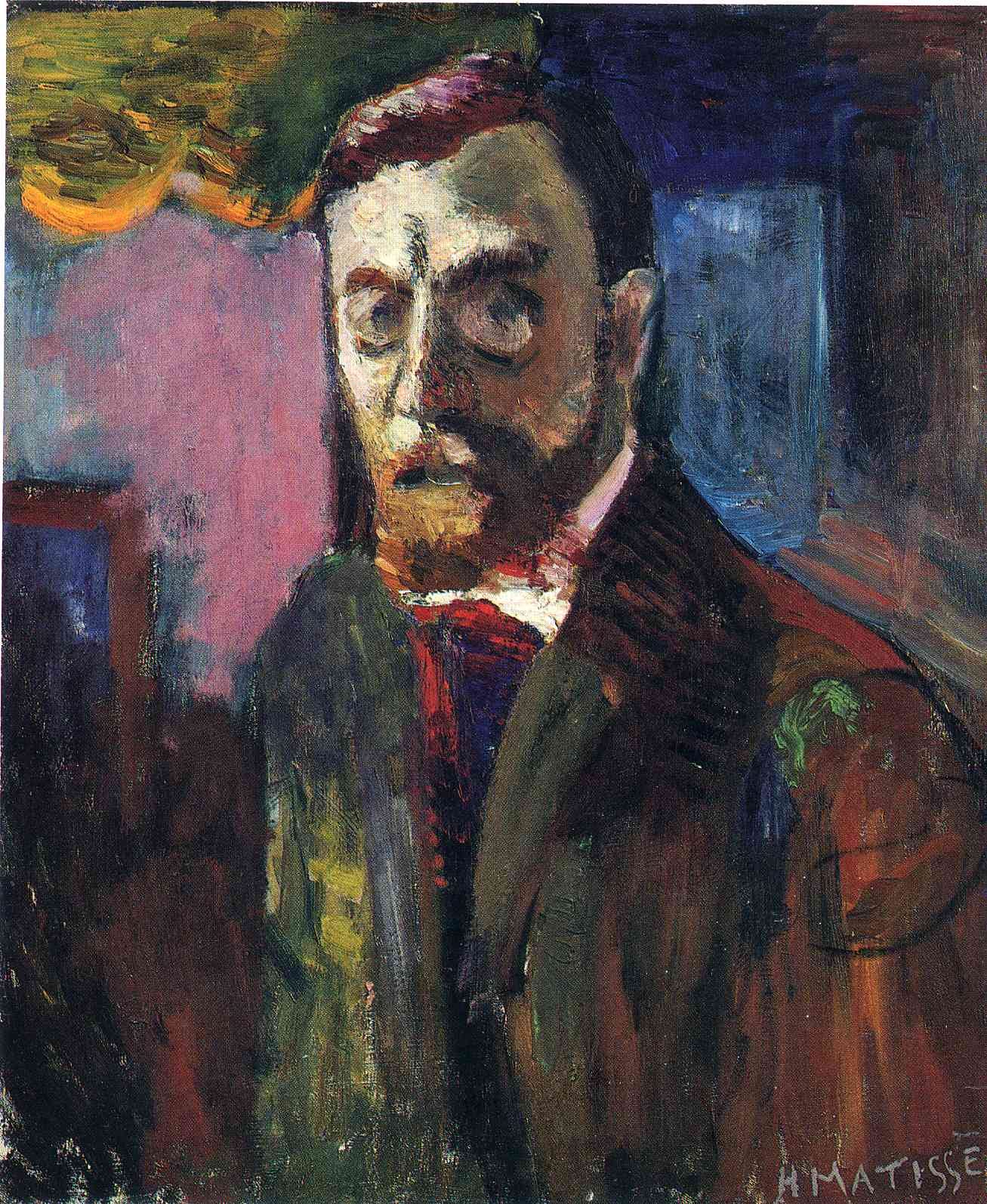
And so, the front is revealed to be a poster or billboard. Shock, horror. All that remains to connect the two images is the chain-link fence, which is glimpsed on the front and easy to overlook in the wider assemblage of brightness-vs-dullness. Meanwhile, the artist signs his name on the billboard, creating an illusion within the illusion, as if he is authoring the billboard (or the visual conjuring trick) rather than the whole sleeve itself. There’s a hint of peeling in the upper and lower left corners behind Marsh, as Smith deliberately points to the collapsing and temporary nature of the scene and its allusion to perfection or wholeness. It brings to mind an early self-portrait by Matisse, when the artist was struggling for recognition, and he includes unpainted edges to suggest visual fraying which in turn suggests an artist suffering anonymity in the margins. Smith brings in a similar mechanism to convey a collapsing of the illusion of wealth and splendour.
The band are badly faking their involvement in the luxury life of 80s pop. They don’t look right with their unsmiling and uncertain faces, their “dress-down duds”, and even the background they are claiming to be either part of or aspiring to is revealed to be a sham. This is The Luxury Gap, possibly their final chance at a hit album with the axe poised over Virgin. According to Ware’s recent autobiography, the pressure was not on Heaven 17 to succeed for themselves and so maintain their position on the Virgin rostra, they were seen as the forlorn hope for the struggling label itself.
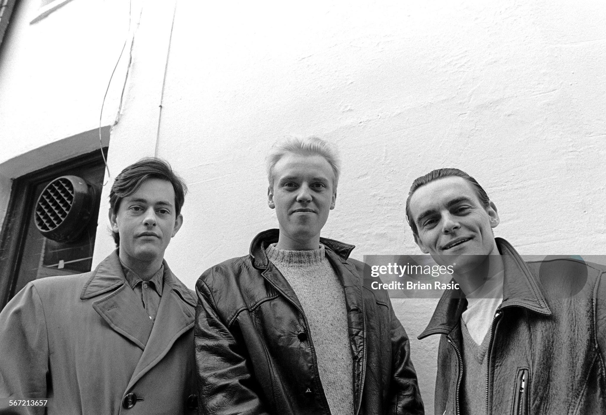
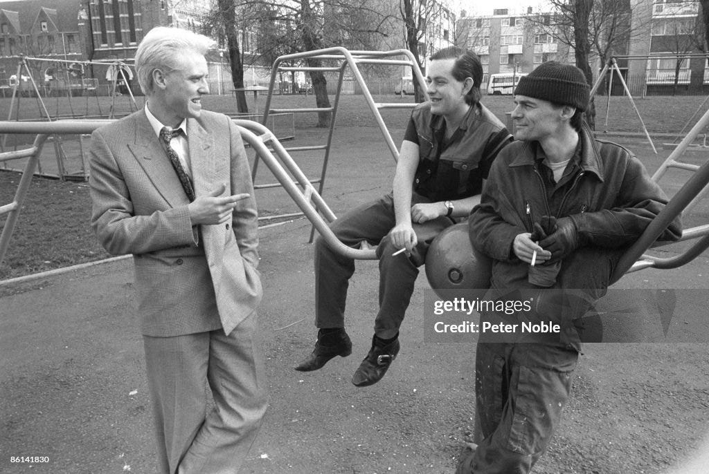
As a ‘style audit’ – the original aim of this article – the band appear in a couple of photoshoots wearing their dressed-down non-look. In fact, for a band without an image they get plenty of camera attention. Photographer Brian Rasic captures them almost as painted by Ray Smith on the sleeve, even though Ware is the only one remembering not to smile. Marsh’s Benny hat is absent, but he wears the same jacket and clearly has ‘hat hair’. A more expansive photoshoot by Peter Noble has the band casually smoking in a deserted playground in London’s outskirts. In this instance the style has moved on… Marsh has the same workman look from the album sleeve, Gregory has taken up with a swanky suit, and Ware has had a trip to Johnsons to purchase boots and a La Rocka sleeveless jacket. Past, present and future in one viewing. It is almost as if these clothes lay out a set of possibilities, portending (via a spread bet) as to what happens next.
Really interesting. I never saw them live but I wonder how these looks translated to a live show?